


Previously: A fan's introduction to costume design.
Unpopular opinion time: I don't think that Sarah Lund's jumpers are all that significant.
For those of you who don't know what I'm talking about, Sarah Lund is the taciturn protagonist of Danish TV series The Killing, AKA Forbrydelsen. The Killing is a political drama/detective show, the first season taking place over 20 days of a murder investigation in Copenhagen. It was very popular in Denmark, and quickly reached must-watch status in the UK when it aired on the BBC last year. Season 2 just started and I'm watching like a hawk, brain already conditioned into Pavlovian stress attacks whenever I hear the credits music (the Forbrydel-drums). However. While I'm psyched that such a well-made, intelligent, feminist show is so popular, the obsession with Forbrydelsen includes some intense yet slightly bemusing involvement in Lund's jumper choices.
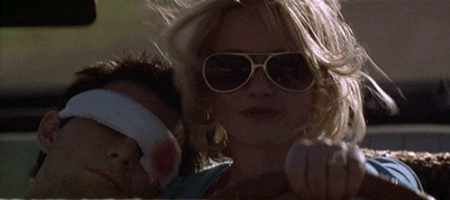
This promo pic gives you a good idea both of Lund's character (confident, serious and aloof), and of the entire cast's attitude towards fashion -- ie, that they don't find it very important.
Everyone in Forbrydelsen is either a workaholic with no spare time whatsoever (the politicians and the detectives), or the grieving family of a murder victim. Not people who spend much time pondering their outfits every morning, in other words. There's a high level of realism throughout all aspects of the show, and in the real world most people just do not care that much about clothes unless they're going to a party or a job interview. They wear things that are comfortable and easily washable and unlikely to get creased if they've got a desk job, and the characters of Forbrydelsen reflect that in their uniformly unremarkable dress-sense. On top of this, the main characters are politicians and cops -- people whose jobs require them to look as normal and un-flashy as possible, albeit for different reasons.
'For fans of The Killing [...] there's only question bigger than whodunnit: "Why does Sarah Lund always wear that thick patterned jumper? And also, of course, where can I get one from?" ' -- from The Killing: Sarah Lund's jumper explained, in The Guardian.
The actress who plays Lund, Sofie Gråbøl, has commented on the jumpers in several interviews. I don't doubt that thought was put into Lund's costumes, but I get the impression that neither Gråbøl nor the showrunners ever predicted the level of interest that fans would exhibit in her jumper collection. And even if she was aware of how exciting people would find her knitwear choices, I suspect she'd prefer to be discussing her acting and character development. I mean, Lund is a pretty unique character -- a female detective who is, if anything, even more abrupt, antisocial and self-destructive than her male counterparts.
One of the main reasons why Lund's jumper became so iconic during season 1 is because it appeared so often. At the beginning of the season Lund is supposed to be moving house, meaning most of her clothes are packed away and/or already shipped. Also, she only goes home to eat cold leftovers directly from the pan and take brief 3am naps before someone calls with the next clue, so it's not like she's sorting through her wardrobe for tomorrow's snazzily-knitted Faroese crimefighting outfit. You get the impression she only pauses to shower because greasy hair would be detrimental to the suspect-interview process.
The jumpers are definitely a characterisation decision, I don't argue with that. Lund is unsettlingly driven and has priorities other than feminine/attractive dressing. She has a boyfriend who clearly has no problem with her wearing the same jumper every day (eat your heart out, Sex And The City neo-feminists). But this isn't some statement of "I'm in a man's world so I'm dressing like this" -- Sarah Lund really does not give a shit. Lund's attitude towards other people's opinions is either to listen to them before ignoring them completely (if they're her professional superior), or to just ignore them completely from the get-go. She ends most conversations by walking away while the other person is still in mid-sentence, looking slightly shocked that anyone could be that rude. The main message her jumpers convey is that she wants to be warm, and the rest of her clothes are in boxes.
 If one googles Sarah Lund, the first two hits are about her jumper. To me, this fixation indicates two things: 1) airing this show in November was a good marketing decision because British people apparently become obsessed with knitwear during the winter months, and 2) audiences have unknowingly been yearning for a female character who dresses like a real person.
Links
Win a The Killing jumper in a Lundalike contest -- Radio Times. (WTF)
Sofie Gråbøl interview regarding season 2 -- Huffington Post.
Sarah Lund's Faroese jumper is the surprise star of The Killing -- The Guardian.
Knit your own Sarah Lund jumper -- Radio Times.
Edited to add, 02/12/2011: Just to highlight the hilariously overblown cult status of the Lundjumper phenomenon, I just discovered that this video exists:
Unpopular opinion time: I don't think that Sarah Lund's jumpers are all that significant.
For those of you who don't know what I'm talking about, Sarah Lund is the taciturn protagonist of Danish TV series The Killing, AKA Forbrydelsen. The Killing is a political drama/detective show, the first season taking place over 20 days of a murder investigation in Copenhagen. It was very popular in Denmark, and quickly reached must-watch status in the UK when it aired on the BBC last year. Season 2 just started and I'm watching like a hawk, brain already conditioned into Pavlovian stress attacks whenever I hear the credits music (the Forbrydel-drums). However. While I'm psyched that such a well-made, intelligent, feminist show is so popular, the obsession with Forbrydelsen includes some intense yet slightly bemusing involvement in Lund's jumper choices.
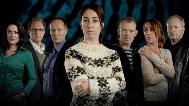 |
| Sarah Lund and the bunch of idiots she has to pretend to tolerate in order to keep her job. |
Everyone in Forbrydelsen is either a workaholic with no spare time whatsoever (the politicians and the detectives), or the grieving family of a murder victim. Not people who spend much time pondering their outfits every morning, in other words. There's a high level of realism throughout all aspects of the show, and in the real world most people just do not care that much about clothes unless they're going to a party or a job interview. They wear things that are comfortable and easily washable and unlikely to get creased if they've got a desk job, and the characters of Forbrydelsen reflect that in their uniformly unremarkable dress-sense. On top of this, the main characters are politicians and cops -- people whose jobs require them to look as normal and un-flashy as possible, albeit for different reasons.
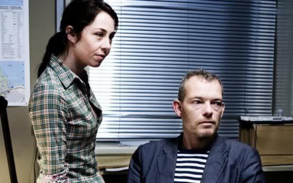 |
| Another world-shattering combo from Sarah Lund, who has more important things to worry about, such as murder. |
The actress who plays Lund, Sofie Gråbøl, has commented on the jumpers in several interviews. I don't doubt that thought was put into Lund's costumes, but I get the impression that neither Gråbøl nor the showrunners ever predicted the level of interest that fans would exhibit in her jumper collection. And even if she was aware of how exciting people would find her knitwear choices, I suspect she'd prefer to be discussing her acting and character development. I mean, Lund is a pretty unique character -- a female detective who is, if anything, even more abrupt, antisocial and self-destructive than her male counterparts.
 |
| The most important development in season two: Lund's new red jumper. |
 |
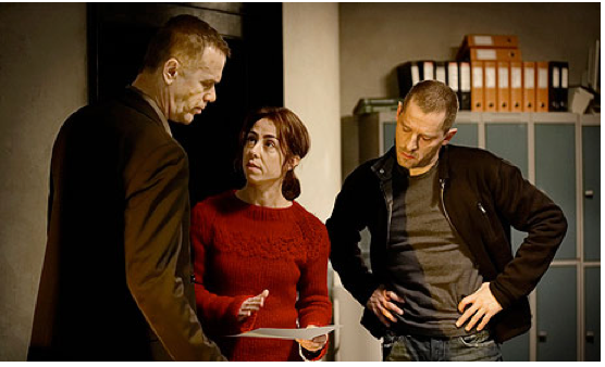
| This photo spoiled me for episode 2x04, which I hadn't seen yet. Now I know her original brown jumper will be back! |
Links
Win a The Killing jumper in a Lundalike contest -- Radio Times. (WTF)
Sofie Gråbøl interview regarding season 2 -- Huffington Post.
Sarah Lund's Faroese jumper is the surprise star of The Killing -- The Guardian.
Knit your own Sarah Lund jumper -- Radio Times.
Edited to add, 02/12/2011: Just to highlight the hilariously overblown cult status of the Lundjumper phenomenon, I just discovered that this video exists:


