


 |
| Chris Benz. (All photos from Style.com.) |
Burberry Prorsum
Believe it or not, the idea of a blank backdrop used to be a weird concept (you can read a bit more about that and post-war fashion photographer Irving Penn here). Sometimes it can make the models look washed out and dull, but for brands like Burberry it's fine because the clothes are mostly in neutral tones.

So, yeah, did I give you enough warning yet that there's going to be a bunch of super-bland shit in this post? Because: BEHOLD.

This gown baffles me because a) there is literally no one in the world who has the correct body shape and boob-volume to correctly fit into this and make it look good, and b) Burberry is a really commercial brand so I really... don't know what they were thinking...?? Resort season mysteries.
Just Cavalli
It's the colour of a really gross-tasting soda drink, it's partially leopard-print, and it comes with a matching lime-green Justin Bieber hat. Teenagers of America, it's your duty to wear this outfit to prom!

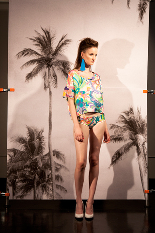
Despite the ~highly imaginative~ usage of backing boards, I give this outfit a grudging B+ because it doesn't look like a half-hearted Resort season attempt at summer fun, and it hits all the things about the irritating "1920s trend" that most mainstream designers miss. Instead of being a period-drama pastiche or Baz Luhrmann ripoff, it takes the drop-waist/long-beaded-necklace details and puts them together in an outfit that looks modern and interesting without being outrageous.

Calvin Klein
This suit may look dull to the untrained eye, but by Calvin Klein standards it's a Lady Gaga stage costume. Calvin Klein hates colours and patterns and loves to design hundreds and hundreds of outfits that essentially amount to beige bedsheets. Unfortunately CK streams a lot of their catwalk shows online, meaning that I've probably wasted/spent at least half an hour of my life heckling at my laptop screen as 37 blank-faced nymphs stride along a pale grey runway in near-identical pale grey smocks. So you can probably understand why this outfit made me fall off my horse.

That being said, there was still a whole bunch of CK outfits that looked like black or white curtains and would only ever look good on Gwyneth Paltrow. But this! Is progress!
DKNY
"LOL" -- direct quote from DKNY head designers after they "finished" "work" on this.

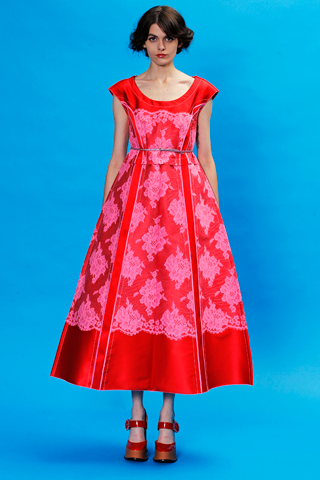
Lanvin
I love this bathing suit because it just looks so ferociously uncomfortable. Nothing says "relaxing beachwear" like an angry-looking model wearing a bathing costume that looks like it may well be 100% rigid (and attempting to cut off all circulation to her vag), armed with 5-inch perspex heels and a leather shoulderbag.

 |
| BEDSHEET. |

Organic by John Patrick.
"My junk feels great in this outfit," thought the John Patrick model, too distracted to button his fucking jacket properly.

Diesel Black Gold
I like this for realsies because it's so Blade Runner.

VPL
This model's name is Hannelore Knut. So: perfect model choice, really, for a lookbook that is so uncharacteristically focused around power rather than passivity. There's always an unfortunate quantity of crappy, sports-themed fashion during an Olympics year, but this is sports-themed fashion done well. It doesn't look like workout gear but it does look strong and practical and simple, and has a few hints of "sporty" colours without going all-out Adidas.


Marc Jacobs
This is an unexpected departure for Marc Jacobs, who is usually far closer to the the chic, vampy end of the Ladylike scale than the floral, Frida Kahlo/Miuccia Prada end. That being said, the sheer exuberant colours of this collection sucked me in, and I found myself really enjoying how summery and weird-looking it managed to be without ending up in Zooey Deschanel hipster quirk territory.


0 comments:
Post a Comment