Why you need to watch Spanish Snow White movie ...

  • Subscribe to our RSS feed.
  • Twitter
  • StumbleUpon
  • Reddit
  • Facebook
  • Digg
Showing posts with label fashion. Show all posts

Sunday, September 29, 2013

RICK OWENS: awesome, awesome, awesome.

Posted on 11:50 AM by christofer D
I didn't post about this (AMAZING) show on HelloTailor because I was writing about it elsewhere. So...
Finally, a Paris Fashion Week show that gives us something to cheer about.
Until this week, fashion designer Rick Owens was mostly known for creating gothic, grunge-inspired clothes that wouldn’t look out of place in a post-apocalyptic wasteland. But thanks to his Spring 2014 show at Paris Fashion Week, he’s now famous for introducing one of the most diverse and rebellious runway shows in recent memory.

Even if you make every effort to ignore the mainstream fashion industry, you’ll still have a fairly accurate mental image of what “models” are supposed to look like: tall, thin, expressionless... and usually white. This Thursday, Rick Owens broke the mold by employing a mostly African American cast of college step-dancers (a combination of cheerleading and military drill) to “walk” his new collection down the runway.

Compared to the size zero, predominantly white models of most womenswear shows, it was a shocking display of diversity. Not to mention a lot livelier than your run-of-the-mill fashion show where models calmly walk in a line from one end of the room to the other. [READ MORE]
Read More
Posted in fashion, paris fashion week, rick owens, spring 2014 | No comments

Monday, September 23, 2013

Spring 2014 Fashion Week: Victoria Beckham, Fausto Puglisi, Vivienne Westwood Red Label, and Chris Kane.

Posted on 9:08 AM by christofer D
Previously on Spring 2014: Ralph Lauren, Theyskens' Theory, Duro Olowu and Tom Ford.

Fausto Puglisi
I love it when designers attempt to describe their new collection in one simple soundbite. It's Stonehenge meets The Hamptons! It's Hollywood meets Star Wars! It's Kraftwerk meets The Craft! Fausto Puglisi attempted to jazz up his first catwalk show by labeling it with the deliciously meaningless publicity soundbite of "Carolina Herrera meets Axl Rose". Thank you, thank you! These clothes are definitely just like a cross between an aging, unwashed douche-rocker, and a super-feminine couture gown designer. What a great description. (In that they are relatively normal-looking skirts and dresses, with a slight leatherwork element. NAILED IT.)
All images via Style.com.

You may be shocked to learn that Fausto Puglisi is a man. He also seems to be somewhat unfamiliar with the concept of breasts. Like for example, this "harness bra" (LOL) may have been manufactured by Tuscan saddlemakers, but that doesn't mean it's very well-designed as an item of boob-regalia. Don't get me wrong! It looks pretty cool, in a bondage/punk kinda way. But there are some things that are just so uncomfortable-looking that, even as a fashion nerd, I have to take a step back and say, "Steady on, pal." First of all, only a tiny fraction of the female population are flat-chested enough for this whole harness bra idea to be a remotely plausible life choice. Secondly, why would you put a tight leather buckle strap directly over your nipples? I guess it would be slightly better if worn over a shirt, but I'm pretty sure that would be the socks-and-sandles of the bra world, and therefore kind of a faux pas.

Leather nipple-restraints aside, I was quite fond of all the wide, A-line skirts. It's a really fun and flattering look, and even the leather/floral print ones would look really good when paired with something a little more toned-down than a leather shirt. (Leather shirts are just a bad idea in general, really. Unless you're actually a medieval blacksmith or a member of a biker gang.)

Victoria Beckham
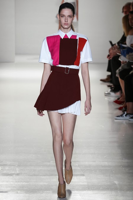
I mentioned already Victoria Beckham when I was writing about the Olsen Twins and celebrity fashion designers the other day. Despite the fact that she's been going for a few years now, I still get the impression that a lot of people think that she's not a "real" designer. Which is... really not true at all. Her label is not enormously innovative or experimental, but she's very good at what she does, which is producing minimalist, classy, office-formal outfits for thin rich ladies. And, yes, I realise that this isn't exactly a niche market in the fashion world. I can already feel you raising your eyebrows. But when I look at Victoria Beckham's output and then look at similar collections from much more established designers (CALVIN KLEIN), Beckham is clearly superior.
I love the little flash of pleated underskirt in these outfits. REALLY hoping that this look somehow makes it to the high street, because, well... none of us are ever gonna be rich and thin enough for real-life Victoria Beckham. I took a look at her website a while ago, and even the bland, loose-fit dresses from her B-label are selling for like £900 each. Nooope.
Horrible shoes, though.

Vivienne Westwood Red Label
There was a whole climate change awareness subtext to this show, as is often the case with Vivienne Westwood's Red Label. Obviously I'm in favour of climate change awareness, and I get that her heart is in the right place. But are mud-spattered models and Lily Cole performing an interpretive dance based on "The Red Shoes" really the best way to go about this? There's something pretty goddamn embarrassing about using a high-end fashion show as a platform to inspire discussion about the dangers of consumerism. This sort of thing is why, even a decade after it came out, Zoolander is still basically a documentary.


Chris Kane
A lot of the imagery in this collection was inspired by photosynthesis and cross-section diagrams of plants: a refreshing alternative to the unavoidable barrage of ~florals~ during Spring Fashion Week. If you're not acknowledging the fact that you have a weird obsession with the sexual organs of a useless decorative plant, then I ain't interested in your floral bullshit.


Read More
Posted in chris kane, fashion, fashion week, fausto puglisi, spring 2014, victoria beckham, vivienne westwood | No comments

Thursday, September 19, 2013

Spring 2014: Ralph Lauren, Theyskens' Theory, Duro Olowu and Tom Ford.

Posted on 1:39 PM by christofer D
Previously on Spring 2014: The Row, J.W. Anderson, Prabal Gurung and Peter Pilotto.

Ralph Lauren
I have mixed feelings on the topic of Ralph Lauren, mostly because I used to work for them and therefore lived through several months of semi-successful corporate brainwashing. Without the brainwashing, my feelings would be decidedly un-mixed, because their designs are largely dull as balls. As it stands, I know way more about Ralph Lauren than any other designer, which forces me to think critically about the brand as a whole. Ugh.
All images via Style.com
Ralph Lauren's high-end work (ie, the stuff you see at Fashion Week) is occasionally interesting, but their lower-price labels are generally an exercise in non-fashion. The purpose of Ralph Lauren clothes is to maintain a supposedly timeless preppy/equestrian/American royalty look, which primarily means a lot of v-neck sweaters, beige, faux prep schoolwear, and touches of feminised "menswear-inspired" shirts and blazers. The ideal Ralph Lauren woman is rich and vaguely sporty, but not really interested in "fashion" so much as interested in looking... rich and vaguely sporty. While other major labels like Dior and Chanel do rely on a certain amount of recycling in order to retain a recognisable brand style, Ralph Lauren is basically in a constant state of self-consumption.
This adherence to the brand's history is a double-edged sword. From a critical perspective, I want Ralph Lauren to shake things up and produce a more thoughtful and innovative variety of clothes, even if it's only in their top-of-the-range collections. Their Fall 2012 collection was a particular success, because it combined an interesting yet topical inspiration (1920s, Downton Abbey-style tweed suits) with the general in-house style of ladylike American preppiness. This season failed because the inspiration (1960s mod; largely in stark black and white with a handful of shriekily colour-blocked dresses and coats) didn't fit with the overall palette and mood of previous Ralph Lauren collections, and isn't really on-trend with the current fashion world as a whole. A few of the outfits appealed to me personally because I enjoy well-tailored trouser suits, but overall this show was not a success.

Duro Olowu

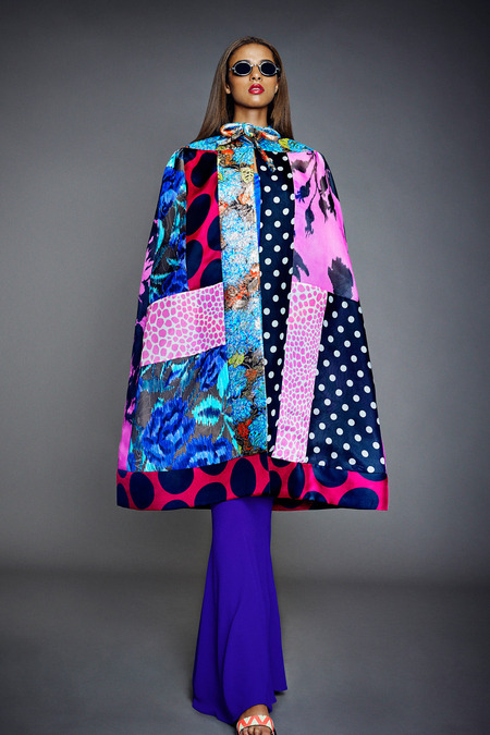
Duro Olowu hasn't changed much in the handful of years he's been on the mainstream fashion circuit, but that doesn't mean his designs don't stand out. Probably because most bigger labels don't tend to go for things like "1970s-inspired Nigerian print capes". TBH I don't have much to say here other than that these BRIGHT, BRIGHT COLOURS are delicious food to my poor, autumnal eyeballs. I live in Scotland. Everything is grey here. It's pretty tragic. Cape on capin' on, Duro Olowu.


Theyskens' Theory
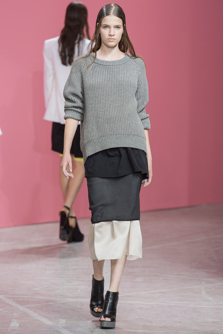
This show was my first genuine personal style inspiration of the season. Plenty of designers make beautiful yet unattainable clothes, but this collection was the opposite: completely everyday clothes styled in an interesting way that you could easily recreate at home. I'm never gonna suggest spending $$$ on a plain grey Theyskens' Theory sweater, but I really enjoyed the layered styling -- if not the odd decision to make all the models look like they'd just dipped their hair in a vat of oil.


Tom Ford
I'm always into any outfit that makes you look like an alien lizard-bug warrior queen, so naturally this show was A++ from my perspective. The crushed glass mosaics looked so sharp that they might easily have been made from actual crushed glass, while the neat silhouettes and simple hair/makeup balanced out the busy appearance of the fabrics. Also, I love the way Ford managed to make a bunch of tough-looking leather outfits that didn't reference aviator jackets or (shudder) "biker chic". When is someone gonna hire this guy to costume a sci-fi movie?


Read More
Posted in duro olowu, fashion, ralph lauren, spring 2014, theyskens theory, tom ford | No comments

Tuesday, September 17, 2013

Spring 2014: The Row, J.W. Anderson, Prabal Gurung and Peter Pilotto.

Posted on 10:55 AM by christofer D
It's been a while since I did any fashion writing, so for new readers... My unscientific method of reviewing Fashion Week is that I only pick the clothes I actually find interesting, whether it's because they seem genuinely innovative/attractive, or just because they're so goddamn ugly. Sadly the vast majority of Fashion Week shows are so dull that I can't muster the spiritual energy to write about them. So without further ado: Some of my favourite outfits from the start of the Spring 2014 season.

The Row
It was a smart decision for the Olsen Twins to name their label "The Row" rather than, you know, "Mary-Kate and Ashley". By now they've proven themselves when running a fashion empire -- not to mention being famed for their personal style (which was mostly shaped by real-life Cruella deVille and professional eating disorder enabler Rachel Zoe, but whatevs). Any lingering doubts over the Twins' ability to run a fashion label are probably because The Row has now evolved past what the Olsens wear in real life -- which doesn't necessarily mean The Row is not still "theirs".
All images via Style.com.
Designing for yourself is the easiest way to quickly hone a personal brand, which is why most celebrity designers (whether it's "real" designers like Victoria Beckham, or just glorified fashion endorsements from a Kardashian) tend to go that route, at least at first. The most successful celebrity fashion label is Jessica Simpson's, for the dual reasons that a) you always know what you're getting, and b) her label caters to plus-size women. While they are respected by critics, the clothes displayed by Victoria Beckham and The Row during fashion week are unlikely to reach Jessica Simpson's level of financial success because you have to be rich and thin in order to wear them. Luckily for her, nobody expects Victoria to cater to the commoners, while the Olsens have several lower-tier labels to fall back on.


This show was particularly interesting to me because while I usually have very little tiem for accessories, I really enjoy The Row's hats, bags and shoes. There was no obviously overarching design theme, with individual outfits taking vague inspiration from all round the world, including details such as fabric choice. I particularly liked the slouchy, casual shoulder bags.


J.W. Anderson
There was a lot of skin on show at J.W. Anderson, in that un-sexy fashion way that would nevertheless get you kicked out of most public space if you wore it in real life. Some interesting looks in general (check out the black and white outfits below), but my fave was probably this dress that is literally a deflated car tire:


Prabal Gurung
Not a great year for Prabal Gurung. A lot of the individual pieces looked good, but I just couldn't get over the fact that the show was supposedly inspired by Marilyn Monroe. Guys, if any of you are planning on starting a fashion label anytime soon, take my advice and don't tell people your latest show is inspired Marilyn Monroe, Audrey Hepburn, or "old-fashioned elegance". The latter is permitted if you're Dior or Chanel, but the first two are 100% verboten. Particularly if a) your show does not actually resemble Marilyn Monroe or her style at all, and b) all your models are 15-year-old skeletal brunettes.
The skirt looks pretty, if you're OK with the clamminess of plastic sheeting on your bare legs. The pink suit is fresh and chic, with prints that look abstract enough to avoid the Spring cliche of randomly dropping flowers all over everything in the hope that it will look topical. HOWEVER. Please stop name-dropping Marilyn Monroe, who certainly wouldn't be wearing these outfits even if she were still alive. It's like traveling to Scotland to stage your latest version of Macbeth. Just don't.

Peter Pilotto
This collection was inspired by a ceramicist named Ken Price, who was a big fan of bright colours, abstract shapes and iridescent glazes. Refreshingly obscure compared to Prabal Gurung's Monroe-free Marilyn Monroe show, plus when you google Ken Price you can definitely see where Pilotto was coming from.
Some of these outfits aren't the most wearable (ie, navel-bearing button-down shirts are not for the faint hearted), but the colours are amazing and I'm really into the idea of modern crinolines. It's not immediately obvious on all the dresses, but pretty much everything here has a flexible frame under the skirt, meaning that it'll sway dramatically when the wearer is walking.

 AMAZING layering on this one. It looks like a stained glass window from the Church of Toothpaste.

Read More
Posted in fashion, jw anderson, peter pilotto, prabal gurung, pre-spring, spring 2014, the row | No comments

Friday, September 13, 2013

Costume design, JK Rowling's new Harry Potter movie, and the wizarding fashions of 1920s New York.

Posted on 9:59 AM by christofer D
JK Rowling announced yesterday that she's teaming up with Warner Brothers to make a new series of Harry Potter movies, instantly causing the the top of my head to flip open with excitement. The HP books shaped my childhood, and my love of the series was recently rekindled when I got to report at LeakyCon London Harry Potter convention last month. The prospect of an entirely new story set in the wizarding universe already has me grinding valium into my martini. STAY CHILL, SELF. IT WON'T BE OUT FOR ANOTHER TWO YEARS. We need to set up a Harry Potter-related group therapy session, stat.

The new movie(s) will focus on Newt Scamander, the author of Fantastic Beasts and Where To Find Them, the definitive textbook on magical creatures. He already seems to me like an ideal choice of protagonist, because he has a strong connection to the wizarding universe but no real link to the events of the Harry Potter series. I'd be very leery of a Harry Potter spinoff that seemed to act as a prequel or sequel to the series itself, but I feel like JKR is pretty unlikely to do that anytime soon. Most interestingly, the Fantastic Beasts movie will take place 70 years prior to Harry Potter (ie, the 1920s), and begins in New York. I'm already brimming with speculation over what this means in terms of worldbuilding and, of course, how the costumes are going to look.
The Harry Potter books are so utterly British (and JK Rowling is so amazing at writing about the British class system) that I'm already enthralled by the idea of a story about a former Hogwarts student in New York City. We learn virtually nothing about American magical culture in the books, which is probably on purpose because it's best not to think too hard about the concept of an international wizarding community. Like, why do other countries never intervene when a tiny racist cult is going around killing people and taking over the government in the UK? My personal assumption was that Britain is seen as so backward and eccentric compared to the rest of the wizarding world, that other countries have a total non-intervention policy. Considering Britain's disastrous muggle/wizarding conflicts, class system, and inexplicable decision to segregate all children by personality type at age eleven, it hardly feels like a place that's very in touch with the outside world. Well done, you put all the ruthlessly ambitious kids together in a school house that's known for producing dark wizards and racist fanatics. What could possibly go wrong? Without the "benefit" of the Hogwarts house system, who knows what wizarding society would be like.

There are a few things we can expect from the setting of 1920s New York. The most obvious, to me, is greater racial diversity than we saw among the main cast of the HP films. While the books are open to interpretation, the movies are very white when it comes to speaking roles, particularly among the adult characters. The casting generally defaulted to white unless the character is explicitly described as otherwise (ie, Kingsley Shacklebolt), which is partly down to the semi-accidental racism of almost all movies casting white actors by default. The other reason is that the books give the impression of being set in ~historical~ England.
Even though Hogwarts is in the Scottish Highlands and the main storyline takes place in the 1990s, the overall feel is that of an English boarding school adventure story, a genre that largely focuses on the period on either side of WWII. The only other major locations are London and Hogsmeade, both of which seem decidedly Dickensian and pretty distant from the multicultural world of 21st century cities. Hogwarts feels like a 60-year-old story taking place in a medieval castle, while general wizarding society has something approaching a 19th-century class structure. The only three wizarding households we see are Malfoy Manor (literally a manor; owned by aristocrats), The Burrow (just outside a small village in Devon), and Grimauld Place (a decaying Victorian town house). None of these exactly scream "modern, multicultural Britain". If Hogwarts had been located in central London during the same time period, it would've been harder to get away with casting almost everyone as white.
While English boarding schools, rural manor houses and Dickensian London all inspire certain ideas of how characters and stories "should" look, 1920s New York gives us entirely different expectations: flappers, jazz, gangsters, the Harlem Rennaissance, and the Great Gatsby. Plus, having read the mystery novel that JKR recently published under a pseudonym, I'd say that she's listened to criticism since the HP books were written, and puts a lot more thought into writing diverse range of characters. Either way, I'm gonna be majorly disappointed if the Fantastic Beasts movie doesn't include at least one scene where clueless Hufflepuff Newt Scamander wanders into a wizarding jazz bar and/or encounters some kind of prohibition-esque NYC hijinks. Also, there must SURELY be at least one black market magical creature smuggler in this movie, right? (CAST TOM HARDY IN THIS ROLE. CAST TOM HARDY IN THIS ROLE.)
Thinking abuot JKR's transition from page to screen, I'm curious to see what happens with regards to worldbuilding. The later HP films are genuinely good, and I think it's safe to assume that Fantastic Beasts will be of a similar tone (ie not a "children's film"), but much of the enjoyment for HP fans comes from the fact that we're aware of the extended universe behind the movies. Sure, there are plenty of people who never read the books, or read the books after watching the films, but JKR's strength lies in attention to detail, specifically when it comes to worldbuilding and minor side-characters. The HP universe is so rich and complex that every chapter contains some new spell or backstory detail or minor character, and all of them are interesting enough to warrant their own story. But you really can't get that level of detail in a film. I can imagine JKR getting frustrated at the limitations of writing a screenplay, but who knows. She spent a decade consulting on the original movie series, so she's hardly a novice.
When it comes to costumes, I'm hoping that Fantastic Beasts looks drastically different from the Harry Potter series. Obviously 1920s NYC is pretty distant from a medieval castle full of teenagers in the 1990s, but the historical setting may be a hindrance because the HP series already looks like a historical drama. The costume designers did an amazing job, but they were kind of stuck between a rock and a hard place when it came to transferring wizarding fashions from book to film. The robes in the books are described as being an entire outfit (rather than a sort of optional overcoat, which is how they look in the movies), with most people also wearing pointy hats. Wizarding styles were intended to be so different from muggle clothes that pureblood wizards don't even understand muggle fashion, with some wizards even having a problem with the concept of trousers. But it's difficult to transfer this look to a movie set in present-day Britain, because most characters would look so weird that audiences might find it distracting. So the designers had to think of other ways to set traditional wizarding fashion apart from the muggle world.
Even the robes worn by older witches and wizards are often close to just being a three piece suit or a dress, aside from especially "magical" characters like Dumbledore, McGonagall and Snape. Lucius Malfoy may be a traditionalist but his leather battle robes are an exception, with most of his costumes looking like a cross between an old-fashioned suit and a costume from a historical drama. The most common style among wizarding characters is some kind of normal-looking outfit with a robe-like coat over the top, while "dress robes" are just muggle eveningwear with the men's outfits taking on a slightly 19th-century aesthetic.
In my opinion the most well-designed "traditional" wizarding outfit is the original Quidditch robes, while the Hogwarts uniform is basically a normal British school shirt-and-tie uniform with an academic/graduation gown instead of the blazer. And hardly anyone wears a hat, because it's difficult to identify with a teenage everyman hero when he's wearing a pointy hat and an ankle-length gown. Even the casual clothes worn by Harry, Ron and Hermione have changed from book to film, I think. I always felt like the clothes worn by the kids in the books implicitly fit in with the boarding school aesthetic (ie, nonspecifically mid-20th century non-fashions, like wearing knit sweaters all the time), while the movie updates them to wear more contemporary outfits like jeans, hoodies, and t-shirts. I'd be interested to know whether the appearance of characters and costumes in the earlier film adaptations actually changed the way JKR described them in the later books.

Continued in Part 2.
Read More
Posted in 1920s, fashion, harry potter, it's historical, movies | No comments

Thursday, April 25, 2013

How I learned to stop hating and love GOOP.

Posted on 3:51 PM by christofer D
[I've been pretty busy recently, but we should be back to regular HelloTailor updates in a couple of weeks! :) In the meantime, have this article I wrote about Gwyneth Paltrow's beauteously delusional millionaire lifestyle website, GOOP.]
If the experts at People magazine are to be trusted, then Gwyneth Paltrow is currently the most beautiful woman in the world. Happily, this means that beauty now comes with a comprehensive instruction manual. Thanks to her lifestyle newsletter, GOOP, it’s possible for us mere mortals to follow Gwyneth’s own advice on how to be exactly like her—that is, perfect.
 According to its website, GOOP (cheerily named after Paltrow’s initials) is “a digital media and e-commerce company.” Its free weekly newsletter includes style tips, recipes, vacation recommendations, and miscellaneous words of wisdom from Paltrow’s rich and famous friends. The writing style is particularly intriguing—primarily first-person Paltrow, with occasional additions from a mysterious editorial “we” whenever Gwyneth wants to interview herself.

GOOP may not sound like it has much of a market aside from people who really, really like to read about quinoa and $350 yoga pants, but it’s mesmerizingly readable—mostly because of its Marie Antoinette–esque detachment from reality. It's a glimpse into a magical alternate universe where money is limitless and the most important things in life are selecting the most authentic Corsican spa for a weekend getaway and teaching one’s children to enjoy buckwheat grains. [READ MORE]
Read More
Posted in fashion, gwyneth paltrow, other writing | No comments

Saturday, March 2, 2013

Dolce and Gabbana, Fall 2013.

Posted on 6:52 AM by christofer D
Entirely by accident, this season's Dolce & Gabbana turned out to be incredibly topical. Inspired by the Vatican and showing at Fashion Week just after the news broke about the Pope's retirement, this collection was guaranteed to appear prominently on the pages of every fashion magazine in the known universe. The only thing better than tall thin ladies wearing sparkly clothes is tall thin ladies wearing sparkly clothes in a newsworthy context. For this reason, I'm going to take a few moments to consider the implications of our briefly Popeless world. NEWS.
photos from Style.com
You know in movies when there's a retired cop (probably played by Bruce Willis) who is brought back for One Last Job? Well, I'm kinda wondering if it's the same with popes. Like, if in the next couple of weeks there's an unexpected demonic armaggedon, can we call Pope Benedict XVI out of retirement to lead the faithful into holy war? Ignoring the fact that it's kind of illogical already to be able to hand in your resignation from being the earthly voice of god, I'm curious about the Pope Emergency issue. Hopefully we can still rely on Ratzinger to come to our aid in times of Biblical disaster.


Back to D&G: this show was so luxuriously detailed that it looked more like Couture than Ready To Wear. The embroidery and beadwork was inspired by Catholic art such as the Byzantine mosaics in the cathedral at Monreale, although the focus was more often on D&G's home island of Sicily.

The aesthetic was a combination of celebrations of Catholic imagery, and outfits inspired by the red vestments of Cardinals. If anything, this show offered a classier view of the Catholic church than is currently being projected by the church itself, as the focus was purely on the beauty of its art rather than any deeper meaning.

The only real low point was the interlude of ten grey tweed outfits in the middle of the show. Why were these outfits even there? They were certainly more traditional for Fall/Winter RTW styles, but the transition from the red and gold luxury of the Vatican to old-fashioned grey tweed seemed needlessly abrupt.

The shoes were a major highlight, with their intricate gold designs fitting perfectly with the theme. Rumour has it that the Pope's red shoes used to be manufactured by Prada -- perhaps D&G are angling for a Papal endorsement?


Read More
Posted in dolce and gabbana, fall 2013, fashion, needs more gold | No comments
Older Posts Home
Subscribe to: Posts (Atom)

Popular Posts

  • Master & Commander: The Far Side of the World. (Part 2)
    Previously: Master & Commander, Part 1. The characters in Master & Commander have a lot to say about the division between Navy and n...
  • Costuming & design in NBC's Hannibal: Hannibal Lecter's wristwatch.
    As part of my ongoing series on costume and design in Hannibal , I'm going to post my first guest blog with contributions from an outsi...
  • The costumes of X-Men: First Class, Part 2: Menswear.
    Part 1: Womenswear. OK, let's be real here. 99% of this section is gonna be about Erik and Charles, firstly because 99% of the movie is...
  • Costuming and Design in Captain America: The Winter Soldier -- Steve & Bucky.
    Part 1: "Trust No One" -- How Captain America became the gritty superhero we never knew we wanted. Part 2: HYDRA, Sitwell, and div...
  • Teen Wolf 2x09: Party Guessed.
    Previously: Teen Wolf 101: An introduction to the eighth wonder of our world . (Now available in audio as well!) Why does Teen Wolf hate ha...
  • Capitol Couture in The Hunger Games.
    It's a little late for a review of the Hunger Games movie itself, so in summary: I thought it was an excellent adaptation, and the few t...
  • The ultimate TEEN WOLF DRINKING GAME.
    OK, the midseason finale is upon us. After tonight, there's no more Teen Wolf until January 2014. To help you deal with the pain, I'...
  • Harry Potter, costume design, and wizarding fashion in 1920s New York. (Part 2)
    Previously: Part 1 . Most wizarding robes in the Harry Potter movies are a combination of bell-sleeved faux medieval robes, and old-fashion...
  • Teen Wolf: Tattoo.
    Previously: Teen Wolf 101: An introduction to the eighth wonder of our world . Welcome to Teen Wolf! The show where the shirts are off, and ...
  • The costumes of Alien. Part 1: Uniforms and characterisation.
    It took me until the ripe old age of 22 to see Alien, mostly because my mother warned me for years that it was the Most Terrifying Film Ever...

Categories

  • "it's historical"
  • 1920s
  • 1940s
  • 1950s
  • 2014
  • accessories
  • agent carter
  • agents of shield
  • alexander mcqueen
  • alexander wang
  • alien
  • alien quadrilogy
  • aliens
  • apocalypse fashion
  • armour
  • avengers
  • bad movies
  • bad reviews
  • batman
  • bbc
  • benedict cumberbatch
  • big bang press
  • books
  • captain america
  • chanel
  • china
  • chris kane
  • comics
  • constantine
  • conventions
  • cosplay
  • costume design
  • costumes
  • couture
  • dance
  • dc
  • dior
  • dior homme
  • doctor who
  • dolce and gabbana
  • duckie brown
  • duro olowu
  • dystopias
  • elementary
  • erdem
  • fall 2012
  • fall 2013
  • fanart
  • fandom
  • fanfiction
  • fashion
  • fashion week
  • fausto puglisi
  • figure skating
  • game of thrones
  • gareth pugh
  • givenchy
  • goth
  • gwyneth paltrow
  • haider ackermann
  • hannibal
  • harry potter
  • hugo awards
  • hunger games
  • interstellar
  • interviews
  • IRL
  • iron man 3
  • it's historical
  • james bond
  • jason wu
  • jean paul gaultier
  • jonathan saunders
  • jw anderson
  • karl lagerfeld
  • ladies in suits
  • links post
  • london
  • london fashion week
  • louis vuitton
  • marc jacobs
  • marketing
  • marvel
  • mary katrantzou
  • masterpost
  • mcu
  • mediocre
  • menswear
  • menswear fashion week
  • milan
  • movie costumes i have loved
  • movie costumes i have loved
  • movie reviews
  • movies
  • mugler
  • needs more gold
  • neil marshall
  • new york
  • nyfw
  • oscars
  • other writing
  • ozwald boateng
  • pacific rim
  • paris fashion week
  • peggy carter
  • penny dreadful
  • persional taste
  • person of interest
  • personal taste
  • peter pilotto
  • podcasts
  • prabal gurung
  • pre-fall 2012
  • pre-fall 2013
  • pre-spring
  • prometheus
  • punk
  • ralph lauren
  • rants
  • resort 2013
  • retrofuturism
  • revenge
  • rick owens
  • s/s
  • scandinavia
  • sci fi
  • sci-fi
  • scotland
  • set design
  • shakespeare
  • sherlock
  • sherlock holmes
  • SHIELD
  • shoes
  • snowpiercer
  • spring 2012
  • spring 2013
  • spring 2014
  • star trek
  • star trek into darkness
  • star wars
  • starfleet
  • stargate
  • stoker
  • street style
  • suits
  • superheroes
  • superman
  • supernatural
  • tailoring
  • teen wolf
  • the hour
  • the row
  • theatre
  • theyskens theory
  • thom browne
  • thor
  • thor 2
  • threeasfour
  • tom ford
  • tom hiddleston
  • tv
  • ulyana sergeenko
  • uniforms
  • upholstery
  • versace
  • victoria beckham
  • video post
  • viktor and rolf
  • vivienne westwood
  • walter van beirendonck
  • watches
  • writing
  • x-men
  • yohji yamamoto
  • zac posen

Blog Archive

  • ▼  2015 (4)
    • ▼  January (4)
      • Hugo Award eligibility & 2014 masterlist
      • Interview: Agent Carter costume designer Gigi Melton
      • Behind the seams of the Oscars' costume design cat...
      • A guide to 1940s costume design in Marvel's Agent ...
  • ►  2014 (38)
    • ►  December (3)
    • ►  November (3)
    • ►  October (3)
    • ►  September (1)
    • ►  August (1)
    • ►  July (3)
    • ►  May (1)
    • ►  April (8)
    • ►  March (4)
    • ►  February (2)
    • ►  January (9)
  • ►  2013 (68)
    • ►  December (2)
    • ►  November (2)
    • ►  October (7)
    • ►  September (9)
    • ►  August (5)
    • ►  July (9)
    • ►  June (6)
    • ►  May (4)
    • ►  April (3)
    • ►  March (5)
    • ►  February (11)
    • ►  January (5)
  • ►  2012 (122)
    • ►  December (6)
    • ►  November (11)
    • ►  October (11)
    • ►  September (13)
    • ►  August (9)
    • ►  July (12)
    • ►  June (13)
    • ►  May (8)
    • ►  April (6)
    • ►  March (7)
    • ►  February (13)
    • ►  January (13)
  • ►  2011 (32)
    • ►  December (8)
    • ►  November (10)
    • ►  October (13)
    • ►  September (1)
Powered by Blogger.

About Me

christofer D
View my complete profile