Why you need to watch Spanish Snow White movie ...

  • Subscribe to our RSS feed.
  • Twitter
  • StumbleUpon
  • Reddit
  • Facebook
  • Digg
Showing posts with label uniforms. Show all posts

Sunday, July 14, 2013

The costumes of Pacific Rim.

Posted on 7:15 AM by christofer D
N.B. If you're here via Bleeding Cool, here is the masterlist of my costume design posts. I know a lot of my recent posts are about Teen Wolf, but I promise that most of the time, this is a costume design blog. ;) 
Dress For Success – An Analysis Of The Pacific Rim Costume Designs, for BleedingCool.com.


Pacific Rim may come across as a live-action anime, but the costumes are relatively down-to-earth. Set a little over a decade in the future, Guillermo del Toro ignored futuristic styles in favour of a mid-20th century aesthetic.

As an outspoken pacifist, del Toro was keen to remove any militaristic overtones from the movie. Hence the Jaeger crews all having ranks like “Marshall” and “Ranger”, and the general lack of a military aesthetic. The overall look of the movie is more wartime than warlike, with people bustling around either in civilian clothing or the grubby overalls of an airport hangar. Any uniforms we see are generally more like those worn by the crew of the Nostromo in Alien, rather than a military uniform with obvious ranks and a dress code. [READ MORE]

Read More
Posted in costume design, movie costumes i have loved, pacific rim, uniforms | No comments

Monday, May 20, 2013

Interview with Michael Kaplan, costume designer of "Star Trek" (2009) and "Star Trek Into Darkness".

Posted on 3:59 AM by christofer D
I interviewed the Star Trek Into Darkness costume designer for Wired.com! You can read it here.

Since Star Trek first made its way to the big screen, its costume design has veered away from the classic color-coded uniforms in favor of experiments with red double-breasted uniforms and unfortunate flesh-colored jumpsuits. But for the 2009 J.J Abrams Star Trek reboot and its recently released sequel, Into Darkness, costume designer Michael Kaplan helped move the sartorial stylings of the Enterprise crew forwards by looking backwards–at the trusty old red, blue, and gold. It’s a comfortingly familiar detail amongst Abrams’ trademark lens flare and glowing spaceship interiors: a conscious chromatic nod to the vintage style of the original costumes.
“I wanted the film based in the ‘60s,” Kaplan told Wired. “Not literally the ‘60s, but I wanted my thinking to be grounded in the concept of the original Star Trek, almost like an homage…. I had a lot of books in my library that I’d consult: [André] Courrèges [inventor of the mini-skirt], designers like that. To keep things rooted in that, even if when you look at the movie, you don’t say, ‘Hey, this is the early 1960s.’" [READ MORE]

Read More
Posted in costume design, sci-fi, star trek, star trek into darkness, starfleet, uniforms | No comments

Friday, May 10, 2013

The evolution of the Star Trek uniform.

Posted on 10:15 AM by christofer D
Just in time for the new Star Trek movie, I wrote this article for Empire Online! It follows the original series Starfleet uniform from the 1960s to the present day -- but don't worry, there aren't any spoilers for Into Darkness. You can expect a post about that sometime next week, after the US release date. :)

Even Star Trek’s most devoted fans wouldn’t dare claim that the original series was a high-budget operation. In among the cardboard sets, guest stars had to wear a selection of costumes that ran the gamut from the baffling (an evil baby in a silver lamé toga; girls in hot-pink fur bikinis) to the plain ugly. In one early episode, an entire alien species is kitted out in a vaguely familiar fabric that one later realises is also used for all the bedspreads on-board the Enterprise.

But in the original series Starfleet uniform, Star Trek struck costuming gold. [READ MORE]

Read More
Posted in costume design, movie costumes i have loved, sci-fi, star trek, uniforms | No comments

Friday, March 22, 2013

Star Trek: The Motion Picture -- A costume design nightmare.

Posted on 9:51 AM by christofer D
Previous Star Trek posts. 

I came to Star Trek: The Motion Picture pre-warned. Kind of. It's famous for being The Worst Star Trek (a title for which there is already some stiff competition) and I'd already heard the various nicknames: The Motionless Picture, The Motion Sickness, etc. But even that didn't prepare me for what was in store. I mean, what were they even thinking?
In fact, watching The Motion Picture, it's pretty clear what they were thinking. They were thinking, "Let's make 2001: A Space Odyssey!" Except it turns out that if you give Gene Roddenberry a quadrillion dollars and too much creative leeway, what you actually end up with is a three-hour screensaver interspersed with shots of William Shatner emoting into the middle distance. Plus music. There are whole sequences where nothing happens except kaleidoscope space-travel effects and an impressive orchestral score for minutes at a time. Come to think of it, it's probably a great movie to watch while high. Thanks, 1979.

In all seriousness, this scene lasts for about 100 years in real time.
The many faults of this movie will surely be evident to anyone who watches it. It goes on for far too long. It's humourless. It lacks the emotional depth that made the original Star Trek series so compelling. The camera spends way too much time panning over William Shatner's increasingly luxuriant middle-aged arm hair. And then there's that whole situation going on with the costumes.
We need to talk about this.
Star Trek's original series ran on a budget of $3.75 per episode and regularly featured guest stars wearing bikinis made out of curtains and tinsel. Yet somehow its costumes still managed to look more plausible than the unsettling fleshbags we see in Star Trek: The Motion Picture. Starfleet's oldschool "red shirt/blue shirt" uniforms are iconic for a reason. They're extremely simple by sci-fi costume standards (which is why the 2009 reboot movie barely had to update the uniform at all), and make it easy to differentiate between characters when they're running around. The Motion Picture's uniforms, on the other hand, are distractingly terrible in every regard. The palette runs from beige to pale blue -- a selection of colours usually restricted to hospital scrubs and control underwear. Worse still, they're actually less practical than the original series uniforms, which in 1979 were seen as frivolous and outdated.
The original intention of The Motion Picture's Starfleet uniforms was to depict a futuristic society where people wore egalitarian, recyclable, organic clothes. Sadly, the eventual result was the creation of some of the worst outfits in science-fiction history. While 1960s Star Trek revelled in tinfoil armour and various other accoutrements of classic sci-fi ridiculousness, its cartoonish atmosphere allowed for a certain suspension of disbelief that The Motion Picture never quite managed. Supposedly designed by the best minds in the galaxy, Starfleet's new uniform was a nightmare in every regard:
  1. Physical impracticality. Catsuits with shoes attached to the legs are pointless and stupid. This is a prime example of what I think of as "idiot futurism". It's perfectly acceptable to design a stupid costume if it's for, like, Barbarella or Flash Gordon, but if you're trying to conceptualise a functional future society, then your costumes should make sense. If your cast is threatening to go on strike because they can't go to the bathroom without an assistant, then chances are your costumes aren't as great as you think they are. 
  2. Visual impracticality. From the perspective of the viewer, the new uniforms were downright confusing. The colour-coded science/communications/command uniforms of the original series provided a useful visual shorthand as to the positions of each crewmember, while the new uniforms had a near-incomprehensible internal logic. In an attempt to make Starfleet seem less militaristic, everyone had the same three uniforms: the dress uniform (the belted tunic thing Shatner wears in the picture above), plus two more casual outfits, which were (maybe?) interchangeable. The end result was that everyone on the bridge was wearing different outfits, all of which looked terrible.
  3. Eye-boggling hideousness. This is already a problem from the perspective of someone watching the movie, but it's also pretty terrible as a worldbuilding detail. If Starfleet is meant to be so utilitarian and clever, then the uniforms wouldn't be so goddamn ugly. 
There are so many contributing factors to the ugliness of the 1979 Starfleet uniforms that it's kind of miraculous. They're like the holy grail of bad fashion. In terms of colour, the problem is immediately obvious the first time you get distracted by a background extra who looks naked because they're wearing a skin-coloured body suit. Although of course, wearing flesh-tone clothes is already kind of an aesthetic disaster. For those of you who always feel guiltily puzzled when someone describes two colours as "clashing": it's similar to the Uncanny Valley. The closer two colours get to each other, the more uncomfortable they are to look at. This is doubly true for skin-tone clothes, because one of the colours that looks gross is you.
There is at least one scene in The Motion Picture where a male character ends up in an unfortunate moose-knuckle situation thanks to those flesh-coloured body suits. It's just not a good idea, is what I'm saying. The best type of uniform is one that's comfortable and practical enough that you can forget that you're wearing it, and it's difficult to forget about what you're wearing if you look really terrible in it. An argument could be made that 300 years in the future, people just don't care as much about appearances as we do in the 21st century, but this is plainly untrue because characters in The Motion Picture have a wide variety of hairstyles, makeup and jewellery. Anyhow, it's difficult to take your coworkers seriously if they're wearing beige catsuits that lovingly cling to every bra strap and roll of paunch, just like it's difficult to take Captain Kirk seriously when he's dressed like someone who works in a health spa onboard a luxury cruise liner:
The one breath of fresh air in this nightmare of taupe taupe onesies and weird Teletubbie belt-buckles is... Spock. Beautiful, beautiful Spock. When we first see him, he's on one of the most painted-on alien planet sets I've ever seen in a legitimate blockbuster movie. There's a giant glowing red foot statue that's probably meant to be made of volcanic rock but looks more like Lego, and a bunch of Vulcan notables wearing a selection of A+ robes. That's more like it.
Then once Spock inevitably decides to go back to the Enterprise, he's dressed in a cool hipster-goth cape and trousers. Not only would I happily wear this outfit myself, in real life, but it looks equally practical to the terrible Starfleet uniforms. Hell, take the poncho-cape off and he'll just be wearing a shirt and trousers, which is better than what Kirk and McCoy have to wear for 90% of the movie.
You can tell everyone on the bridge agrees with me, because they're all, "Holy shit! Someone wearing clothes that let him move around without getting a wedgie!" Spock is the fashion messiah. Which is kind of intriguing when you consider the fact that Vulcans are supposed to be ultra-rational and unconcerned with material things. I always found Vulcan fashion to be a particularly clever element of the visuals of Star Trek, because it's this blindingly obvious visual clue that Vulcans are nowhere near as logical as they claim. The intricacies of Vulcan style are completely in keeping with their love of tradition, ritual, and symbolism.
The weirdest thing about the costumes in Star Trek: The Motion Picture is that the same costume designer, Robert Fletcher, worked on the next three Star Trek films as well. In hindsight, this movie was an experiment that went embarrassingly wrong, and even the most intense Trekkies are hard-pressed to say much in its favour. I tend to assume that the costumes were another indicator of Gene Roddenberry going mad with power, and that Fletcher fared better when working with other directors.

Coming soon: The costumes of The Wrath of Khan.

Previous Star Trek posts.
Read More
Posted in sci-fi, star trek, uniforms | No comments

Tuesday, November 27, 2012

Master & Commander: The Far Side of the World. (Part 2)

Posted on 10:58 AM by christofer D
Previously: Master & Commander, Part 1.

The characters in Master & Commander have a lot to say about the division between Navy and non-Navy sailors, whether it's out loud in dialogue or implicitly through their costuming. The final battle of the movie hinges upon the HMS Surprise being mistaken for a whaling ship, a ruse which is helped along by the recent addition of some former whalers to the crew. The idea of a Navy ship being neat and organised is so ingrained that their "disguise" is merely to seem messier and less competent than usual, and for the officers to wear brown oilcoats over their uniforms. For the everyday crewmembers, the task of upholding the image of the British Empire is to keep the ship running as cleanly and smoothly as possible; for the officers, it's to maintain an appearance of upstanding British aristocracy even in the middle of a storm.
The finest example of the British Seafaring Gentleman archetype in Master & Commander is, surprisingly, not Captain Aubrey. In fact it's one of the midshipman, Peter Calamy. Calamy is the most well-respected of the midshipmen -- experienced enough to be a good leader, but still young enough to be idealistic. With his short hair, sideburns and long trousers he definitely falls into the category of the proto-Victorian gentlemen, and unlike the younger midshipmen he's relatively clean and kempt. By contrast, Aubrey looks a lot more 18th century and careworn, and has clearly relaxed with age. Most of his clothes are old and worn, and in private he regularly strips down to stained shirtsleeves and knee-breeches. 

Aubrey's second in command, Tom Pullings, falls somewhere between Aubrey and Calamy. Pullings is an established officer in his own right, meaning that M&C isn't really "his" film and far more screentime goes to the aging hero (Aubrey) and the various coming-of-age stories of the midshipmen. In style he generally takes after his role-model Aubrey, with long hair and relatively traditional dress, but I'd say he's neater and more put-together -- which may partly be down to his role onboard ship. Since Aubrey's method of leadership is rather paternal and flexible, Pullings has to be more by-the-book in order to balance things out. The most interesting thing about Pullings' costuming is his bicorn hat, which he wears "fore-and-aft" in contrast to Aubrey's "athwartships" style. Athwartships was the style favoured by the older generation, modelled off Nelson's style, and this type of variation within the uniform is a clear sign of how much Naval uniforms were influenced by changing fashions.
I find it interesting, the way men's fashions and the value of personal style are so evident in this movie. Most of the officers take pride in their appearance even if only out of societal pressure, but it's a type of vanity that doesn't really have a modern equivalent -- particularly among men. These are 19th-century men who are influenced by 19th-century dandyism, even if they aren't dandies themselves. Being clean and well-turned-out was associated with things that don't necessarily have anything to do with fashion these days: patriotism, manliness, aristocracy, and competence. It's often the case that a character will be mocked for seeming too prissy or obsessed with their appearance (for example, the pastel-coloured Naval officers and East India Trading Company men in Pirates of the Caribbean), but I feel like the attitudes expressed in Master & Commander are far truer to life than that. These men aren't trying to impress women (because there aren't any), they aren't really trying to impress each other (because there's no privacy onboard ship, so everyone sees each other at their worst), and they certainly aren't keeping up with a strict uniform code as in the modern military. They're just living up to a set of standards that don't exist in modern society.
While the crew of the Surprise are somewhat ragtag and the officers are governed by the twin masters of 19th century fashion and the Naval uniform code, Paul Bettany's Dr Maturin is very obviously a civilian -- and very obviously unconcerned with Naval ideals of masculinity and Britishness. I'm not overly familiar with the original Aubrey/Maturin novels, but I do know that Maturin is the character who changed most between the books and the film. Although in M&C he's still an Irishman, his history as a spy and a laudanum addict is erased, as are his extreme levels of scruffiiness when compared to the other Gentlemen onboard the Surprise. Instead his lack of seamanship is emphasised, both in terms of his total lack of interest in sailing and in his many philosophical differences with dyed-in-the-wool Navy men like Aubrey.
The relationship between Aubrey and Maturin is the focal point of the film, with the unusually forward-thinking Maturin providing the audience with an outsider's view of Navy life. As a scientist and a rationalist, Maturin is a kind of Spock figure to Aubrey's Captain Kirk, since much of Aubrey's skill as a captain comes down to instinct and experience. Because he's the ship's doctor and the captain's closest friend, Maturin gets a lot of leeway when it comes to eccentricity, but he still wouldn't get away with the way he acts unless he also had the respect of the crew. The main reason he's allowed to dress and behave the way he does is because he's the only real civilian onboard, and therefore doesn't have to fit in with the crew or with the strict upper-class guidelines of the officers.
While he isn't as unkempt as his print counterpart, Paul Bettany's Maturin still bears very few signs of a 19th century gentleman's interest in fashion. He has no time for masculine posturing, and when it comes to his appearance he's something of an eccentric-intellectual stereotype -- all shabby waistcoats and old coats. Probably as a concession to the movie's 21st-century audience, Maturin's periwig has been traded in for a distinctly modern (well, Victorian) hairstyle. His most unusual outfit is the one he wears while exploring the Galapagos islands: a patterned banyan robe, a straw hat, and lace-up leather spats. It's an interesting combination: old-fashioned knee-breeches like Aubrey, coupled with the distinctly casual and unpatriotic addition of an Indian-style overcoat that has little in common with the more formal Naval fashions of the day.

Click here for more Movie Costumes I Have Loved.
Read More
Posted in costumes, it's historical, movie costumes i have loved, uniforms | No comments

Wednesday, November 21, 2012

Master & Commander: The Far Side of the World. (Part 1)

Posted on 2:32 PM by christofer D
Master & Commander is #1 on my list of movies where I pine for a sequel. The thing is, even nine years on, they could still totally make one. The hope just makes it all the more painful, my friends. Master & Commander is so close to perfect that it even withstands the presence of Bach's Prelude for Cello in G, one of the most overused pieces of classical music in movie history. And as for the visuals, while M&C is mostly dominated by Naval uniforms, I find its costume design to be far more satisfying than a hell of a lot of other historical movies.
As a war story with an all-male cast, Master & Commander is immediately predisposed to look more realistic because in movieland, war + men = dirt = authenticity. While men's costumes in period dramas are typically less showy than women's, they tend to be a lot more accurate because female characters are almost always idealised. Pirates of the Caribbean came out at around the same time as M&C, and while it's a Disney comedy about zombie pirates and therefore can be taken with a pinch of salt, it's still weird to see so many scenes where Keira Knightley looks immaculate while the male leads look like they haven't washed for a week. The female lead in a historical drama is expected to be alluring regardless of the state of everyone else, but the cast of M&C is made up of rugged, grime-spattered sailors who occasionally happen to be played by handsome movie stars. They even made the actors get their teeth stained in the name of historical authenticity, which I can pretty much guarantee has never happened to Keira Knightley in anything. Although in Master & Commander's defence, a 19th century Naval ship is one of the very few instances where it's legitimate for there to be zero female characters, so it doesn't actually bother me in that regard.

Regular readers will know that I have a soft spot for movies where a lot of the characters are in uniform, because it forces filmmakers to be more thoughtful about costume design. One of my favourite examples of this is Alien, another shipboard film that actually has a few parallels with M&C when it comes to the divide between officers and working stiffs. The thing that makes Master & Commander particularly interesting in this regard is that in 1805, British Navy Uniforms really weren't all that uniform. The first Naval uniform guidelines were issued to officers in 1748, and by 1805 those had been narrowed down to a more-or-less uniform selection of navy blue coats, white waistcoats and so on. But that still didn't translate to everybody  looking the same, and the general attitude towards the uniform was very different from the way it is today.
The uniform's main purpose was to create a clear distinction between the upper and lower classes onboard ship, so it wasn't hugely important for all the officers to wear precisely the same thing -- just for them to represent the officer class in a respectable manner. The basics of a Naval officer's uniform were a navy blue coat, white breeches or trousers, a white shirt, and a waistcoat. Within those parameters, you can already see a fair amount of variety among the officer characters in Master & Commander. It's closer to a strict office dresscode than a modern-day military uniform -- as in, you have to wear a sombre suit, but your boss doesn't tell you what colour of tie to wear. If you look at the officers onboard the HMS Surprise, you can tell they're wearing near-identical coats and other "uniform" items, but their waistcoats, shirts and cravats are often different, as are the styles in which they wear them. The standards were more exacting when it came to dress-uniform occasions but for everyday wear, officers had a certain amount of leeway.
Military uniforms in the early 19th century were closely tied to current fashions and images of masculinity, so it's not surprising that the uniform guidelines were so malleable. Not only was there a certain amount of fashion-based posturing among officers in real life, but there was also a generational divide -- one that we see quite clearly in this film. Captain Aubrey, a traditionalist in early middle-age, represents the old guard in canvas knee-breeches and long hair. But the teenaged midshipmen look more like Victorians in terms of style, with short hair and long trousers. The enlisted men wear what were known as "slops" -- non-uniform clothing that was generally bought either from the ship's stores or at the docks when the ship was berthed. Enlisted/pressganged men often made and mended their clothes themselves, whereas the officers, as Gentlemen, were expected to pay for their uniforms to be made from scratch. Since mass-production wasn't yet an option, the officers would have their uniforms tailored professionally, which further adds to the lack of uniformity among the ranks. Aubrey is probably wearing the same coat he's had for years, whereas a younger officer's coat would be tailored to a more modern style.
One of the things that makes this movie seem so true to the period is the widespread grime and the characters' attitude towards it. This was the beginning of the "cleanliness is next to godliness" era, with a great deal of pressure being put upon people to look smart and therefore "civilised". There are several scenes where Midshipmen are told to smarten up or Aubrey references the importance of neatness and efficiency to a British Navy vessel, but to a modern eye everything still looks filthy. Maintaining an image of British aristocracy and cleanliness is no picnic when you have a full-time manual job sailing an 18th-century frigate, and have relatively little fresh water or, indeed, soap.
This post is already getting too long, so I'm going to split it into two and write about the individual character costumes in the second half. But for now, have some nerd facts:
  • When filming onboard ship, the actors in Master & Commander were segregated according to class, meaning the officers never socialised or ate with the enlisted/pressganged men.
  • The reason why a long pigtail is the stereotypical fashion for the enlisted/pressganged sailors was originally because it showed you hadn't recently been shaved for lice.
  • When it came to "uniforms" for the enlisted men, captains were encouraged to set guidelines, which were semi-enforced by the ship only selling a particular colour of fabric to the sailors for clothing manufacture. Of course, this also meant that captains could effectively make their entire crew dress in red gingham, if they wanted to. According to legend (mmm, reliable), the captain of the HMS Blazer made his crew wear blue-and-white striped jackets, which may or may not be the original source of the modern-day blazer jacket.
Link to Part 2.
Read More
Posted in costumes, it's historical, uniforms | No comments

Friday, June 22, 2012

Costume design and the crew of the Prometheus.

Posted on 4:12 PM by christofer D
Costume design is the point where my positive and negative feelings about Prometheus intersect. The visuals of this movie were amazing, but at the same time I'm of the opinion that almost every reference that directly connected Prometheus to Alien was handled very poorly. I've already written about how the decision to make Prometheus into a glossy sci-fi epic and attempt to overtly tie it to Alien was a mistake, and costume design was definitely one of the details that should have been used to distance Prometheus from Alien, not bring the two together.
In space, all food is brightly-coloured and comes served in Muji containers.
This interview with costume designer Janty Yates touches upon the fact that while the spacesuits in Prometheus were designed to look very different from those in Alien, the indoor/casual clothes were intentionally similar to the costumes worn by the crew of the Nostromo. Which, to me, immediately seems like a bad idea. The waking-up/breakfast scene in Prometheus is already similar enough to the one in Alien that it's a comfortably direct reference, but aside from the basic scene-setting they should have avoided any other similarities because the premise and setting of the two movies are so fundamentally different. Although the two films share the same discovery-thriller structure and pacing, the crews are different people with very different aims in mind. The Nostromo was a beat-up old mining ship, crewed by experienced blue-collar workers who treated each other with friendly, professional wariness; the Prometheus is a brand new, hugely expensive exploration vessel, crewed by academics, businesspeople, and some expert pilots and security staff. The idea of these two casts of characters looking similar makes no sense at all.

Shaw, Ford, Holloway, and Fifield. (pics from www.prometheus-movie.com)
Alien has some of my favourite character-based costume design ever. If you want a bit more detail my review is here, but the short version is that most of the clothes we seen on the crew of the Nostromo are well-worn uniforms, with a couple of personal items thrown in. For a group of people who work for a strongly branded corporation -- and may only be allowed a limited quantity of personal items onboard -- this makes perfect sense, especially when you see how dirty some parts of the Nostromo are. Basically, they are dressing for work on the space equivalent of a long-distance freighter ship. The Prometheus, however, is a completely different kettle of fish. Firstly, the ship itself was built specifically for this mission, and is state-of-the-art. For several of the people onboard this is probably the first time they've travelled to another planet, and in the case of Shaw and Holloway at least, they are passionate. Unlike the characters in Alien or Aliens, they aren't just showing up for another day at work in an uninspiring job they don't particularly enjoy. The fact that everyone seems to be wearing Weyland Industries uniforms kind of makes sense because that's who funded the mission in the first place, but also they're really not very... uniform? This isn't something I have a major problem with, but I do feel like it's been consciously included in order to emulate the aesthetic of Alien in a way that doesn't really make a lot of sense.
Ford, Fifield, and Millburn
Much of my confusion about the costuming decisions stems from my confusion about the characters themselves. One of the biggest failings of this movie was its inability to explain why the characters acted the way they did. Which, you know, is kind of an important aspect of storytelling. Alien was simple: the crew of a mining vessel happen upon what appear to be the ruins of an alien structure and accidentally bring an alien onboard their own ship, causing chaos and disaster. Prometheus, though, is a far trickier story to tell, mostly because Ridley Scott made it difficult for himself. The background of the mission to LV-223 was baffling from the start because even once we'd found out Weyland's "true" reasons for wanting to find the Engineers, we still had no explanation as to why half of the people onboard had agreed to come along in the first place. In the introductory scene where Shaw and Holloway explain their hokey search for Bald Xenu Jesus to the rest of the crew, we learn that several of the crewmembers literally do not know why they are there.
Ravel, David, and some redshirts.
As an expository device, that scene was incredibly clumsy. In a more general sense it was even worse because it immediately made me start wondering about a) who the hell signs up for a two-year research mission on another planet without knowing what they'll be working on or why, and b) who picked out the crew in the first place. Because the two people in charge are Vickers and Weyland, and since they're both meant to be entitled, self-absorbed control-freaks, crossing the galaxy in a spaceship full of volatile and/or incompetent strangers seems like a really out-of-character life choice. This Prometheus Pre-Prequel youtube sketch is spot-on with regards to the terrible survival skills of these people. A certain amount of panicked stupidity can be excused in sci-fi and horror movies, but not this much -- especially when you're trying to inject a little gravitas into your sci-fi epic. I mean, either you can tell a story about people struggling with faith and searching for the origins of the human race, or you can make a cheesy horror movie where people get their heads blown up for doing stupid things like taking their helmets off on an alien planet and touching creepy-ass slime worms. You can't have both.
You're an idiot.
There are a lot of clumsy plotholes in Prometheus that I can ignore or explain away, but I just can't find a way to legitimise why Vickers and/or Weyland would actively allow everyone to go into such a dangerous situation completely unprepared. Considering the fact that they're all alone in a spaceship millions of miles away from anything safe or familiar, this shows a distinct lack of the self-preservation instincts that supposedly make up the backbone of Vickers' and Weyland's personalities.
Fifield the geologist is the only crewmember chose characterisation really benefited from his costuming and character design. Although other characters all had little personalised costume details like Holloway's neckerchief (realistically douchey because he's a world-travelling archaelogist), Fifield had the most distinctive style, and for good reason. Aside from Shaw, none of the characters get any explicit backstory. This isn't a criticism per se -- Alien did just fine without providing any backstory for anyone -- but Fifield's actions and appearance made him seem like he might be the kind of person who would be reckless enough to sign up for a lengthy space mission to an unknown destination. It's implied that Fifield has had more field experience than the other academics, specifically in terraforming (Weyland Industries' main focus). His smock is covered in patches, indicating that he's travelled with several other ships, and his personal style is way more individualistic than anyone else's. With his mohawk and tattoos, there's clearly no way that he's going to fit in with the uniform guidelines -- if, indeed, there even are any. The fact that no one seems bothered that he's ditched the uniform entirely just makes everyone else look stranger to me, because if no one's enforcing the uniform rules then why does everyone else appear to be following them?
If the costumes in Prometheus hadn't been so closely related to Alien, I probably would've been way less critical. The visuals are one of the main strengths of this movie, and it's not like I think Janty Yates did a bad job. I think the crew look great, in fact, particularly the spacesuits (which were apparently an absolute bitch to construct and maintain) and Millburn's white tube hoodie, for which I have an inordinate fondness. Ridley Scott is the real source of my irritation here because although he didn't actually write the movie, he's the person who made all the major decisions. He hasn't reached anywhere near George Lucas levels of franchise-ruination, but some of the quotes I've heard from him regarding this movie's mythological background have been rather ominous. As in, his original vision included wayyy more Space Jesus. After 30 years it's  understandable that he'd want to tell a different kind of story than he did when he was just starting out as a director, but rather than providing a complementary addition to the Alien franchise, Prometheus only seemed to ovecomplicate things. Instead of trying to tie the crew of the Prometheus to the crew of the Nostromo he should have done the exact opposite and made them look as different as possible.

Coming soon: David8! Until then, you should totally read that Clothes On Film interview with Janty Yates, particularly if you're interested in the intricacies of how they worked out spacesuit logistics during filming.

Previously
Prometheus: Proof that epic sci-fi doesn't belong in the Alien franchise.
Prometheus and the fannish mindset: Plotholes Aren't Everything.
The costumes of Alien. Part 1: Uniforms and characterisation.
The costumes of Alien. Part 2: Space suits, retrofuturism, and Prometheus.
Read More
Posted in alien quadrilogy, costumes, movies, prometheus, sci-fi, uniforms | No comments

Monday, May 14, 2012

The costumes and characters of The Avengers. Part 3: Steve Rogers, Captain America.

Posted on 12:11 PM by christofer D
Previously: The costumes and characters of The Avengers. Part 1: SHIELD. and Part 2: Tony Stark, Pepper Potts, and Bruce Banner.


As a person with maybe too many thoughts and feelings about superheroes (cf. all previous Avengers posts) I have no idea what an Avengers viewing experience is like for someone who doesn't know who Steve Rogers is. However, given the fact that Iron Man/Robert Downey Jr is such a big part of the current pop-culture zeitgeist, I assume that he's enough to hold the movie together for the few people in the audience who have no prior experience of Marvel superhero movies. Given the chance to advise one of the aforementioned newbies, though, I'd say that the prequels most likely to improve your Avengers experience are Captain America: The First Avenger, and Thor.

The Thor movie is relevent to The Avengers not as a source of backstory info for Thor, but more as Loki's own origin story. Already an unusually complex and emotionally engaging villain, Loki only becomes more interesting when you know more about his upbringing. As for Captain America, while I don't think that knowledge of Steve's backstory is necessary to understand The Avengers, an appreciation of his character definitely helps. Seeing Steve Rogers before his supersoldier transformation helps us understand the reason why he "is" Captain America rather than just a star-spangled man, and the fact that he's fresh from the '40s has the twofold influence of making him the ultimate fish-out-of-water character (perhaps even moreso than Thor, who has no real need to fit in with human society) and adding a horrendously depressing aspect to every one of his scenes because everyone he ever knew or loved is dead. The fact that Steve Rogers is even remotely functional in day-to-day life is tantamount to a miracle.
Steve's original 1940s uniform from Captain America.
Steve Rogers has the same goofily earnest attitude as Clark Kent/Superman, something that's rather hard to pull off in a movie aimed at the cynical bastards of 2012. It makes me worry that people who haven't seen the Captain America prequel might misunderstand the charm of the Steve Rogers we see in Avengers. I saw several reviews that commented that Cap seemed clunky or cheesy compared to the rest of the Avengers, and each time I got this ridiculous protective urge to be like, No! Watch his own movie! It's heartbreaking and inspiring and there's a musical number where he punches Hitler in front of a chorus line of girls in spangly stars-and-stripes minidresses! Man, I'm Scottish and a pacifist and barely have any patriotic spirit for my own country (unless you include gallows humour about rain and alcoholism), but if you don't like Captain America then I don't even know what to do with you. He's even better now than he was fifty years go because as a person he's really the exact opposite of the kind of jingoistic sentiment the 1940s propoganda "Captain America" was originally intended to be. Seriously, all I want for his sequel (aside from a scene where someone explains to Steve that Ronald Reagan became President of the United States) is for him to be a feminist, gay-friendly human rights advocate. Look, I can dream, OK!!
He just poses like that naturally. Because he's CAPTAIN AMERICA!!!
I feel like Avengers managed to make a little go a very long way with Steve Rogers, character-wise. While the lack of explicit backstory for characters like Hawkeye, Black Widow and Bruce Banner was most likely a timing issue, the lack of Cap-based exposition was necessary in order to avoid muddying the waters for the writers of the Captain America sequel. Steve Rogers' characterisation had to rely on in-the-moment reactions and visual details like costuming or Chris Evans' remarkable ability to have the facial expressions of a Disney prince. Joss Whedon did do some work on the script of Captain America: The First Avenger, and I have to wonder how much of that was stuff about his sense of humour/speech habits that carried over to The Avengers the next year.

There's very strong line of continuity between Steve's costumes in Captain America and The Avengers. When we first see him in the gym with Fury, the whole aesthetic is very retro -- the old-fashioned gym; the dusty sepia-tone colour scheme; the fact that Fury gives him an actual paper file. The detail of the paper file prop jumped out at me at once because it's so clearly something that Fury has tailored to Steve's comfort level -- or what he perceives Steve's comfort level to be. It made me think that Fury/SHIELD is making a conscious effort Steve feel more at home, and I'd hazard a guess that those attempts are doing more harm than good. At the end of The First Avenger when Steve wakes up in the 21st century, SHIELD has constructed a special 1940s bedroom for him in an attempt to slowly acclimatise him to the "future" -- which, of course, backfires. Although Fury mentions in the gym scene that Steve has his own apartment, I suspect that it's closely monitored by SHIELD, as is every aspect of Steve's life. And I suspect that Steve knows it. The mysteriously deserted 1940s-friendly gym is the first clue; the subtle weirdness of his casual clues are the next.

Steve's casual clothes are just really old-school. I don't believe for a second that he bought these himself because a) I doubt that SHIELD would allow him out into the chaotic environment of a 21st century shopping mall, and b) finding this type of outfit would actually be quite hard. His main casual clothes (see the first picture in this post) are high-waisted pleat-front suit trousers -- which aren't typically available in anything other than "70-year-old grandfather" dimensions, decidedly not the Adonis-like frame of Steve Rogers -- checked shirts, and an old-fashioned brown leather jacket with epaulettes. That jacket is way too specific in terms of quality, fit, and style for Steve to have been able to find it himself a few weeks after being defrosted. I'm very interested to see how his costumes evolve over the course of the next movie, because continuing to wear 1940s-esque clothing walks a fine line between comforting homesickness, and denial. Once he's truly autonomous from SHIELD and able to do everyday things like go shopping, will he stick with what's familiar or head straight for the future? I actually think it'd be a great characterisation decision if they had him leaping headfirst into 21st-century styles while retaining more retro tastes in things like music and movies.
Steve Rogers in the 21st Century. (The final scene of Captain America.)
The direct continuity crossover between the two movies is Steve's white t-shirt/khaki trousers outfit. When he emerges from the magical hot-body steroid machine in the Captain America movie the first things he puts on are the white t-shirt and khakis, which are then mirrored in the final scene when he escapes out into 21st century New York while dressed in a SHIELD t-shirt. At the beginning of Avengers we see the same outfit, this time with khaki workout pants -- which, don't tell me SHIELD didn't personally provide him with those because when was the last time you saw someone wearing khaki workout pants? And it's a great outfit for reasons other than continuity: it implicitly resembles military-issue clothing, the plain white t-shirt is the archetypal wholesome American staple item, and the colour scheme neatly slots into Steve Rogers' sepia/brown/beige palette.
This may seem like a stupid statement coming from someone who writes about both costume design and superheroes, but... I find it hard to write about superhero costumes. Comicbook costumes look cartoonish and ridiculous in real life, but the "realer" you make a live-action adaptation of a superhero comic, the less fun it is -- and the less likely you are to retain the core fanbase. Characters like Batman and Iron Man get a pass because their costumes are functional and double as body-armour, but Superman and Spider-Man? Sorry bro. I can watch it, I can enjoy the hell out of it, but I'm not going to waste time trying to legitimise how and why someone would make a perfectly-fitted spandex outfit for themself and then wear it in public. Especially in the context of urban crime-fighting as opposed to, say, lucha libre wrestling.

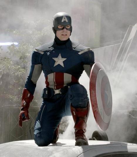
Captain America kind of falls into this category because his costume is, fundamentally, a 1940s Americana cheerleader uniform with extra pockets around the waist for bubblegum and hair gel (or whatever the hell it is that superheroes keep in their utility belts). That scene where Agent Coulson tells Steve that "the world needs a little old-fashioned" is enough for me, really. The body-armour and boots they've incorporated into the basic blue body-suit are feasibly practical-looking, and although the cowl isn't exactly great I'd like to see how you would go about designing a winged blue helmet that looks serious and manly. Cap is a cultural icon, a guy whose photo appears on trading cards, a symbol of a naiive, nostalgic idealism that never really existed even in the 1940s. He doesn't need to look cool. And the fact that he willingly puts on a stars-and-stripes catsuit and a helmet with a giant "A" on the forehead is proof enough of his beautifully earnest dedication to his job.
Source: mercmouth @ Tumblr. (Of course from Tumblr.)
I saw Avengers with two guy friends of mine, both of whom are well aware of my love of overanalysing movies and, more specifically, my sensitivity about the sexism present in most geek/superhero franchises. When we were coming out of the cinema, one of them asked if I'd been bothered by the way the film had displayed Black Widow and her catsuit. To which my reply was, basically, "???" because not only was The Avengers unusually equal-opportunities with regards to eye candy, but most of its prequel movies were as well. Both Thor and Captain America: The First Avenger featured sensibly-dressed, awesome female characters checking out the shirtless male heroes in what was pretty much a textbook reversal of the typical male-gaze "pan the camera up and down her body before she gets to say a line" shit you see in most blockbusters. I mean, I don't pretend to be an expert in cinematography, but Steve's first appearance in Avengers is a lingering shot of his ass flexing while he pummels the crap out of a punch-bag.
We know that Black Widow's pockets are full of weapons, but I still say that Cap's are full of bubblegum.
Black Widow may be wearing a catsuit, but so, more or less, are Captain America and Hawkeye, and no one of those costumes or characters is shot in a way that seems any more gratuitous than the others. Joss Whedon isn't perfect, but I feel that his policy regarding eyecandy visuals is indicative of his attitude towards his audience in general. ie, that his thought process is more like, "Who is my audience, and what would they like?" rather than the more typical Hollywood filmmaking attitude of, "This is the audience we think we're writing for, and this is what we've decided they enjoy". Which is how movies like Battleship and Catwoman get made.

Next up:  Black Widow, Hawkeye, Thor, and Loki! 

Links
If there's no such thing as a vintage Captain America venereal disease PSA then I'm going to be so disappointed.
The real contents of Batman's utility belt.
Read More
Posted in "it's historical", 1940s, avengers, captain america, marvel, movie costumes i have loved, movies, superheroes, uniforms | No comments

Monday, May 7, 2012

The costumes and characters of The Avengers. Part 1: SHIELD.

Posted on 1:29 PM by christofer D
This post contains no plot spoilers.

In many ways The Avengers is comparable to the 2009 Star Trek reboot. Both are major Hollywood juggernauts with a huge pre-existing fanbase; both had to deal with the problem of setting up a cast of well-known characters in a way that would seem new and fresh. My trust in Joss Whedon's writing was the only thing that kept me from being skeptical when it was announced that The Avengers would include a lot of adversarial posturing between the teammates, but the fact is that the type of team dynamic that drives a two-hour movie is very different from the dynamic that drives a long-running TV show or comic series. The story of a collection of superheroes meeting and immediately becoming BFFs would be somewhat lacking in dramatic tension.
Maria Hill and Phil Coulson, Agents of SHIELD.
SHIELD represents the unromantic side of the Marvel universe. Individually, each of the Avengers has their own origin story and hero's journey, Steve Rogers' probably being the most fairytale-like: a poor boy growing up during a time of war, gaining strength thanks to his goodness of heart and spirit, and using that strength to protect others before finally sacrificing himself for the greater good. Then there's Thor, an alien prince whose greatest enemy is his own hubris, who must learn to control his temper and act with empathy before he can regain his powers. But in the context of a world very much like our own, these characters cannot realistically survive to become heroes without some more cynical and practical-minded external force buffering them from the rest of society.

Nick Fury, Director of SHIELD.
Nick Fury didn't make much of an impression on me in the previous Marvel movies, aside from the the fact that his presence was telegraphing the possibility of a future Avengers team-up. Samuel L Jackson is one of those actors who can steal the show merely by playing himself, which is great for a cameo role but doesn't have a great deal of emotional or intellectual impact. But Fury's role in The Avengers is far more fleshed-out, and SHIELD is very clearly Nick Fury's baby. And Jackson's as well, in a way, since he originally had a hand in pressuring Marvel to increase SHIELD's presence in the first Iron Man film.
Nick Fury in Iron Man 2. For him, this is apparently casual-wear.
Fury's costume should be the silliest at SHIELD. Most people who wear ankle-length leather coats 24/7 tend to resemble late-1990s Blade or Matrix wannabes, but Fury gets away with it because he's Samuel L Jackson and he can probably have you vanished if you look at him funny. The coat should be cumbersome, limiting and easy to trip over, but since we see Fury firing rocket-launchers at fighter jets while running around his giant invisible flying aircraft-carrier, I'll handwave all that. Either way, we know that Fury's pretty fond of that coat because he wears it all the time, even when he's meeting Tony Stark for breakfast in Iron Man 2. Fury's costume in Avengers is tougher than the more relaxed outfits we see in his previous appearances, though, with a visible thigh-holster and a bulletproof vest. The vest I find particularly telling because while he spends most of the movie in his own home base, the Helicarrier, he still feels the need to be armed and protected at all times. He didn't survive this long by taking any chances.  

The Nick Fury we see in Avengers is far more interesting than the two-dimensional hardass we met in those prequel cameos. He's been fleshed out into someone whose life and work extends far beyond the Avengers Intiiative, who always has to be thinking five steps ahead of his enemies, his superiors and his underlings, and who is altogether a far more morally ambiguous character than any of the other "good guys".
Clark Gregg as Agent Coulson of SHIELD, alongside Thor's biceps, triceps and deltoids.
Agent Coulson is one of my favourite characters in the Marvel universe. Originally appearing in a minor role in Iron Man, Marvel quickly realised that Clark Gregg's sly, understated humour was gaining him a significant fanbase. I've read interviews where Joss Whedon et al seemed to think that Coulson's popularity is down to the fact that he provides an everyman character for the audience to identify with, but I'm inclined to think it's more to do with his quiet competence providing a counterpoint to the bombastic, showy nature of characters like Tony Stark. In a way he's the Alfred Pennyworth or Ianto Jones of The Avengers -- often in the background, but never unimportant.

Coulson's role at SHIELD is never really specified. He's high up on the food chain, working directly alongside Fury and usually getting sent on missions that require someone to act as a liaison or negotiator between SHIELD and a potential threat. He's kind of the superhero babysitter, and seems to be a person who is very aware of his own image -- a small, unassuming man with a suit and a nametag who will pose no apparent threat to the gargantuan egos of people like Tony Stark and Thor. Perfectly happy to act in the beta-male role while remaining quietly confident in his own abilities. The generic two-piece suit is very much part of that deceptively bland persona, but I enjoy how it's evolved over the course of his Marvel movie appearances. In Iron Man, for example, he looked quite different:
The original Coulson was meant to be more of a nerdy beaurocrat, a G-Man who spends most of the film trying but failing to arrange a meeting with Tony Stark. And his suit does not fit at all! The sleeves are way too long, it isn't tailored around the shoulders or waist, and it generally makes him look like a bit of dweeb when compared to Tony's billionaire playboy wardrobe. Whereas in The Avengers, Coulson's Dolce & Gabbana (seriously) fits like a glove, with one precise inch of shirt-cuff emerging from the sleeves.
Cobie Smulders as Deputy Director Maria Hill
Maria Hill, Nick Fury's deputy, is our first real look at a more typical SHIELD agent. The pre-movie advertising gave the impression that she was going to have a far greater role than she actually did, and I suspect that this oversaturation of Cobie Smulders/Maria Hill publicity was because they were very aware that out of an ensemble cast of around 15 characters, only three are women, and only one of those women is in a starring role. While The Avengers wasn't explicitly sexist, it did follow the Hollywood habit of setting all action/adventure stories in some parallel universe where women only make up about 25% of the population. This isn't a criticism of Hill's characterisation, which was more or less what you'd expect from a businesslike second-in-command/expository dialogue character. The cast is already so big that there's no time to expand every character, but the fact that Cobie Smulders was featured so prominently at the Avengers premieres and press events does rather highlight the fact that the first-tier cast consists of seven men plus Scarlett Johansson.
Another issue that The Avengers shares with the Star Trek reboot is that both franchises originate in the '60s, and the characters are now so beloved that augmenting the lineup in a remake/adaptation would alienate fans. This troubles me because while I find it irritating and belittling to watch so many movies where women are under-represented in token or love-interest roles, I'd still react negatively if the next installment in the Star Trek reboot series suddenly introduced three or four new Enterprise crewmembers to a cast that already feels whole and complete. With The Avengers, however, there is the option of including a whole host of female characters from the extended Marvel universe, even women who were in the Avengers team themselves, like Wasp. Because this film was the product of a long game of semi-prequels -- Iron Man, Captain America, Thor and The Hulk -- it would've been difficult to introduce another new first-tier character this time round, but I hold out hope that the Avengers sequel(s) will include more lady superheroes. Or Darcy Lewis from Thor. Because Darcy is awesome.

Recreation of the Helicarrier interior, at Comiccon 2011.
I have mixed feelings about the SHIELD uniforms as we see them in The Avengers. The fitted jumpsuits/trousers-shirt combos worn by most of the agents onboard the Helicarrier don't look too bad, but I'm a little confused as to why they're wearing them. They look like field uniforms, but we already know that field agents either wear normal clothes like the suit-wearing Coulson, or out-and-out military gear (like the soldiers sent to pick up Bruce Banner and guard Loki when he's on the Helicarrier). Also, the people on the bridge of the Helicarrier are analysts and pilots, doing what essentially amounts to desk work. Although Hill and Fury do both carry sidearms, the fact that female SHIELD agents have the option of wearing a skirt and heels indicates to me that the agents on the bridge of the Helicarrier are not expected to be battle-ready.
More from Comiccon -- these uniforms are accurate, as far as I can tell.
Joss Whedon doesn't seem to believe in the idea of "background characters". A lot of the time, his characters are the background characters. Just look at Cabin In The Woods. In the context of The Avengers, this meant that even the dialogue-free SHIELD agent extras got their chance to shine, reacting to Tony Stark's posturing and, at one point, playing Galaga on one of the Helicarrier's display screens when they were meant to be working. But while I always enjoy efforts to give personality to background extras, I'm still not wild about the whole jumpsuit/catsuit thing. Jumpsuits are near-universal in sci-fi/superhero movies, and the current zeitgeist (X-Men; Star Trek 2009; Prometheus) is for the slightly more flattering option of figure-hugging bodysuits with concealed structure and muscle padding. They look more like diving wetsuits than the spandex costumes we know from Adam West's Batman, and even musclebound types like Chris Evans get to have a little shoulderpad action going on.
The captain and bridge crew of the USS Kelvin in Star Trek (2009).
It's all well and good for the crew of fit 30-somethings on the Helicarrier be kitted out in catsuits every day, but even if people in real life were as uniformly slim and well-muscled as the average SHIELD agent appears to be, I still doubt they'd be entirely comfortable about wearing that to work every day. Particularly if their entire job is to sit in front of a computer screen and zap any pigeons that look like they might be getting near to one of the Helicarrier's rotor blades. The best reason I can think of for the ubiquity of pointless jumpsuit-wearing is that it helps to normalise the costumes worn by the superheroes themselves. Captain America's and Black Widow's skin-tight outfits -- both manufactured by SHIELD -- bear more than a passing resemblance to the SHIELD uniform jumpsuits. 
Black Widow on the bridge of the SHIELD Helicarrier.
Oh, and a postscript: The interior of the Helicarrier cracks me up, a little. It looks so shiny and awesome, but I'm not convinced that it was such a great decision to have smooth floors and no barriers on the raised walkways... on a ship that spends half the time flying and half the time in the water, and is equipped for mobile combat. How many times a day do you think people slip over and brain themselves on one of the consoles? Seriously, I want to baby-proof the corners of every single one of those Stark Industries display screens.

CONTINUED IN:  Part 2: Tony Stark, Pepper Potts, and Bruce Banner.


Links
The Pentagon Quit The Avengers Because of ‘Unreality’
Marvel Avengers wallpapers.
Interview with the super-dreamy Clark Gregg about Agent Coulson (after Iron Man 2; before The Avengers).
SPOILERY interview with Clark Gregg about his role in The Avengers.
Read More
Posted in avengers, costumes, marvel, movie costumes i have loved, movies, sci-fi, star trek, suits, superheroes, uniforms | No comments
Older Posts Home
Subscribe to: Posts (Atom)

Popular Posts

  • Master & Commander: The Far Side of the World. (Part 2)
    Previously: Master & Commander, Part 1. The characters in Master & Commander have a lot to say about the division between Navy and n...
  • Costuming & design in NBC's Hannibal: Hannibal Lecter's wristwatch.
    As part of my ongoing series on costume and design in Hannibal , I'm going to post my first guest blog with contributions from an outsi...
  • The costumes of X-Men: First Class, Part 2: Menswear.
    Part 1: Womenswear. OK, let's be real here. 99% of this section is gonna be about Erik and Charles, firstly because 99% of the movie is...
  • Costuming and Design in Captain America: The Winter Soldier -- Steve & Bucky.
    Part 1: "Trust No One" -- How Captain America became the gritty superhero we never knew we wanted. Part 2: HYDRA, Sitwell, and div...
  • Teen Wolf 2x09: Party Guessed.
    Previously: Teen Wolf 101: An introduction to the eighth wonder of our world . (Now available in audio as well!) Why does Teen Wolf hate ha...
  • Capitol Couture in The Hunger Games.
    It's a little late for a review of the Hunger Games movie itself, so in summary: I thought it was an excellent adaptation, and the few t...
  • The ultimate TEEN WOLF DRINKING GAME.
    OK, the midseason finale is upon us. After tonight, there's no more Teen Wolf until January 2014. To help you deal with the pain, I'...
  • Harry Potter, costume design, and wizarding fashion in 1920s New York. (Part 2)
    Previously: Part 1 . Most wizarding robes in the Harry Potter movies are a combination of bell-sleeved faux medieval robes, and old-fashion...
  • Teen Wolf: Tattoo.
    Previously: Teen Wolf 101: An introduction to the eighth wonder of our world . Welcome to Teen Wolf! The show where the shirts are off, and ...
  • The costumes of Alien. Part 1: Uniforms and characterisation.
    It took me until the ripe old age of 22 to see Alien, mostly because my mother warned me for years that it was the Most Terrifying Film Ever...

Categories

  • "it's historical"
  • 1920s
  • 1940s
  • 1950s
  • 2014
  • accessories
  • agent carter
  • agents of shield
  • alexander mcqueen
  • alexander wang
  • alien
  • alien quadrilogy
  • aliens
  • apocalypse fashion
  • armour
  • avengers
  • bad movies
  • bad reviews
  • batman
  • bbc
  • benedict cumberbatch
  • big bang press
  • books
  • captain america
  • chanel
  • china
  • chris kane
  • comics
  • constantine
  • conventions
  • cosplay
  • costume design
  • costumes
  • couture
  • dance
  • dc
  • dior
  • dior homme
  • doctor who
  • dolce and gabbana
  • duckie brown
  • duro olowu
  • dystopias
  • elementary
  • erdem
  • fall 2012
  • fall 2013
  • fanart
  • fandom
  • fanfiction
  • fashion
  • fashion week
  • fausto puglisi
  • figure skating
  • game of thrones
  • gareth pugh
  • givenchy
  • goth
  • gwyneth paltrow
  • haider ackermann
  • hannibal
  • harry potter
  • hugo awards
  • hunger games
  • interstellar
  • interviews
  • IRL
  • iron man 3
  • it's historical
  • james bond
  • jason wu
  • jean paul gaultier
  • jonathan saunders
  • jw anderson
  • karl lagerfeld
  • ladies in suits
  • links post
  • london
  • london fashion week
  • louis vuitton
  • marc jacobs
  • marketing
  • marvel
  • mary katrantzou
  • masterpost
  • mcu
  • mediocre
  • menswear
  • menswear fashion week
  • milan
  • movie costumes i have loved
  • movie costumes i have loved
  • movie reviews
  • movies
  • mugler
  • needs more gold
  • neil marshall
  • new york
  • nyfw
  • oscars
  • other writing
  • ozwald boateng
  • pacific rim
  • paris fashion week
  • peggy carter
  • penny dreadful
  • persional taste
  • person of interest
  • personal taste
  • peter pilotto
  • podcasts
  • prabal gurung
  • pre-fall 2012
  • pre-fall 2013
  • pre-spring
  • prometheus
  • punk
  • ralph lauren
  • rants
  • resort 2013
  • retrofuturism
  • revenge
  • rick owens
  • s/s
  • scandinavia
  • sci fi
  • sci-fi
  • scotland
  • set design
  • shakespeare
  • sherlock
  • sherlock holmes
  • SHIELD
  • shoes
  • snowpiercer
  • spring 2012
  • spring 2013
  • spring 2014
  • star trek
  • star trek into darkness
  • star wars
  • starfleet
  • stargate
  • stoker
  • street style
  • suits
  • superheroes
  • superman
  • supernatural
  • tailoring
  • teen wolf
  • the hour
  • the row
  • theatre
  • theyskens theory
  • thom browne
  • thor
  • thor 2
  • threeasfour
  • tom ford
  • tom hiddleston
  • tv
  • ulyana sergeenko
  • uniforms
  • upholstery
  • versace
  • victoria beckham
  • video post
  • viktor and rolf
  • vivienne westwood
  • walter van beirendonck
  • watches
  • writing
  • x-men
  • yohji yamamoto
  • zac posen

Blog Archive

  • ▼  2015 (4)
    • ▼  January (4)
      • Hugo Award eligibility & 2014 masterlist
      • Interview: Agent Carter costume designer Gigi Melton
      • Behind the seams of the Oscars' costume design cat...
      • A guide to 1940s costume design in Marvel's Agent ...
  • ►  2014 (38)
    • ►  December (3)
    • ►  November (3)
    • ►  October (3)
    • ►  September (1)
    • ►  August (1)
    • ►  July (3)
    • ►  May (1)
    • ►  April (8)
    • ►  March (4)
    • ►  February (2)
    • ►  January (9)
  • ►  2013 (68)
    • ►  December (2)
    • ►  November (2)
    • ►  October (7)
    • ►  September (9)
    • ►  August (5)
    • ►  July (9)
    • ►  June (6)
    • ►  May (4)
    • ►  April (3)
    • ►  March (5)
    • ►  February (11)
    • ►  January (5)
  • ►  2012 (122)
    • ►  December (6)
    • ►  November (11)
    • ►  October (11)
    • ►  September (13)
    • ►  August (9)
    • ►  July (12)
    • ►  June (13)
    • ►  May (8)
    • ►  April (6)
    • ►  March (7)
    • ►  February (13)
    • ►  January (13)
  • ►  2011 (32)
    • ►  December (8)
    • ►  November (10)
    • ►  October (13)
    • ►  September (1)
Powered by Blogger.

About Me

christofer D
View my complete profile