Why you need to watch Spanish Snow White movie ...

  • Subscribe to our RSS feed.
  • Twitter
  • StumbleUpon
  • Reddit
  • Facebook
  • Digg
Showing posts with label ladies in suits. Show all posts

Friday, July 6, 2012

Jean Paul Gaultier Couture: Dandies, Decadence, and George Sand.

Posted on 2:39 PM by christofer D
This review may be a little on the dodgy side because I wrote it through a veil of tears while pouring chocolate truffles and absinthe directly into my mouth and smoking a cheroot in a ten-inch-long holder. GUYS, I JUST LOVE THIS COLLECTION A LOT, OK. Gaultier's a triple-threat expert in the field of awesome yet faintly ridiculous haute couture, his main failing being the restrictive nature of his influences. This season, as with so many of his previous collections, Gaultier was inspired by Victorian dandies, vintage corsetry, tuxedoes, and classic Indian fashions, but even after thirty years in the public eye he still seems to be able to turn out new ideas for stunning couture.
photos from Style.com
The show opened with Erin O'Connor in a top hat and tails, dressed in an homage to George Sand. Gaultier has long enjoyed playing with gender-roles in his shows and even though his new Menswear collection was revealed only last week, this Couture show included new "menswear couture" items as well as several womenswear outfits worn by male models.

Tanel Bedrossiantz has modeled in over eighty of Gaultier's shows now, and as he ages he seems to grow more and more vampiric in appearance. Tanel commands a certain fearsomeness that can't quite be managed by the younger, prettier male models, which is exactly what Gaultier's shows need -- something to leven the slightly cheesy Moulin Rouge air for which he is so well-known.
It's unclear whether Andrej Pejic's first outfit was from the menswear or womenswear department -- perhaps intentionally so. On one side it was a relatively average dinner-suit, but the other side was completely sheer with an elbow-length leather glove. Even the shape holds no clues, because this season Gaultier almost entirely abandoned his love of corsetry in favour of a looser, more masculine silhouette for the womenswear. Corsets, in fact, were only seen on the men, with slight hourglass silhouettes being added to the suit-jackets through rigid structure-work and clever tailoring.

This collection wasn't so much a celebration of fresh creativity as it was about quality. While dandies and 19th-century decadence are by no means a new topic in the world of high-end fashion, a show like this proves that Gaultier can provide consistent excellence without resorting to gimmickry.

 Current mood: desperate to wear these iridescent grey velvet trousers and green shoes:

This is the kind of textured, luxurious couture work that makes me miss Christian Lacroix.

The one low point of the show was, for me, this purple tailcoat modeled by Erin O'Connor. It's a little too 1970s Vegas magician compared to the 19th-century sumptuousness of the rest of the collection.
The eveningwear ran from late nineteenth to early 20th century, with some outfits almost reaching flapper proportions. Fortunately the styling was such that most of the gowns didnt fall into the period-movie costume trap, although the colour scheme did remain securely in vintage tones of red, gold, and pale blue-green.


In among the out-and-out period pieces were some outfits that were harder to define, but no less beautiful for it. One of the things this season really made me appreciate was Gaultier's ability to balance a show: not too many costumey pieces, but enough that the collection seemed to vary widely from beginning to end. While the tuxedo-inspired suits (for both men and women) were relatively recogniseable as dandy-wear, some of the gowns seem to go straight for the faux-medieval trends of the early 20th-century aristocracy, and others had hints of angular Art Deco imagery:
Sidenote: My new hobby is printing off 1000 copies of this photo of the best spats of all time, folding the photos into a giant origami bed, and then rolling around on the bed until I die.


Tanel Bedrossiantz is Dracula.


While I usually dislike strapless body-suits, this gold outfit modelled by Karlie Kloss was so stunning I had to include it. The cape photographs so beautifully while in motion that it makes me sad this piece is almost certainly one of the ones that'll be bought up by a collector, never to be worn again by anything other than a mannequin.


These exterior-framework outfits were reminiscent of early Thierry Mugler or Gaultier's own designs from the '80s and '90s -- stripped-down corsetry and crinoline hooping, with a fetish edge. The gold bustier dress even seems to include some kind of chastity belt, and looks terrifyingly inflexible.

As is traditional, the show closed with a bridal gown, this one worn with a deconstructed top hat and made entirely from solid white fabric. Even this was dandy-influenced, with tuxedo lapels swooping down the model's back to join the floor-length skirts.
Read More
Posted in 1920s, couture, jean paul gaultier, ladies in suits, menswear, spring 2013, tailoring | No comments

Tuesday, December 20, 2011

Pre-Fall 2012: Diane von Furstenberg, J. Mendel, Moschino Cheap & Chic, Alice + Olivia, and Giorgio Armani.

Posted on 3:50 PM by christofer D
Diane von Furstenberg
I think that's some kind of... digitalised houndstooth pattern? I'm not sure. What I do know is that it looked enough like houndstooth that I immediately had the stomach-turning fashion thought of, "houndstooth is so in right now". I disgust myself sometimes. It smacks of trend articles like this one, in which Lady Gaga and Kim Kardashian's houndstooth outfits are compared/forced to compete for our entertainment. First of all, Gaga's is obviously better because she went marvellously over-the-top with houndstooth accessories, stockings, makeup and piano, playfully turning the "conservative and tweedy" houndstooth image on its head, but secondly... this article exists for realzies. Oh boy. I don't like "who wore it better" gossip stories at all, since they're invariably code for "here are two attractive millionaires in similar outfits -- now, you decide which one is a flawed and hideous creature!" That's not "following fashion". That's petty and needless judgement of strangers based on their appearance.
I'd like this 100x more if the belt and sunglasses were removed, since they turn it into a fairly generic party-dress outfit. Sans belt, the combination of transluscent latex-y dress, visible stocking-tops, severe shoes and  leather gloves make for a rather interesting faux-fetish look.


I include this last Von Furstenberg outfit not because I find it particularly interesting, but because of the proportions. If there are any graphic designers/artists reading this, I apologise in advance for my clumsy terminology, but I really like this method of proportioning outfits with one very long section and one marginally shorter. Allow me to illustrate:
Thank you, Microsoft Paint.
This style needs to be quite minimalist and structured to work, but what it boils down to is either a long top over a dress, a short dress over a longer dress, or at a pinch, a dress in a block colour with a strip of a contrasting colour around the hem. I suspect that there's a specific term for this way of disproportionately elongating one element of the outfit/image, but whatever it is it reminds me of Charles Rennie Mackintosh designs:
Fun Scotland fact: Mackintosh knock-offs are called "mockintosh".
J. Mendel
One of those "on the bright side, I can gain ALL the weight" outfits.
Why so bizarrely bulky and unwieldy?? That top/gilet/dress/thing looks like a rug mated with the suade upholstery from the interior of someone's van circa 1976 or so. As it stands, this woman's torso is going to be very warm while her shoulders remain frostbitten, but considering the fact that she's wearing spike heels I assume that she's not planning on spending much time outdoors.
By now you may or may not have noticed that all these outfits include elbow gloves. I hesitate to even label this a "trend" because it's so easy/lazy, but it seems that elbow gloves are a thing. At least your wrists will be warm? Although if you're wearing a dress like this one, they might be the only part of you that is.

Moschino Cheap & Chic
Little did the bear know that these were her taxidermy gloves.
In my opinion the setting of this photoshoot was egregiously cutesy, what with the socks-and-shoes thing and the bright colour palette and the model animals in the background, but I do quite like the clothes in a Chuck-from-Pushing-Daisies/Zooey Deschanel kind of way. The fact that the model looks about twelve doesn't really help matters, though.
 

Alice + Olivia
The backdrop for this photoshoot appeared to be based on mediocre faux-European coffee-shop art, but on the bright side this outfit is SO Carmen Santiago NYC, am I right? (I'd wear it, anyway.)

Giorgio Armani
The masculine accessories (plain, square bag and flat shoes) are what what pushes this outfit from "nice trouser suit" straight over into the "hell, yes" category. Also helpful: the model's Janelle Monae hairstyle.
This shot makes me want a Fifth Element sequel (all that orange rubber!) with a serious-faced female secret agent in the lead role, but I guess I'll have to make do with Men In Black III.
Read More
Posted in ladies in suits, pre-fall 2012 | No comments

Wednesday, November 23, 2011

Leyendecker and the Arrow Collar Man.

Posted on 3:18 PM by christofer D
Because I feel this blog has been tragically short on vintage suits so far, here's a post all about Leyendecker and the Arrow Collar Man.
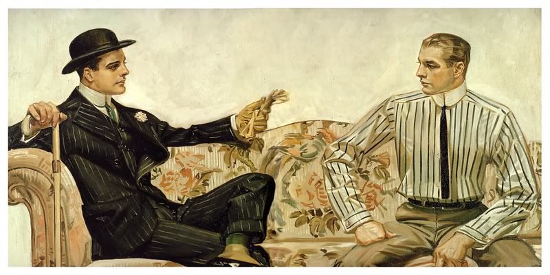
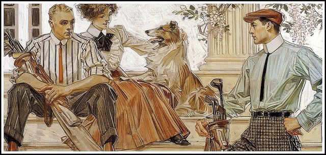
The Arrow Collar Man is a creation of J.C. Leyendecker, a German-American illustrator of magazine covers and advertisements in the 1900s-30s. Leyendecker worked on a variety of illustrations and ad campaigns, but his speciality was these hyper-masculine, square-jawed all-American guys who spent their days smoking, posing in a manly fashion, and playing sports. The Arrow Collar Man is kind of The Man Your Man Could Smell like of the early 20th Century.

1920s Twilight.
Arrow Collar Man didn't really have a personality the way The Man Your Man Could Smell Like does, though. He was more just endlessly handsome and glamourous, which is probably all you need in your shirt adverts in 1920s America. The campaign was incredibly successful, although that's probably less to do with the advert itself and more to do with the fact that the concept of shirts with collars already attached was astonishingly tempting when compared to the prospect starching all your collars separately.
Sherlock Holmes and Captain America (I wish).
Despite running for over 20 years, the Arrow Collar Man never seemed to age, which is particularly impressive since Leyendecker used the same model the entire time. I find them a lot more appealing than today's equivalent suit/fashion ads, to be honest, because using an illustration is an acknowledgement that people can't/don't have to be this perfect-looking. With a modern photo ad, the viewer sees a suit and is supposed to think, "That's what the suit looks like," with the photoshop/airbrush artist hopefully an invisible presence somewhere far away from either the model or the camera lens. But with a painting you have the model at one end, the viewer at the other, and in the middle the artist saying, "Hey guys, I'm here to make everyone look better and we both know that!" Photographs imply authenticity, but the point of advertising isn't authenticity, it's to show the product from its good side.
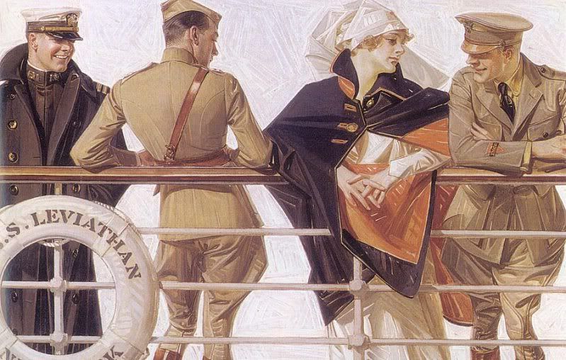
I think it's safe to assume that at least two of those soldiers are not remotely interested in the nurse.
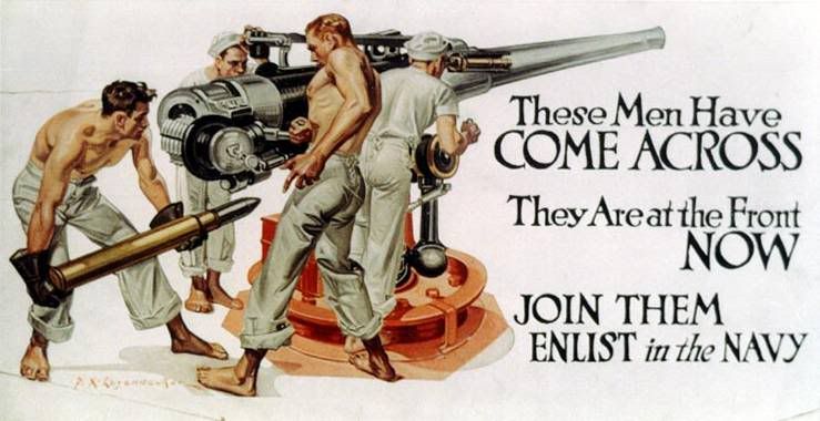
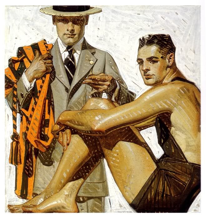
There's a definite element of homoeroticism in a lot of Leyendecker's illustrations, although I have to wonder how much of it was ever picked up on by the general population circa 1905/1920/etc. Most of the time it's rather coy, like the picture above, although occasionally you get adverts that to the modern eye seem entertainingly obvious:
It's like he was going for "world's most phallic advert" award or something.
I mean, what is THAT? "Join the Navy, where glistening, shirtless men thrust huge missiles into waiting holes"? And there's more:
I'm going to go ahead and assume that Leyendecker never had much experience with the military, because these guys are basically Chippendales. It makes me feel a little bad for the small number of guys who looked at these posters, thought, "Hell, yeah!" and were then sorely disappointed by the realities of military life in the 1930s.
o rly?
But it's not just a "Leyendecker was gay so he drew a bunch of hot men" thing, I don't think, because he was being hired consistently for this work, meaning that not just gay dudes were buying the products he helped advertise. Arguably the Arrow Shirts could have been marketed directly at women buying for their husbands, but Leyendecker's magazine covers and other adverts weren't. To me it indicates that Leyendecker's men (and the men of early 20th ads in general, although to be honest I don't know much about this) aren't just objects of desire, they're meant to be enviable, and to be emulated. Much like women in modern ads.
 It's no secret that practically everything these days is sold using a hot, frequently half-naked woman, because in theory either you're going to associate sex-appeal with the product (straight men) or you're supposed to want to buy the product in order to gain sex-appeal (women). Leyendecker's men aren't the men of modern ads -- they're admirable, but they're also intentionally desirable. They're paragons of gentlemanly style and sportsmanship. They're a far cry from the Lynx/Axe body spray dudes -- probably an unfair comparison, but you get what I mean. All ice-cream ads in 2011 are women orgasming over the sheer gloriousness of ingesting £2.50's-worth of processed frozen chocolate, whereas a Leyendecker ad for ice-cream in 1911 would probably be two hearty chaps at the tennis court holding ice-creams and looking like they're in the middle of a discussion about tie-pins, the German Problem, or stock options.
JUST CHILLAXIN' HERE IN MY GOLFING UNDERWEAR...
Check out this sock ad. First of all: sock ad. Obviously it's charmingly archaic by our standards, especially the snappy slogan ("The most extensively sold make of Men's Half Hose in existence"). This is not the way to advertise socks in 2011. Socks are functional; sock ads in 2011 are functional. Men only get to be sexy if they're driving a new car or using a new shaving product, and then it's the product that's sexy, not the man. But I think we can all agree that the socks are not what makes this image awesome.
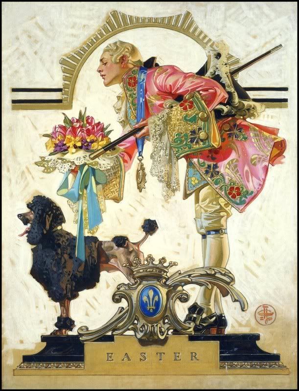
Nothing says "Easter" like an 18th century French courtiere and a poodle.
What really cracks me up is when Leyendecker's bosses give him creative control. If you google-image his art you get just as many magazine covers as adverts, and most of those magazine covers are totally impossible to parse. He seems to enjoy historical themes, but not usually for any... relevent reason...
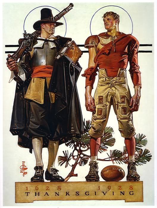
Of course this picture represents Thanksgiving. OF COURSE.
Actually, looking at the Thanksgiving picture above, I can help thinking that 1920s American football uniforms are sort of steampunk. I would so totally wear that! Then again, I'd probably also wear the courtier outfit as well, so long as you removed some of the lace.
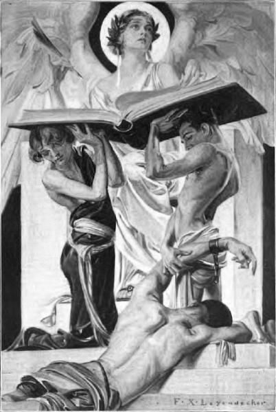
I looked at this magazine cover for a good thirty seconds trying to work out what news story it could possibly be supposed to represent. Maybe there was an article about sports and/or rowing in the magazine somewhere? All I know is, most weekly papers no longer feature oiled-up men in short-shorts on the cover.
You know you'd watch this movie in a shot.
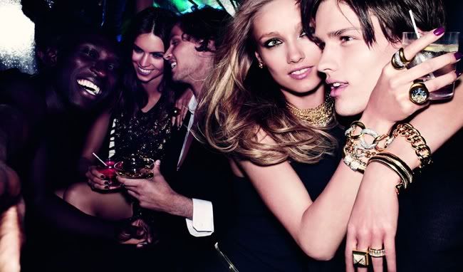
Despite the fact that most of Leyendecker's paintings are very obviously posed scenes, I find it much easier to imagine a narrative for them than I can for modern adverts/fashion spreads. Possibly this can be put down to me being a pleb who finds it easier to interpret "art" in a painting rather than a photograph, but I think it's more likely thanks to the expressiveness of the models. Take this current Michael Kors ad:
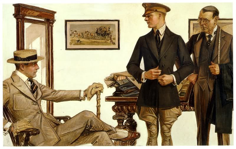
Scene: personality-free mannequins having fun in a bar while being stunningly attractive yet oddly expressionless. Compared to the next scene: the similarly everyday scenario of people buying clothes (albeit buying clothes from a professional tailor in 1910), but in this case the characters seem to be imbued with 100% more human warmth despite being painted rather than acted out by professional models. I don't know if this picture tells a thousand words, but it certainly has more of a story to it than the Michael Kors ad.
N.B. I think the man on the far right is Giles from Buffy.
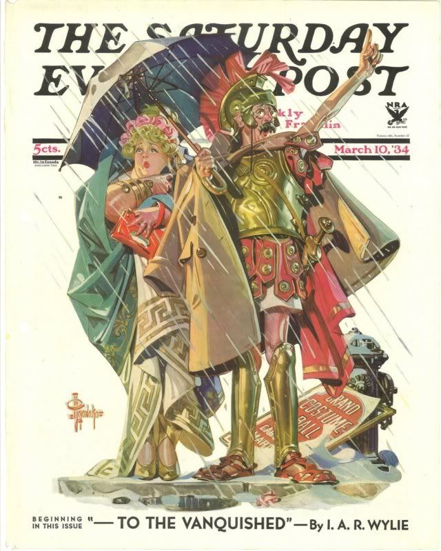
Quite apart from the whole female gaze/male gaze thing, I rather love Leyendecker's love of unnecessary costuming. Check out this newspaper cover:
I bookmarked this as "Mr and Mrs Weasley roleplaying as Naughty Maid and Sexy Centurion". I think Leyendecker just wanted an excuse to draw some Roman armour because it was March and it was chilly and he was being paid for this anyway so hey, why not? (Why not?)

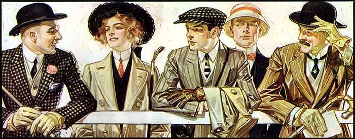
To finish, here's one of my favourite Leyendecker illustrations, another (quite early: 1907) Arrow Collar ad. I particularly love this one because of the variety of styles displayed in the lineup -- two different (and very stylish!) businessman looks bookending the group, a woman with a riding crop, a young dandy out for a walk in his flat-cap, and the 1900s equivalent of a prepster. The woman I particularly like, of course. It's highly unlikely that the ad would be marketing to the women-who-wear-suits crowd (not exactly a big market in 1907, although I assume she is in fact wearing some type of riding outfit) but she's still there and looking badass.
The Arrow Collar Man, Virginia Woolf, Dorian Gray, Sebastian Flyte, and Dr John Watson.
Read More
Posted in "it's historical", ladies in suits, personal taste, suits | No comments
Older Posts Home
Subscribe to: Posts (Atom)

Popular Posts

  • Master & Commander: The Far Side of the World. (Part 2)
    Previously: Master & Commander, Part 1. The characters in Master & Commander have a lot to say about the division between Navy and n...
  • Costuming & design in NBC's Hannibal: Hannibal Lecter's wristwatch.
    As part of my ongoing series on costume and design in Hannibal , I'm going to post my first guest blog with contributions from an outsi...
  • The costumes of X-Men: First Class, Part 2: Menswear.
    Part 1: Womenswear. OK, let's be real here. 99% of this section is gonna be about Erik and Charles, firstly because 99% of the movie is...
  • Costuming and Design in Captain America: The Winter Soldier -- Steve & Bucky.
    Part 1: "Trust No One" -- How Captain America became the gritty superhero we never knew we wanted. Part 2: HYDRA, Sitwell, and div...
  • Teen Wolf 2x09: Party Guessed.
    Previously: Teen Wolf 101: An introduction to the eighth wonder of our world . (Now available in audio as well!) Why does Teen Wolf hate ha...
  • Capitol Couture in The Hunger Games.
    It's a little late for a review of the Hunger Games movie itself, so in summary: I thought it was an excellent adaptation, and the few t...
  • The ultimate TEEN WOLF DRINKING GAME.
    OK, the midseason finale is upon us. After tonight, there's no more Teen Wolf until January 2014. To help you deal with the pain, I'...
  • Harry Potter, costume design, and wizarding fashion in 1920s New York. (Part 2)
    Previously: Part 1 . Most wizarding robes in the Harry Potter movies are a combination of bell-sleeved faux medieval robes, and old-fashion...
  • Teen Wolf: Tattoo.
    Previously: Teen Wolf 101: An introduction to the eighth wonder of our world . Welcome to Teen Wolf! The show where the shirts are off, and ...
  • The costumes of Alien. Part 1: Uniforms and characterisation.
    It took me until the ripe old age of 22 to see Alien, mostly because my mother warned me for years that it was the Most Terrifying Film Ever...

Categories

  • "it's historical"
  • 1920s
  • 1940s
  • 1950s
  • 2014
  • accessories
  • agent carter
  • agents of shield
  • alexander mcqueen
  • alexander wang
  • alien
  • alien quadrilogy
  • aliens
  • apocalypse fashion
  • armour
  • avengers
  • bad movies
  • bad reviews
  • batman
  • bbc
  • benedict cumberbatch
  • big bang press
  • books
  • captain america
  • chanel
  • china
  • chris kane
  • comics
  • constantine
  • conventions
  • cosplay
  • costume design
  • costumes
  • couture
  • dance
  • dc
  • dior
  • dior homme
  • doctor who
  • dolce and gabbana
  • duckie brown
  • duro olowu
  • dystopias
  • elementary
  • erdem
  • fall 2012
  • fall 2013
  • fanart
  • fandom
  • fanfiction
  • fashion
  • fashion week
  • fausto puglisi
  • figure skating
  • game of thrones
  • gareth pugh
  • givenchy
  • goth
  • gwyneth paltrow
  • haider ackermann
  • hannibal
  • harry potter
  • hugo awards
  • hunger games
  • interstellar
  • interviews
  • IRL
  • iron man 3
  • it's historical
  • james bond
  • jason wu
  • jean paul gaultier
  • jonathan saunders
  • jw anderson
  • karl lagerfeld
  • ladies in suits
  • links post
  • london
  • london fashion week
  • louis vuitton
  • marc jacobs
  • marketing
  • marvel
  • mary katrantzou
  • masterpost
  • mcu
  • mediocre
  • menswear
  • menswear fashion week
  • milan
  • movie costumes i have loved
  • movie costumes i have loved
  • movie reviews
  • movies
  • mugler
  • needs more gold
  • neil marshall
  • new york
  • nyfw
  • oscars
  • other writing
  • ozwald boateng
  • pacific rim
  • paris fashion week
  • peggy carter
  • penny dreadful
  • persional taste
  • person of interest
  • personal taste
  • peter pilotto
  • podcasts
  • prabal gurung
  • pre-fall 2012
  • pre-fall 2013
  • pre-spring
  • prometheus
  • punk
  • ralph lauren
  • rants
  • resort 2013
  • retrofuturism
  • revenge
  • rick owens
  • s/s
  • scandinavia
  • sci fi
  • sci-fi
  • scotland
  • set design
  • shakespeare
  • sherlock
  • sherlock holmes
  • SHIELD
  • shoes
  • snowpiercer
  • spring 2012
  • spring 2013
  • spring 2014
  • star trek
  • star trek into darkness
  • star wars
  • starfleet
  • stargate
  • stoker
  • street style
  • suits
  • superheroes
  • superman
  • supernatural
  • tailoring
  • teen wolf
  • the hour
  • the row
  • theatre
  • theyskens theory
  • thom browne
  • thor
  • thor 2
  • threeasfour
  • tom ford
  • tom hiddleston
  • tv
  • ulyana sergeenko
  • uniforms
  • upholstery
  • versace
  • victoria beckham
  • video post
  • viktor and rolf
  • vivienne westwood
  • walter van beirendonck
  • watches
  • writing
  • x-men
  • yohji yamamoto
  • zac posen

Blog Archive

  • ▼  2015 (4)
    • ▼  January (4)
      • Hugo Award eligibility & 2014 masterlist
      • Interview: Agent Carter costume designer Gigi Melton
      • Behind the seams of the Oscars' costume design cat...
      • A guide to 1940s costume design in Marvel's Agent ...
  • ►  2014 (38)
    • ►  December (3)
    • ►  November (3)
    • ►  October (3)
    • ►  September (1)
    • ►  August (1)
    • ►  July (3)
    • ►  May (1)
    • ►  April (8)
    • ►  March (4)
    • ►  February (2)
    • ►  January (9)
  • ►  2013 (68)
    • ►  December (2)
    • ►  November (2)
    • ►  October (7)
    • ►  September (9)
    • ►  August (5)
    • ►  July (9)
    • ►  June (6)
    • ►  May (4)
    • ►  April (3)
    • ►  March (5)
    • ►  February (11)
    • ►  January (5)
  • ►  2012 (122)
    • ►  December (6)
    • ►  November (11)
    • ►  October (11)
    • ►  September (13)
    • ►  August (9)
    • ►  July (12)
    • ►  June (13)
    • ►  May (8)
    • ►  April (6)
    • ►  March (7)
    • ►  February (13)
    • ►  January (13)
  • ►  2011 (32)
    • ►  December (8)
    • ►  November (10)
    • ►  October (13)
    • ►  September (1)
Powered by Blogger.

About Me

christofer D
View my complete profile