Why you need to watch Spanish Snow White movie ...

  • Subscribe to our RSS feed.
  • Twitter
  • StumbleUpon
  • Reddit
  • Facebook
  • Digg
Showing posts with label movies. Show all posts

Sunday, December 28, 2014

Mockingjay and Costume Design: Real or not Real?

Posted on 9:37 AM by christofer D
Previously: Capitol Couture in the Hunger Games, and Capitol Couture: Catching Fire.

In terms of costume design, first two Hunger Games movies never quite lived up to my expectations. It wasn't that the costumes were bad -- far from it -- but they seemed far too homogeneous. Given free rein to create the most outlandish designs imaginable, the Capitol fashjons were disappointingly conservative and homogeneous.

Mockingjay, Part 1 was another matter entirely. With no Hunger Games, Capitol makeovers, or District 12, the story focused on Panem's growing revolution, shown through the eyes of the propaganda war between the Capitol and District 13. Before the film even came out, YouTube propaganda clips began to illustrate the calculated nature of President Snow's public image.


Mockingjay flipped the cliché of dark and light, with the villainous President Snow surrounding himself with pure white to match his signature white roses. His brainwashed prisoners Peeta (dressed in an uncharacteristically stiff suit and a painful-looking white paper collar) and Johanna presented a united front, fitting in with Snow's clean, luxurious aesthetic. Meanwhile Katniss, daughter of coal miners, wears black body armour and fatigues.

In the earlier films, this kind of contrast was meant to highlight Katniss's salt-of-the-earth nature with Snow's obsessively controlled image, but this time it's more complex. Katniss may look more practical and less "styled" than Snow and his entourage, but that's because her District 13 stylists decided this was the best way to market her to the rebels. Her Mockingjay armor (in real life, modeled off a Japanese archery breastplate) was designed for her by Cinna, and continues the asymmetrical theme of previous outfits she wore to public appearances.


Each Hunger Games film has a different costume designer, which I'm beginning to think was a very smart idea. I found The Hunger Games (Judianna Makovsky) to be overly simplistic, but the filmmakers probably didn't want to take too many risks when first introducing the setting. The costumes of Catching Fire (Trish Summerville) were closer to what I'd hoped for, but they still had to adhere to the visual themes set up by the first film. But as Mockingjay branches out into the wider world of Panem, more avenues open up for interesting work by the new costume designers Kurt and Bart, who previously worked on the wonderful Stoker.


Visually, District 13 felt a lot more coherent than the Capitol ever did. My issue with Capitol fashion is that while the costumes were gorgeous, they all had an oddly similar aesthetic -- something that didn't make sense when you consider the furious competition between stylists. District 13, on the other hand, has a perfect excuse for everyone to look the same: It's a military bunker where citizens are given food, clothing and shelter by the state, and where luxury items are rationed. The end result is a utilitarian grey uniform that reflects the stern practicality of President Coin's leadership.


Uniforms and bland, drab costumes are an easy way to illustrate a certain type of dystopian setting. Given the right encouragement and/or legal obligation, most people probably would agree to wear the same uniform every day, especially if they think it's for the greater good. However, there's always someone who can't bear to look the same as everyone else, which is why I'm so fond of Effie Trinket's new costumes.

Dragged away from her life in the Capitol, Effie quickly begins to modify her District 13 fatigues until she's got a collection of grey turbans and capes. Even the way she wears her shirt is different from the neat and practical appearance of characters like Beetee and Plutarch. She simply cannot bear to not look her best.


Between Snow, Katniss, and District 13, we have a white/black/grey color scheme that contrasts beautifully with the rainbow of luxurious costumes we saw in the first two movies -- and each one of these design themes has a solid foundation in the film's worldbuilding. Katniss is dressed in black by Plutarch and Effie, in armor that was designed by Cinna to make her look like the perfect Mockinjay. President Snow is dressed in pure white to offset the filth of the Districts, and the people of District 13 are proud to give up their individuality in favor of wearing the uniform of the revolution, all working hard for what they believe to be a better tomorrow.

For me, the most satisfying aspect of Mockingjay's costumes was the constant theme of "real or not real." The first two movies were already obsessed with authenticity (Katniss and Peeta faking their relationship for the cameras; the sinister glamour of the Capitol's propaganda machine), but Mockingjay upped its game.

Along with Katniss, we begin to realize that nothing is "real." When Katniss sings the Hanging Tree song, that brief moment of genuine emotion is recorded, remixed, and broadcast to budding revolutionaries out in the Districts. Her image as the Mockingjay was designed by Cinna and propped up by clever camera work. Even the goal-oriented practicality of District 13 is arguably the result of propaganda. And so, while I love the costumes of Mockingjay in their own right, their greatest strength is their ability to make the audience think about why characters wear what they do. Instead of just being beautiful or helping build characterization, Mockingjay's costumes are a central aspect of the film's worldbuilding, and constantly demand our attention.

Previously: Capitol Couture in the Hunger Games, and Capitol Couture: Catching Fire.

Tweet
Read More
Posted in costume design, hunger games, movie costumes i have loved, movies | No comments

Sunday, November 9, 2014

Interstellar, costume design, and the difficulties of "realistic" visual worldbuilding.

Posted on 10:38 AM by christofer D

Interstellar is one of those movies where the costume design is almost invisible, which is part of what makes it so interesting. The simplest explanation is that the visual style is purposefully "realistic" and avoids any kind of futurism... which in itself is unrealistic. A conundrum, right? Technically, it doesn't make sense for people 50-100 years in the future to wear the same clothes as people in 2014. But from the perspective of a filmmaker who wants his apocalyptic sci-fi film to be taken seriously, this aesthetic decision makes perfect sense.


The earthbound setting of Interstellar is a classic American fantasy: a manly farmer hero, raising his kids in a bleak, rural landscape. Despite the film's image as a deep and thoughtful space epic, it still relies on the familiar old Hollywood scenario of a messianic white American dude being the one person who can save mankind. (And yes, I know his daughter does the actual saving, but this is very much a film about Cooper, not Murphy.) Underdog heroes NASA and Matthew McConaughey save humanity while the rest of the world is apparently helpless. Politically and socially, this is a tired old trope, but it aligns well with the kind of generic hero that can be inserted into a complex movie with minimal exposition. Cooper is the kind of guy who, for better or worse, is perceived as "universal." Luckily, McConaughey's performance was brilliant.

So here we have Coop and his kids, looking both relatable and realistic in their jeans and hoodies. This is the difference between a meticulously researched film that is actually realistic, and a film whose worldbuilding gives the appearance of realism, and therefore does not jolt viewers out of their comfort zone. On the whole, the appearance of realism tends to be the better choice. We're watching fiction, after all.


Decades in the future, the characters on Earth continue to wear clothes that look nondescript in the context of present-day fashions. We see Murph in her practical, neutral-toned outfits both at work and when visiting her brother at the farm. Judging by the clothes worn by Murph and her peers, fashion has stopped evolving altogether. 

As someone who follows fashion, I'm certain this level of sartorial stagnation could never happen in real life. Even within a dying civilization where fewer new clothes are commercially available, fashions would continue to change over time. But I understand why Christopher Nolan and his costume designer made this decision, because it grounds the film in a sense of reality -- or rather, what we think of as reality in 2014. The other option would be to dress Jessica Chastain in futuristic outfits to illustrate the passage of time, which would clash with Nolan's desire to distance himself from the popular visual tropes of the Hollywood sci-fi genre.

When we see Murph wearing nondescript shirts and jackets, we only think of the passage of time in relation to to her age and Cooper's journey, not in the general sense of what year it is for the rest of the world. We already know the film is set in the future, so there's no point in introducing the costume equivalent of a flying car.


The space suits are the only costumes that look like "costumes" in this film, so they're the only ones that really get discussed in promotional interviews. The earthbound costumes are designed to be absorbed passively without any kind of conscious thought, rather than reminding the audience that they're watching a work of fiction.

In this interview, Interstellar costume designer Mary Zophres says, “My first, gut instinct was that you should not anticipate what the future is going to look like. In fact, there is no attention paid to sartorial aspects at all. It’s unimportant.” She goes on to say that the space suits were meant to look like they'd been cobbled together from spare parts. Since most viewers' personal image of a space suit is still based on the astronauts of the late 20th century, that's what they went for in Interstellar. Any additions or changes were for purely practical purposes.


Costuming is always important to the way we consume a movie, but it's particularly important to Christopher Nolan's work as a writer and director of science fiction blockbusters. All of his best-known films are out-and-out fantasy (The Dark Knight, Inception, The Prestige), but their costumes and set design are intended to add a veneer of realism. 

Nolan movies are treated with an unusual amount of respect compared to other sci-fi and fantasy blockbusters, and I'm pretty sure his costume design choices are a major contributing factor to this attitude. With the unavoidable exception of Batman, all of his characters are dressed to look as normal and everyday as humanly possible, which distracts us from the fantastical concepts behind each movie. In Inception (perhaps my favourite costume design film of all time) Nolan is telling a story of pure fantasy, but it's illustrated in the visual language of a real-world drama.


Dreams are depicted as buildings and hotel rooms full of everyday humans, and the only fantasy elements are the stretching dimensions and timescales of the dream world. Even those are introduced to us by an architect who carefully explains the situation by scribbling a diagram on a piece of paper -- which, incidentally, is also how Nolan explains wormhole travel in Interstellar.

Because most of Inception takes place in this realistic urban landscape, and because all of the characters are dressed in staid, businesslike clothes, it feels more like a corporate espionage thriller than a successor to the worlds depicted in movies like Dark City, Paprika and The Matrix.


In the case of Interstellar, we're watching a movie that melds sci-fi ideas about relativity, apocalyptic climate change (more or less), and space travel. But we're also watching a Hollywood fairytale where NASA selects an American everyman farmer dude to lead a world-saving space mission, where five-dimensional beings help him transmit Morse Code messages to his daughter through time and space. Humanity is saved by a combination of the power of love and faith, and a message sent via books falling off a shelf and the ticking of a wristwatch. 

As a viewer, this combination of hard sci-fi and nonsensical Hollywood fantasy requires a herculean feat of suspending one's disbelief. We need all the serious and "realistic" trappings we can get. Hence why Interstellar was marketed with Google-sponsored lesson plans and interviews with the film's astrophysicist, and why Nolan spent so much time on the ground-level worldbuilding elements of Coop's farm, the NASA labs, and the overall aesthetic of Earth scenes taking place in a contemporary setting.


I usually tend to write about costume design from a characterization standpoint, but characterization is rarely an important aspect of a Nolan film. In Interstellar, the most personal costuming detail is Cooper's jacket -- which is later copied by Murphy as an adult, as she wears a jacket that looks very nearly identical to her father's. In amongst a cast of characters with no individual style whatsoever, this is a beautiful little personal touch; a subtle sign that Murph hasn't abandoned her father's memory quite as thoroughly as she likes to think. 


Further reading
  • "Why won't Christopher Nolan just embrace sci-fi?"
  • My response to people who object to Interstellar being described as a Hollywood fantasy.
  • The costumes of Alien: Uniforms and characterization. 
  • Space suits, retrofuturism, and Prometheus.
  • Supercut of Christopher Nolan's favourite movie tropes.
  • Q&A with Jeffrey Kurland, costume designer of Inception.
  • Article discussing Interstellar's space suits.

Tweet
Read More
Posted in costume design, interstellar, movies, sci fi | No comments

Tuesday, July 29, 2014

Interview: "Snowpiercer" costume designer Catherine George.

Posted on 7:29 AM by christofer D
Following my review of Snowpiercer, I originally intended to write a post discussing the film's very striking costumes. But after looking back at some photos and clips, I was struck by how much more I wanted to learn about the process behind this film's visual design. Each section of the train had such a strong theme (filth and poverty in Tail Section; delusionally wholesome springtime pastels in the school car; opulence and luxury towards the front of the train), but nevertheless felt grounded in reality.

Happily, costume designer Catherine George agreed to an interview about her work on the film. She discussed the inspiration behind Snowpiercer's most memorable costumes, and what it was like to work with director Bong Joon-Ho and a cast including Chris Evans and Tilda Swinton.


HelloTailor: To begin with, how did first you get involved with Snowpiercer? The combination of Korean and English-language production made me curious about how you came to work on the film.


Catherine George: Director Bong had seen We Need To Talk About Kevin at Cannes in 2011, when he was on the jury, and he liked how the costumes looked. They sent me the script a couple of months later and I Skyped with Bong and and his producer Dooho because they were already in Prague prepping [for Snowpiercer]. Before I knew it, I was on a plane to Prague. Bong also met with Tilda Swinton at Cannes as they were both fans of each other’s work, and he decided to cast her as Mason -- a role that was originally written as a man.

[You can read more about the costumes of We Need To Talk About Kevin in this article by Clothes On Film.]

HelloTailor: How much did you consider the idea of finite resources onboard the train? In the Tail Section, people were wearing whatever rags they had left after 17 years. I was wondering what kind of thought went into the idea of a world where you can't really obtain new materials for new clothes. Was this a major concern when you were designing the overall look of each train car?


CG: Yes, we talked a lot about how long the passengers had been on the train, where they’d come from, what random materials they would use to fashion practical clothing. In the Tail Section, the aging and distressing was quite heavy and their clothes were made of different parts of garments pieced together. They had to improvise with whatever materials they could find. Curtis' coat had layer upon layer of repairs.

The character Painter wore a poncho made from old moving blankets. He also wore a helmet with a lantern left over from the train utility-wear, to enable him to draw in his cage at night.

Chan, the kid who steals the matches and lights the flame, was the little thief of the Tail Section. We looked at pictures of child soldiers in Africa who attach small charms and amulets to their clothing to warn off evil spirits. Chan had all kind of stolen trinkets attached to his jacket.

While designing Gilliam and his team of martyrs, I was inspired by an image of an Indian street beggar. The martyrs had missing limbs, and the sarong idea was more practical and combined Eastern and Western elements.


In the prison section, Nam and Yona wear the darker-coloured intense black that we don’t see until we get there. Nam’s costume was inspired by train engineers from the early industrial period. We had discussed at length the global aspect to the mix of people on  the train, and this was elemental in the making of the film. The cast was international as well as the crew, and we did a lot of research into bringing details from different cultures into the wardrobe.


HT: Did you take inspiration from other dystopian and post-apocalyptic movies? Or alternatively, were there any particular aspects of the genre you were trying to avoid?

CG: I loved Tarkovsky’s Stalker, how the colour changes and becomes more intense in the two different worlds. But mostly we talked about how we wanted Snowpiercer to start off at a point of realism and not go in a futuristic sci-fi direction. I love Children of Men and how realism is strong in that movie.

I had designed different headgear for the axe soldiers. They were more like medieval-inspired helmets, but we decided to keep them simpler and in keeping with the theme of creating something from pre-existing materials or that could be improvised, so now the old ones look quite surreal.


HT: When you were creating the look for each of the main characters, how much input did the actors have? I read an interview with Tilda Swinton where she mentioned you visiting her house to discuss what her character would look like, so I'd be really interested to hear more about that. 

Also, I was wondering if she was intentionally designed to look slightly like Ayn Rand, which is a comparison I've heard from a few people already.


CG: I contacted all the actors and shared the research and design ideas for their character early on. When we fit John Hurt in London we tried out an outfit and he shared a great story about aging his own costume for ‘Midnight Express’. Some of the other actors schedules didn’t allow for early fittings so we had to share images via email and we Skyped a lot. 

In Tilda’s case, Mason’s look was so drastically different that we needed to have clothes and prosthetics made in advance in order to camera test. So we travelled to Scotland with a couple of suitcases of clothes, wigs, glasses and teeth and really had fun with the wardrobe, all while Tilda’s fish pie was baking, and we also got to enjoy the Scottish countryside.


I had collected pictures of dictators wearing elaborate uniforms and crazy hand-made medals. I hadn't looked at Ayn Rand specifically but I had collected some images of old ladies from that period who would wear their fur and look down their noses at people who were less better off, a bit like Thatcher. But now people are mentioning it, there are similarities to Ayn Rand .

HT: Could you tell me a little about the process for designing the lead character, Curtis? I remember reading that Chris Evans had to wear sleeveless shirts under his coat in an attempt to make him look less muscular and healthy. That made me wonder how much of an active effort there was to visually distance Chris Evans the actor (who is now so recognizable as Captain America) from Curtis the character.

CG: We talked and worked on Curtis' outfit for a while before Chris came to Prague. We wanted to make Curtis look very recognizable but at the same time anonymous, the common man who can't take the status quo any longer -- and yes, quite different from Captain America.


We did have to fight against his physique and had to cut away the under-layers, his t-shirt, shirt and sweater. We had so many multiples made without sleeves for different scenes.

Chris was available pretty early on to us. He wholeheartedly embraced his role and was in Prague rehearsing the stunt scenes, most of which he did himself. So luckily we were able to have more than one fitting and have more of his input, which was really helpful.

HT: Each of the individual compartments is almost like a little world unto itself, with its very own colour palette. Was there an unusual amount of collaboration with production and set designers for this film, or is it just simply more noticeable thanks to this kind of strong visual cue?


CG: I worked closely with Ondrej Nekvasil, our incredible production designer who himself was somewhat of a Wilford having built this amazing full-size train that was on a gimbal and moved and swayed. He had very beautiful detailed sketches and we talked a lot about the overall colour and tone of each car.


HT: Are there any little custuming details that you feel particularly proud of, that you'd want people to look out for on their second viewing?

CG: After all the dirt and destroying of clothes for the Tail Section, it was really fun working on the different  themes in the front cars. I was especially happy designing the costumes for the lounge-car, the set was opulent like something  from the Orient Express and I was inspired by one of my favorite periods in costume, the late Belle Epoque period. I was able to use very saturated colours and luxe fabrics, although unfortunately it is a very quick scene.

The other little fun moment that you already spotted is Tilda’s cameo in the club scene.

[A clip showing Tilda Swinton's hidden cameo in the club car scene can be watched here on YouTube. It includes some very fabulous eye makeup and an enormous wig.]

Previously: My thoughts on Snowpiercer.

Tweet
Read More
Posted in costume design, interviews, movie costumes i have loved, movies, snowpiercer | No comments

Thursday, July 3, 2014

Snowpiercer

Posted on 3:53 PM by christofer D
Miraculously, Snowpiercer lived up to the many months of anticipation I've experienced since it was released elsewhere. My friends, I have been waiting a long time for this movie.

Every component part of Snowpiercer was another thing that I love to see in blockbuster entertainment. I don't just mean in the shallow, tropey sense that I love dystopian sci-fi, but in the sense that Snowpiercer is a straightforward adventure story that doesn't play to the lowest common denominator. It's simple, but it's not stupid. Its characters are people, there aren't any shitty moments of casual sexism or racism, and it's structured around a piece of interesting, thoughtful political symbolism that you could probably still ignore if you just want to watch Chris Evans Save The Day. 
A friend of mine had issues with the implausibility of Snowpiercer's setting, but I found it pretty easy to accept on its own terms. Like the contrived scenario in Sunshine (another sadly rare example of a good Chris Evans film), the plausibility of the premise was almost meaningless. No, you can't reignite the sun with a weaponized disco ball rocketship, Sunshine. No, it isn't feasible for an entire civilisation to spend 17 years in a perpetually moving train, Snowpiercer. But there were plenty of intentionally surreal touches there to remind us that director Bong Joon-Ho was well aware that the setting wasn't "realistic.". More importantly, the underlying metaphor was clear: Crash the train and risk killing everyone to gain freedom for a few, or maintain the horrifying status quo so that more people can survive in undeserved squalor.

Having now seen Snowpiercer in its original cut, I find it genuinely baffling that Bong Joon-Ho had such difficulty with his US/UK distributors, the Weinsteins. If you haven't been following this saga (which you can read about here), the film came out last year in Korea, Japan and parts of Europe, but Harvey Weinstein somehow decided that English language audiences would respond better to a "simplified" cut. A cut that is rumored to have removed something like 20 minutes of the original movie (including Curtis's monologue at the end), and included the suggested addition of an expository voiceover.

You know, just in case the central plotline of "get to the front of the train" was too complicated.
As a result of this distribution fiasco, the original cut has been trickling through festival screenings for months, with frustrated film fans resorting to crappy bootlegs and European DVDs until the Weinsteins finally deigned to give it a limited release in the US. The situation sounds like a total mess, particularly once you've seen the film in question. I went into the cinema expecting Chris Evans to have a far smaller and less appealing role, for large chunks of the dialogue to be in Korean, and for the whole thing to be far weirder and more ~arthouse than it actually was.

In truth, Snowpiercer is very easy to follow, and contains all the elements required for a successful blockbuster: a famous lead actor and excellent supporting cast, an interesting concept, and a well-paced balance between action scenes and emotional impact. (Although personally, I found myself in the unusual position of wishing there were fewer action scenes, simply because they didn't always seem necessary.)

The belief that Snowpiercer wouldn't appeal to "mainstream" audiences is kind of depressing, especially when you consider the way Hollywood markets The Hunger Games as tween-friendly entertainment. Obviously the Hunger Games movies are less of a commercial risk in that they're adapted from bestselling novels, but seriously: Snowpiercer is hardly any weirder or more traumatising, and it stars Captain America. An even more damning comparison would be Cloud Atlas, which actually was strange and often impenetrable, but still received a huge amount of public attention while Snowpiercer languishes in distribution purgatory.
Snowpiercer may make no sense on a logistical level, but the train's social structure is basically true to life. However, instead of going for the peasant/monarch society you see in many dystopian stories of this type, I was interested to note that there's no practical reason for the colossal divide between rich and poor. There's no evidence that the people in Tail Section are forced into menial labour or ground up into Soylent Green, for example. In fact, the only people with jobs are service workers like the train guards, food production, entertainment for the upper classes, and Tilda Swinton's politician character. The vast majority of passengers are idle, and the people with visible jobs all appear to be enjoying their work -- even the train guards, who are mostly portrayed as thugs and sadists.
The sole exception is the invisible slave labour of the children Wilford kidnaps and hides beneath his floorboards. Timmy's reappearance in the Engine scene was one of the most unexpected moments of the film, partly because when you hear that a powerful man likes to collect children, the immediate assumption is that it's for horrifying entertainment purposes. But instead, the reason was something even more shocking, because we don't expect it. Wilford has dehumanized those children without a shred of remorse, reducing them to a literal cog in the machine.

Rather than having the Tail Section slums-dwellers work on something that supports the rich, we see them being force-fed cockroaches and beaten into submission while the rich take drugs and party (or knit and stare out the window, if they're old). The most significant piece of set design in Tail Section is their squalid bunkbeds, where they spend most of their time when they're not planning insurrection or standing up to be counted. The fact that they're not being forced into some kind of workforce highlights how false the entire system is, because it's clearly just based on Wilford's crackpot idea of how human society should be "balanced" for optimum survival.
It's no coincidence that the man at the head of the train is a deified white patriarch, mirrored perfectly by John Hurt's Gilliam as the working class leader. Together, they keep everything aligned with their warped sense of "balance," and groom Curtis to become a similar leader once they're gone. The great thing is that despite his eventual heroism and self-sacrifice, Curtis really is a good choice of replacement for Wilford.

For all that we get to see that fantastic breakdown monologue at the end, we already know that Curtis is violent and fueled by revenge, that he doesn't trust himself as a leader, that he's the kind of person who would keep his followers in the dark in order to "protect" them (hello, cockroach soup), and that he would rather strategically capture an enemy than save the life of his best friend. Every one of these actions and character traits is understandable, but he's not sufficiently different from Wilford or Gilliam to give us much hope for a potential future with Curtis in charge. His rags-to-riches journey even mirrors what little we know of Wilford, who went from being a normal boy to the richest and most powerful man on the planet.

Wilford and Gilliam are the best kind of villain, because while they're clearly evil and manipulative and have no real care for human beings as individuals, they give every impression of having a near-religious belief in the "balance" of his train's self-contained ecosystem. Every good villain is the hero of their own story, after all.

The conclusive realisation isn't that Curtis has been tricked by Gilliam all along, but that there's no point in attempting to fight the system on its own terms (i.e. by Getting To The Front Of The Train). The only people who recognise the need for true revolution are Namgoong Minsu and Yona. And since this blog post has already careened into the territory of obnoxious undergrad political essays, I may as well describe Namgoong and Yona as what they are: Representatives of the counterculture and the marginalised. The prophets who have become reliant on mind-altering drugs because it's better than facing up to the truth that only they can see.
Snowpiercer is a post-apocalyptic movie about people who are obsessed with avoiding a repeat apocalypse in their ever-shrinking new world. They are hanging by their fingertips from the precipice of yet another disaster.

It's also a story about breaking points, and when Curtis and Yona reach that final moment at the front of the train, we learn that everyone's worst fear is little more than a fairytale. No one had even bothered to check whether the outside world was habitable again.

Once again, it's no coincidence that the central survivors this time round aren't Wilfords or Curtises, but are Yona and Timmy: both visually and thematically the polar opposite of the traditional ruling classes who took charge of the train 17 years ago. I love it all. Curtis is simultaneously a messianic cliche and a takedown of white saviour heroes, because the most important thing he does in the end is kill himself in order to save future generations from more of the same old bullshit.
Curtis is a product of the train -- in fact, the film makes sure to point out that he can't remember life before he was onboard -- and as a result, he's an asshole. He's a brutal killer, and he has no qualms about meting out petty punishments like making Mason eat a cockroach bar while everyone else eats sushi. The difference is that unlike Wilford and Gilliam, he recognises that he has been corrupted by his surroundings. His drive for vengeance and power is the tool that frees people who otherwise might never have escaped: Yona and Timmy, the two great innocents of the movie. But of course, if he'd lived on as well, he'd probably just have turned into another Wilford. 

Honestly, I could talk about Snowpiercer all day. I haven't even gotten into the film's visual beauty, or the way the revolution's journey progresses up the food chain from filth (cockroaches) through cleansing water to plants, then fish, and finally the atavistic party zone of first class passengers. There's also the unexpected humor, with Tilda Swinton taking on the role of darkly comic villain/minion, or the revolution pausing to gape at a classroom full of brainwashed but hilarious spoiled brats. If I have time then I'll write about the costumes in a later post, but for now I'll just live in hope that Snowpiercer will get a proper UK release so I can see it again some day.

Tweet

Next: My interview with Snowpiercer costume designer Catherine George.
Read More
Posted in movies, snowpiercer | No comments

Wednesday, April 30, 2014

Costuming and Design in Captain America: The Winter Soldier -- Steve & Bucky.

Posted on 6:10 AM by christofer D
Part 1: "Trust No One" -- How Captain America became the gritty superhero we never knew we wanted.
Part 2: HYDRA, Sitwell, and diversity in the Marvel universe.
Part 3: Black Widow and Falcon. 
Part 4: The Tragedy of Bucky Barnes.
Part 5: Worldbuilding in the MCU.

The decision to set CATWS in Washington DC was certainly a departure from the visuals of the first Captain America movie. Compared to the sepia-toned beauty of The First Avenger, Steve's new life looks depressingly drab and grey. The car chases churn through DC traffic on concrete freeways, SHIELD headquarters looks like a cross between a multi-storey car park and an office block, and the Helicarriers are all cold, smooth glass and metal. The only hint of the warm colour scheme of Steve's youth is when he goes to visit Sam Wilson at the VA, a comforting moment among the corporate cleanliness of the rest of DC.


Each of the Avengers movies has its own distinct aesthetic, with Iron Man flitting between palaces of high-tech luxury, Thor living in a world of gold embossed armour and faux-historical alien weirdness, and Cap spending the entirety of his first movie surrounded by 1940s grime. CATWS was definitely the ugliest instalment in the franchise, which kind of worked in its favour because it highlighted Steve Rogers' isolation in 21st century DC.

Unfortunately, I don't think all of that ugliness was on purpose. One of my biggest problems with CATWS was the way they filmed the fight scenes, which I theorize was influenced by the fact that the directors have mostly worked on TV before now. The worst offender was the extended battle sequence that culminates in Steve unmasking the Winter Soldier. I know for a fact that Chris Evans and Sebastian Stan spent months working out and practicing their fight choreography for this movie, so why the hell were so many of the hand-to-hand combat scenes ruined by shaky camerawork and slowed-down frame rates?


Slowing down the frame rate is a technique you often see in fight scenes, and I think it's meant to make everything more chaotic and stressful to watch. In some instances this works out pretty well (i.e. violent battle scenes in films like Gladiator), and I suspect it's useful when an actor doesn't have much stunt training, which is why you tend to see it more in TV than in actual martial arts movies. However, I don't think it was an appropriate choice this time round.

Black Widow and the Winter Soldier's fighting styles are both meant to be very fluid and skilled, and part of that is lost when you edit everything into a rapid-fire slideshow of disjointed frames. This technique would've made sense if we were watching them fight from the perspective of a terrified civilian or something, but we're not. We're just watching a cast of characters who are physically adept and always keep a cool head in the heat of battle, and this kind of panicked camerawork doesn't work in that context. For me, it even detracted from the Winter Soldier's impact as a threatening presence onscreen. There was no reason for the filmmakers to shoot everything with a wobbly handheld camera behind someone's elbow, rather than pulling out a little and actually letting us see what's going on.


So, yeah: mixed feelings on the overall aesthetic, in part because I was dissatisfied by the way they chose to film the combat scenes. However, I did think the overwhelming greyness of DC worked in their favour. Aside from the first two scenes with Sam (running in the park and hanging out at the VA), our view of Steve's 21st century lifestyle was dominated by looming US government monuments and grey cinderblock. One of my favourite details was the fact that Alexander Pierce's brutally pared-down bunker of an office was decorated by a large picture of... the outside of his office. Seriously, it's literally just an aerial shot of the the Helicarrier bay, done in a tasteful grey to match the concrete walls of his office. TERRIBLE, TERRIBLE.


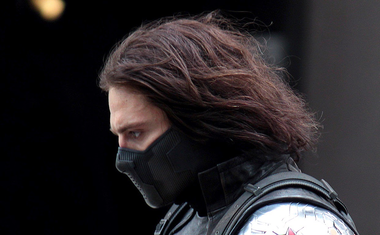
As for costume design, you will probably not be surprised to hear that I have A LOT of thoughts on this topic. First up: The Winter Soldier himself. He has one main outfit throughout the film, and the designer clearly put a lot of thought into it both from a practical standpoint, and as an opportunity for symbolism.

The Winter Soldier's costume consists of a leather jacket, reinforced combat trousers, and boots. From an in-universe perspective, the main thing we have to consider here is that this costume is obviously not Bucky's choice. It doesn't look like normal clothes because it's not for his personal comfort or convenience, it's designed for efficiency. Also, he probably spends a fair amount of time being dressed and undressed by other people, much like how his hair and nails are probably cut by some lab tech whenever he's defrosted from HYDRA's cryofreeze. Actually, his hair is the only thing that doesn't make sense in this context because long hair is not exactly practical in a combat situation, but I'll allow it because that's how he looks in the comics. Plus, the long hair makes him look less like 1940s Bucky and more like the Winter Soldier, hiding behind a curtain of sullen grunge misery.


From a design perspective, there are several things that I really enjoyed about the Winter Soldier's leather jacket. Looking back at Bucky's uniform in the first movie, it's clear that it was part of the inspiration for the Winter Soldier's costume. If you look at the button flaps along the front and the overall stockiness of the silhouette, you'll see a lot of similarities. Also, the straps across the Winter Soldier's chest make his jacket look kind of like a straitjacket. A horrible straitjacket that is probably his only item of clothing and is used to strap him down to various lab benches so evil scientists can wipe his brain and force him to murder more people. THIS IS THE MOST DEPRESSING SUPERHERO MOVIE OF ALL TIME. Ugh. Even the Winter Soldier's clothes are suffused with misery and horror, especially after you've seen him shirtless and strapped into that brainwashing machine, like a fragile sea creature whose protective exoskeleton has been forcibly removed.


I talked a bit about the mirroring between Steve and Bucky in one of the earlier installments of this review, and this is particularly apparent when looking at their respective costumes. In real life Chris Evans is only about an inch taller than Sebastian Stan, but in the first film they go out of their way to make Steve look far taller, to emphasise his change in stature. In the sequel, they concentrate more on making the Winter Soldier look as bulky as possible, helped along by Sebastian Stan's grim, purposeful body language.

I suspect that one of the reasons why Chris Evans has been cast in so many comicbook adaptations is his ridiculous physique, which is about as close to superheroic as you're likely to see in real life. Even without the punishing training regimen and padded clothing required for the Captain America role, he has that "martini glass" body shape of huge shoulders, a tiny waist, and long legs. His various costumes in the Avengers franchise tend to highlight that triangular shape, while Bucky always looks more like a rectangle.


Masks are a staple of superhero costumes, but hey, guess what? The Winter Soldier's is depressing as hell, just like every other aspect of his life.

While Steve's "mask" is more like a helmet than anything else (most obviously because he no longer has a secret identity to protect), the Winter Soldier's mask is basically a muzzle. Not only does it anonymize him with far more efficiency than the domino mask we often see him wearing in the comics, but it dehumanizes him as well, showing only a few slivers of skin to indicate that he's anything other than a relentless cyborg. With the goggles on he's almost completely faceless, and the muzzle serves to hide Sebastian Stan's expressive mouth. And while he does bark out a few orders during one of the fight scenes, that mask is not exactly conducive to friendly conversation -- possibly a subtle callback to the facial restraint we see Loki wearing at the end of Avengers. Not pleasant in the slightest.


Cap's costume has gone through several updates now. The one we see him wearing at the beginning of this movie is clearly SHIELD issue, and is about as "stealth" as you're going to get while still having a great big star emblazoned across your chest. The red part of the stars-and-stripes motif has vanished, and the star on Cap's chest has been modified to include what looks like the "wings" of SHIELD's stylised eagle logo.

This costume was based on Cap's uniform in the "Steve Rogers: Super Soldier" comics, and I think of it as the kind of costume Steve would be wearing in a Christopher Nolan-style gritty reboot. It's darker, it's "tactical," and it doesn't have the smooth, slightly cartoonish appearance of the costume we see him wearing in Avengers (which, as we already know, was personally designed by Cap fanboy Agent Phil Coulson). This costume choice is significant because we see him reject it towards the end of the film, symbolically breaking away from the morally ambiguous world of SHIELD and returning to his classically heroic roots.


Steve Rogers doesn't really have "dress sense," as such. If I ever get round to writing about the (brilliant) costumes in The First Avenger then I'll discuss that more in the context of his life in the 1940s, but in the present day, we mostly just see him wearing t-shirts and hoodies. Steve doesn't seem to care much about what he's wearing, as long as it's comfortable and clean.

His first outfit is a tight white t-shirt and workout pants, a variation on outfits we see him wearing in both of his other movies. The only difference is that this time the t-shirt isn't specified as being SHIELD-issue. He looks more 21st century than he did in Avengers (where we see him wearing pleat-fronted trousers like the old man that he is), but aside from that he isn't exactly a fashion icon. His most significant costume-related choice is his decision to don his antique costume from the Smithsonian, which is meaningful on several levels.


Wearing a brightly coloured jumpsuit with a great big target on your torso probably doesn't seem very practical from an urban camouflage point of view, but for Steve Rogers, it's perfect. Why is he wearing the costume? So people will know that he's Captain America. He's trusting that people will see him and rally around him, because that's the whole point of Captain America.

That Cap/Falcon conversation ("How do we know which ones are the bad guys?" "They'll be the ones shooting at us.") isn't just a snappy one-liner, it's a tactical decision. In a war where no one is wearing a uniform and anyone could be the enemy, Steve is consciously choosing to represent one side instead of sneaking into SHIELD headquarters in disguise. He'll be able to tell who the bad guys are because they're shooting at him... and loyal SHIELD agents will know that if you're shooting at the dude in the red, white and blue superhero costume , then you're the enemy.


There's also the possibility that the vintage Captain America costume helps Bucky regain his memory for long enough to stop murdering Steve in the face. Steve's 21st century hair, clothes and uniform would all render him well-nigh unrecogniseable to Bucky's distant memories of their life together, which are almost entirely subsumed by the Winter Soldier's conditioning. Cap's old wartime costume is the only thing that stands a chance of seeming familiar. Plus, it's kind of appropriate that we see Steve fall from the Helicarrier in the same costume he was wearing when Bucky fell from the train, and when he finally crashed the Red Skull's plane into the ice himself. 

Continued in Part 7: Costuming in CATWS: Nick Fury, Black Widow and S.H.I.E.L.D.

Tweet

Follow on Tumblr: hellotailor.
Read More
Posted in avengers, captain america, costume design, marvel, movies, superheroes | No comments

Sunday, April 27, 2014

Captain America: The Winter Soldier Part 5 -- Worldbuilding in the MCU.

Posted on 11:08 AM by christofer D
Part 1: "Trust No One" -- How Captain America became the gritty superhero we never knew we wanted.
Part 2: HYDRA, Sitwell, and diversity in the Marvel universe.
Part 3: Black Widow and Falcon. 
Part 4: The Tragedy of Bucky Barnes.

With a movie of this scale, I tend to fixate on what happens after the end credits roll. Not in an "I'm really looking forward to Sebastian Stan crying in the sequel!" way (although obviously that's a given), but in the sense of what impact Steve Rogers' actions will have on the rest of the world. I find it disappointing when movies just focus on the main characters and hit the reset button on the rest of the universe, as if the only people effected by a deadly supervillain/apocalypse are the hero and supporting cast. Luckily, the scope of the Marvel Cinematic Universe has given us a far better chance to see how the world changes and develops over time.


People love to point out the little details that link Marvel movies together, like Sitwell's offhand mention of Dr Strange. But to be honest, this type of in-universe worldbuilding is pretty easy. The MCU's real strength is the way it portrays a world with a realistic history and contemporary culture, rather than following the more familiar method of plopping a superhero into a city with no hints of influence from the outside world.

From the first Iron Man movie onwards, the existence of superheroes is something that has directly influenced everyday life in the MCU, from the legal ramifications of Tony Stark's unlicensed "prosthesis" to the way he markets himself as a celebrity hero, to his decision to move from weapons manufacturing to clean energy and robotics. By the time we reach Avengers, we've seen more than a glimpse of how the rest of the world is changing as a result. Agents of SHIELD was a stroke of genius because it shares more of the everyday nuts-and-bolts stuff that we're ever going to see in the actual movies. (Note to anyone who stopped watching after the first few episodes: AoS is so awesome now. Persevere.)

Captain America is the strongest strand in this worldbuilding web because he's the first publicly recognised superhuman in the MCU. He gives us a link between the Red Skull in the 1940s, and the present-day world of SHIELD, the Avengers, and the ever-growing pantheon of weird 21st century tech and superhuman characters. Fittingly, CATWS was the first movie to give us a truly in-depth look at the non-superheroic side of the MCU.


A typical superhero/adventure movie ends with the hero defeating the villain, plus some kind of set-up for a sequel. Just to be clear, I have zero problem with this. A simple storyline doesn't necessarily preclude good writing. However, one of the reasons for the popularity of this formula is the fact that big-budget filmmakers are leery of making things "too complicated" in case audiences don't show up for later sequels -- a theory that's now been obliterated by the increasingly complex nature of the MCU. Marvel Studios loves worldbuilding, and their movies are better as a result. 

The events of CATWS have turned the MCU on its head. SHIELD is not only rotten to the core, but functionally dead. The Avengers no longer have the support structure of a rational, government-funded backup to help clear things up after the next alien invasion. Fury is in hiding. Natasha is now a public figure. Coulson and his team are on the run. Thanks to Natasha's Snowden-esque leak, anyone with internet access can now read everything from SHIELD's black ops missions to the Helicarrier specs to Hawkeye's psych evaluations. Civilians now know precisely how much SHIELD has been hiding from them all these years, and therefore people are likely to react differently to superhuman threats (and heroes) in the future. By sheer force of numbers, "normal people" are now more powerful and influential than the strongest of the Avengers.


Avengers was the most high-impact movie before this, but for obvious reasons it didn't show much of its own aftermath. Iron Man 3, much like its prequels, focused on Tony Stark's life and emotional journey rather than on the outside world -- although it was still a direct follow-up from Avengers, because one of the main themes was Tony struggling with PTSD resulting from the Chitauri attack. Thor: The Dark World told Loki's side of the post-Avengers story and spent half of the time on alien planets, meaning that there wasn't much room for earthbound worldbuilding. But Captain America? He was the perfect choice to show us everything else, not just because we already knew he was working with SHIELD (i.e. the Avengers' most direct link to the civilian population), but because Cap has always been a hero of the people.


It would be a waste of a movie to just have Steve Rogers face off against some supervillain all by himself. Even in The First Avenger, he was backed up by Bucky, Peggy and the Howling Commandos. Before that, his first mission as Captain America was as a propaganda icon, a foundation for his later role as an in-universe historical/comicbook hero. Basically, Cap is public property. Even his origin story is all about collaboration, with Dr Erskine and Howard Stark working to build a supersoldier, rather than Steve's powers being an accident of birth, magic, or science.

Cap is pretty unusual in that his battles aren't personal so much as idealogical. Most supervillain/hero conflicts are a combination of personal rivalry (Lex Luthor/Superman, Thor/Loki, Tony Stark/Obadiah Stane, etc.) and the supervillain Doing Something Evil That Must Be Stopped. In the MCU, Captain America doesn't really have an arch-enemy in that sense. He just fights bad people, which he'd already been trying to do before he got the supersoldier serum. This attitude is why it makes sense for Steve to be working for SHIELD in CATWS, while Tony Stark continues to stay on the sidelines. Steve wants to help, and he feels that SHIELD is the place where he can most effectively put himself to good use.

This also ties into the way Steve straddles the line between human and superhuman, meaning that it's still ethically acceptable for him to be going toe-to-toe with normal people. Captain America can be surprisingly indiscriminate in the kind of bad guys he decides to take down, because unlike Superman (who can kill more or less anybody without breaking a sweat) or Tony Stark (who is richer than god and can blast you out the sky with his near-indestructible robot suit), it doesn't feel like overkill to have Steve go up against someone like Batroc. Sure, he's stronger and faster than an ordinary human, but he's not so strong and so fast that you see him having to rein himself in. His enhanced physical abilities are a tool rather than a weapon of mass destruction.

In The First Avenger, Steve's battle with the Red Skull only becomes personal after Bucky dies. CATWS mirrors this because Cap's plan to defeat HYDRA is all very strategic and practical until he discovers that Bucky is the Winter Soldier, at which point all bets are off. All those comparisons between CATWS and spy thriller movies are apt, because the story structure isn't particularly superheroic: Cap goes out of his way first to identify the enemy, then to investigate what's going on, and finally to gather a team and face up to that threat. This is a perfect fit for Steve Rogers' characterisation as a commanding officer and as a guy who always goes out of his way to do the right thing, and it also highlights the significance of him risking everything to keep Bucky alive at the end.


The disaster movie genre has been around forever, but recently there's been an uptick in the number of summer blockbusters that illustrate their impact with colossal infrastructure damage. This may be Michael Bay's fault, and I don't find it very effective because with a PG or PG-13 rating in mind, no amount of toppling skyscrapers will feel meaningful.

This feels particularly bizarre when you consider America's obsession with urban terrorist attacks. Hollywood movies regularly include disasters that are ten or even a hundred times more devastating than 9/11, but they zoom out until all you're experiencing is grey concrete dust, tiny people running around like ants, and the distant vibration of a dramatic bass soundtrack. The true impact of such a disaster quickly becomes bloodless, distant, and sanitized.

I find it quite unpleasant to watch this kind of movie that implies vast amounts of civilian casualties, but cleanses that loss by removing its bloodshed and viscerality. I'd rather have a supervillain cause the meaningful death of one character we actually care about, than have him destroy fifty skyscrapers full of nameless civilians whose deaths are reduced to a silent, PG-rated nonentity. I'd rather have Obi-Wan Kenobi say "It was as if millions of voices suddenly cried out in terror and were suddenly silenced," than watch another CGI shot of buildings falling like dominoes, with no sign of who was inside. CATWS wasn't perfect in this regard, but it had three things counting in its favour:
  1. Whenever action scenes took place in a public space, it was a situation where the heroes had no choice but to stand and fight -- or drive wherever there was still space on the road. There were very few situations where the good guys could have caused the deaths of innocent bystanders, which is more than you can say for Man of Steel.
  2. The inevitable "huge things crashing into each other" scene was when Team Steve took down the Helicarriers, and there was an actual reason for them to be crashing, unlike the endlessly disaster-prone skyscrapers I keep seeing in other movies. Also, the people in the Helicarriers were explicitly shown to be enemy combatants, and Steve already gave them every opportunity to leave their posts.
  3. The scene where Natasha desperately yells at civilians to get to safety. (Which, incidentally, is one of the very few scenes where one of the heroes actually has a chance to do something to help nearby civilians, because most of the time they're already running for their lives as well.)
Take a look at Avengers, Star Trek Into Darkness and Man of Steel. All three include scenes where major population centres are heavily damaged by attacking alien forces, but Avengers is the only one that attempts to humanize the situation. Captain America is on the ground, coordinating police to get civilians to safety, while the rest of the Avengers keep the Chitauri attackers inside a five-block radius to avoid more buildings being damaged. In Man of Steel and STID, buildings collapse and thousands of civilians die invisible offscreen deaths that in the case of MoS, are at least partly the fault of Superman himself. Meanwhile in the Marvel universe, an entire movie (Iron Man 3) was dedicated to the trauma of that attack, with Tony Stark exhibiting classic PTSD symptoms and building hundreds of Iron Man suits in an attempt to shield himself from (possibly imaginary) threats.


Superhero movies often seem to use civilian casualties as a kind of points system: "Choose between saving a schoolbus full of children, or saving your girlfriend!" The goal of superheroism is to protect the helpless from superpowered threats, but I feel like The Avengers is the only recent urban-warfare example that does this in an practical fashion. In the MCU, the main characters interact with the rest of the world in an organic and believable way, and CATWS was the most ambitious example of that so far.

This genre is always going to require a certain amount of suspension of disbelief. For example, the concept of secret identities has always been kind of ridiculous, and is now even less plausible than it was before. Given the level of surveillance technology now available, Spider-Man and Batman would have been unmasked within days of becoming public figures. However, for those stories to keep being told in any recogniseable fashion, the issue of secret identities must simply be ignored. And personally, I don't have a problem with that. What I do have a problem with is when a hero repeatedly defeats various supervillains in a very public and dangerous way, and everyone else just keeps... living on as normal.

Character-wise, one of the most significant worldbuilding decisions in the MCU was to make all of their heroes completely public. Steve Rogers is famous enough that Sam Wilson could recognise him in the park. Tony and Pepper are already celebrities, of a sort. All of the Avengers are now mythologised with in-universe memorabilia. In fact, the only characters with anything remotely resembling secret identities were SHIELD agents like Hawkeye, Fury and Black Widow, who are the least "super" of the main Avengers team. Following CATWS, even Black Widow is a public figure, appearing on TV to testify about the SHIELD/HYDRA document leak. She is now the Edward Snowden of the MCU.


The MCU doesn't really require the kind of suspension of disbelief needed to continue watching Spider-Man movies, where New York cops continually fail to shoot the Green Goblin out of the sky. First of all, the scope of the MCU allows us to get a closer look at things like SHIELD, which explains how superhuman/alien phenomena have stayed secret for so long. SHIELD also shows how normal humans react to the sudden appearance of people like Thor and Captain America. Secondly, the hero/villain conflicts in the MCU are not confined to just the hero and the villain, but have a solid foundation in the world "outside." Even Malekith in Thor: The Dark World (probably the most two-dimensional villain so far) was shown in terms of the real consequences of his actions, with that tear-jerking Asgardian funeral scene.

Most importantly of all, the human characters in the MCU are just as significant and powerful as the superhumans. Nick Fury is undoubtedly more powerful than any of the Avengers: he's their boss. Peggy Carter and Howard Stark helped found SHIELD, an organization that spent decades shaping the way the world would react to people like Thor and Iron Man. Pepper Potts and Jane Foster both have an ongoing impact on the world around them. Phil Coulson is the catalyst that brings the Avengers together in the first place.

In CATWS, we see this expand to its greatest extent so far, with Agent 13 and crowds of other SHIELD agents making the decision to ignore their orders and fight alongside Cap. By elevating the importance of human/civilian characters, the MCU creates a far more complex and believable world than most other superhero movies -- and all without disempowering its heroes.

Tweet

Follow on Tumblr: hellotailor.

Continued in:

Part 6: Costuming and design: Steve & Bucky
Part 7: Costuming in CATWS: Nick Fury, Black Widow and S.H.I.E.L.D.
Read More
Posted in captain america, marvel, movies, SHIELD, superheroes | No comments
Older Posts Home
Subscribe to: Posts (Atom)

Popular Posts

  • Master & Commander: The Far Side of the World. (Part 2)
    Previously: Master & Commander, Part 1. The characters in Master & Commander have a lot to say about the division between Navy and n...
  • Costuming & design in NBC's Hannibal: Hannibal Lecter's wristwatch.
    As part of my ongoing series on costume and design in Hannibal , I'm going to post my first guest blog with contributions from an outsi...
  • The costumes of X-Men: First Class, Part 2: Menswear.
    Part 1: Womenswear. OK, let's be real here. 99% of this section is gonna be about Erik and Charles, firstly because 99% of the movie is...
  • Costuming and Design in Captain America: The Winter Soldier -- Steve & Bucky.
    Part 1: "Trust No One" -- How Captain America became the gritty superhero we never knew we wanted. Part 2: HYDRA, Sitwell, and div...
  • Teen Wolf 2x09: Party Guessed.
    Previously: Teen Wolf 101: An introduction to the eighth wonder of our world . (Now available in audio as well!) Why does Teen Wolf hate ha...
  • Capitol Couture in The Hunger Games.
    It's a little late for a review of the Hunger Games movie itself, so in summary: I thought it was an excellent adaptation, and the few t...
  • The ultimate TEEN WOLF DRINKING GAME.
    OK, the midseason finale is upon us. After tonight, there's no more Teen Wolf until January 2014. To help you deal with the pain, I'...
  • Harry Potter, costume design, and wizarding fashion in 1920s New York. (Part 2)
    Previously: Part 1 . Most wizarding robes in the Harry Potter movies are a combination of bell-sleeved faux medieval robes, and old-fashion...
  • Teen Wolf: Tattoo.
    Previously: Teen Wolf 101: An introduction to the eighth wonder of our world . Welcome to Teen Wolf! The show where the shirts are off, and ...
  • The costumes of Alien. Part 1: Uniforms and characterisation.
    It took me until the ripe old age of 22 to see Alien, mostly because my mother warned me for years that it was the Most Terrifying Film Ever...

Categories

  • "it's historical"
  • 1920s
  • 1940s
  • 1950s
  • 2014
  • accessories
  • agent carter
  • agents of shield
  • alexander mcqueen
  • alexander wang
  • alien
  • alien quadrilogy
  • aliens
  • apocalypse fashion
  • armour
  • avengers
  • bad movies
  • bad reviews
  • batman
  • bbc
  • benedict cumberbatch
  • big bang press
  • books
  • captain america
  • chanel
  • china
  • chris kane
  • comics
  • constantine
  • conventions
  • cosplay
  • costume design
  • costumes
  • couture
  • dance
  • dc
  • dior
  • dior homme
  • doctor who
  • dolce and gabbana
  • duckie brown
  • duro olowu
  • dystopias
  • elementary
  • erdem
  • fall 2012
  • fall 2013
  • fanart
  • fandom
  • fanfiction
  • fashion
  • fashion week
  • fausto puglisi
  • figure skating
  • game of thrones
  • gareth pugh
  • givenchy
  • goth
  • gwyneth paltrow
  • haider ackermann
  • hannibal
  • harry potter
  • hugo awards
  • hunger games
  • interstellar
  • interviews
  • IRL
  • iron man 3
  • it's historical
  • james bond
  • jason wu
  • jean paul gaultier
  • jonathan saunders
  • jw anderson
  • karl lagerfeld
  • ladies in suits
  • links post
  • london
  • london fashion week
  • louis vuitton
  • marc jacobs
  • marketing
  • marvel
  • mary katrantzou
  • masterpost
  • mcu
  • mediocre
  • menswear
  • menswear fashion week
  • milan
  • movie costumes i have loved
  • movie costumes i have loved
  • movie reviews
  • movies
  • mugler
  • needs more gold
  • neil marshall
  • new york
  • nyfw
  • oscars
  • other writing
  • ozwald boateng
  • pacific rim
  • paris fashion week
  • peggy carter
  • penny dreadful
  • persional taste
  • person of interest
  • personal taste
  • peter pilotto
  • podcasts
  • prabal gurung
  • pre-fall 2012
  • pre-fall 2013
  • pre-spring
  • prometheus
  • punk
  • ralph lauren
  • rants
  • resort 2013
  • retrofuturism
  • revenge
  • rick owens
  • s/s
  • scandinavia
  • sci fi
  • sci-fi
  • scotland
  • set design
  • shakespeare
  • sherlock
  • sherlock holmes
  • SHIELD
  • shoes
  • snowpiercer
  • spring 2012
  • spring 2013
  • spring 2014
  • star trek
  • star trek into darkness
  • star wars
  • starfleet
  • stargate
  • stoker
  • street style
  • suits
  • superheroes
  • superman
  • supernatural
  • tailoring
  • teen wolf
  • the hour
  • the row
  • theatre
  • theyskens theory
  • thom browne
  • thor
  • thor 2
  • threeasfour
  • tom ford
  • tom hiddleston
  • tv
  • ulyana sergeenko
  • uniforms
  • upholstery
  • versace
  • victoria beckham
  • video post
  • viktor and rolf
  • vivienne westwood
  • walter van beirendonck
  • watches
  • writing
  • x-men
  • yohji yamamoto
  • zac posen

Blog Archive

  • ▼  2015 (4)
    • ▼  January (4)
      • Hugo Award eligibility & 2014 masterlist
      • Interview: Agent Carter costume designer Gigi Melton
      • Behind the seams of the Oscars' costume design cat...
      • A guide to 1940s costume design in Marvel's Agent ...
  • ►  2014 (38)
    • ►  December (3)
    • ►  November (3)
    • ►  October (3)
    • ►  September (1)
    • ►  August (1)
    • ►  July (3)
    • ►  May (1)
    • ►  April (8)
    • ►  March (4)
    • ►  February (2)
    • ►  January (9)
  • ►  2013 (68)
    • ►  December (2)
    • ►  November (2)
    • ►  October (7)
    • ►  September (9)
    • ►  August (5)
    • ►  July (9)
    • ►  June (6)
    • ►  May (4)
    • ►  April (3)
    • ►  March (5)
    • ►  February (11)
    • ►  January (5)
  • ►  2012 (122)
    • ►  December (6)
    • ►  November (11)
    • ►  October (11)
    • ►  September (13)
    • ►  August (9)
    • ►  July (12)
    • ►  June (13)
    • ►  May (8)
    • ►  April (6)
    • ►  March (7)
    • ►  February (13)
    • ►  January (13)
  • ►  2011 (32)
    • ►  December (8)
    • ►  November (10)
    • ►  October (13)
    • ►  September (1)
Powered by Blogger.

About Me

christofer D
View my complete profile