Why you need to watch Spanish Snow White movie ...

  • Subscribe to our RSS feed.
  • Twitter
  • StumbleUpon
  • Reddit
  • Facebook
  • Digg
Showing posts with label star trek. Show all posts

Tuesday, May 21, 2013

Star Trek Into Darkness: Too many dicks on the Enterprise.

Posted on 3:02 PM by christofer D
[From my Star Trek Into Darkness article at The Daily Dot.]

In 2009’s Star Trek, JJ Abrams successfully made the effort to appeal to new viewers as well as dyed-in-the-wool Trekkies. This time round, he seems to be going further afield— and alienating the original fanbase entirely.

The publicity for Into Darkness has been solidly high school: Don’t worry—it may be Star Trek, but it’s not for nerds anymore! In an interview with Jon Stewart this week, Abrams made it very clear that he’d never liked the show as a kid, because it was “too philosophical.” “I stopped listening when you said you didn’t like Star Trek,” Stewart joked. “I saw your mouth moving, so I assume you apologized.”
It’s not actually necessary for a director to be a lifelong fan if they want to make a successful adaptation. In fact, JJ Abrams’ first Star Trek movie was proof of that. But it’s another thing for an adaption to leave most of the original show’s values in the dust, which is what Into Darkness seems to be doing. The dialogue is snappy, the action sequences are fun, and the characters seem real enough, but the heart and the brain are now gone.

In 1966, Star Trek broke new ground with its international crew of hopeful explorers, scientists, and adventurers. True, the show was full of heavy-handed Cold War metaphors and casual 1960s misogyny, but its central messages were obvious: Racism is bad. Give peace a chance. That kind of thing. Men and women, Russians and Americans, aliens and humans: all could work together on a more-or-less equal footing. For many viewers, Nichelle Nichols (Lieutenant Uhura) was the first woman of color they’d seen playing anything other than a maid. Star Trek was pushing the envelope.

In 2013, not so much. [READ MORE]
Read More
Posted in movies, sci-fi, star trek, star trek into darkness | No comments

Monday, May 20, 2013

Interview with Michael Kaplan, costume designer of "Star Trek" (2009) and "Star Trek Into Darkness".

Posted on 3:59 AM by christofer D
I interviewed the Star Trek Into Darkness costume designer for Wired.com! You can read it here.

Since Star Trek first made its way to the big screen, its costume design has veered away from the classic color-coded uniforms in favor of experiments with red double-breasted uniforms and unfortunate flesh-colored jumpsuits. But for the 2009 J.J Abrams Star Trek reboot and its recently released sequel, Into Darkness, costume designer Michael Kaplan helped move the sartorial stylings of the Enterprise crew forwards by looking backwards–at the trusty old red, blue, and gold. It’s a comfortingly familiar detail amongst Abrams’ trademark lens flare and glowing spaceship interiors: a conscious chromatic nod to the vintage style of the original costumes.
“I wanted the film based in the ‘60s,” Kaplan told Wired. “Not literally the ‘60s, but I wanted my thinking to be grounded in the concept of the original Star Trek, almost like an homage…. I had a lot of books in my library that I’d consult: [André] Courrèges [inventor of the mini-skirt], designers like that. To keep things rooted in that, even if when you look at the movie, you don’t say, ‘Hey, this is the early 1960s.’" [READ MORE]

Read More
Posted in costume design, sci-fi, star trek, star trek into darkness, starfleet, uniforms | No comments

Friday, May 10, 2013

The evolution of the Star Trek uniform.

Posted on 10:15 AM by christofer D
Just in time for the new Star Trek movie, I wrote this article for Empire Online! It follows the original series Starfleet uniform from the 1960s to the present day -- but don't worry, there aren't any spoilers for Into Darkness. You can expect a post about that sometime next week, after the US release date. :)

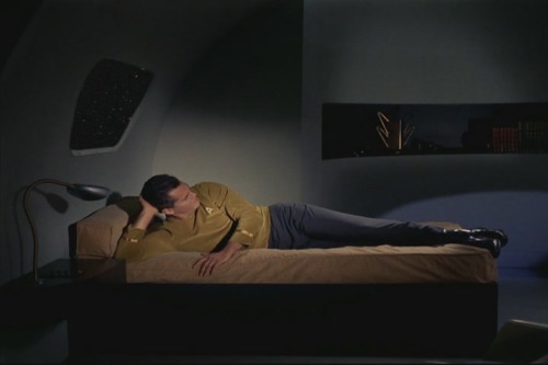
Even Star Trek’s most devoted fans wouldn’t dare claim that the original series was a high-budget operation. In among the cardboard sets, guest stars had to wear a selection of costumes that ran the gamut from the baffling (an evil baby in a silver lamé toga; girls in hot-pink fur bikinis) to the plain ugly. In one early episode, an entire alien species is kitted out in a vaguely familiar fabric that one later realises is also used for all the bedspreads on-board the Enterprise.

But in the original series Starfleet uniform, Star Trek struck costuming gold. [READ MORE]
Read More
Posted in costume design, movie costumes i have loved, sci-fi, star trek, uniforms | No comments

Friday, March 22, 2013

Star Trek: The Motion Picture -- A costume design nightmare.

Posted on 9:51 AM by christofer D
Previous Star Trek posts. 

I came to Star Trek: The Motion Picture pre-warned. Kind of. It's famous for being The Worst Star Trek (a title for which there is already some stiff competition) and I'd already heard the various nicknames: The Motionless Picture, The Motion Sickness, etc. But even that didn't prepare me for what was in store. I mean, what were they even thinking?
In fact, watching The Motion Picture, it's pretty clear what they were thinking. They were thinking, "Let's make 2001: A Space Odyssey!" Except it turns out that if you give Gene Roddenberry a quadrillion dollars and too much creative leeway, what you actually end up with is a three-hour screensaver interspersed with shots of William Shatner emoting into the middle distance. Plus music. There are whole sequences where nothing happens except kaleidoscope space-travel effects and an impressive orchestral score for minutes at a time. Come to think of it, it's probably a great movie to watch while high. Thanks, 1979.

In all seriousness, this scene lasts for about 100 years in real time.
The many faults of this movie will surely be evident to anyone who watches it. It goes on for far too long. It's humourless. It lacks the emotional depth that made the original Star Trek series so compelling. The camera spends way too much time panning over William Shatner's increasingly luxuriant middle-aged arm hair. And then there's that whole situation going on with the costumes.
We need to talk about this.
Star Trek's original series ran on a budget of $3.75 per episode and regularly featured guest stars wearing bikinis made out of curtains and tinsel. Yet somehow its costumes still managed to look more plausible than the unsettling fleshbags we see in Star Trek: The Motion Picture. Starfleet's oldschool "red shirt/blue shirt" uniforms are iconic for a reason. They're extremely simple by sci-fi costume standards (which is why the 2009 reboot movie barely had to update the uniform at all), and make it easy to differentiate between characters when they're running around. The Motion Picture's uniforms, on the other hand, are distractingly terrible in every regard. The palette runs from beige to pale blue -- a selection of colours usually restricted to hospital scrubs and control underwear. Worse still, they're actually less practical than the original series uniforms, which in 1979 were seen as frivolous and outdated.
The original intention of The Motion Picture's Starfleet uniforms was to depict a futuristic society where people wore egalitarian, recyclable, organic clothes. Sadly, the eventual result was the creation of some of the worst outfits in science-fiction history. While 1960s Star Trek revelled in tinfoil armour and various other accoutrements of classic sci-fi ridiculousness, its cartoonish atmosphere allowed for a certain suspension of disbelief that The Motion Picture never quite managed. Supposedly designed by the best minds in the galaxy, Starfleet's new uniform was a nightmare in every regard:
  1. Physical impracticality. Catsuits with shoes attached to the legs are pointless and stupid. This is a prime example of what I think of as "idiot futurism". It's perfectly acceptable to design a stupid costume if it's for, like, Barbarella or Flash Gordon, but if you're trying to conceptualise a functional future society, then your costumes should make sense. If your cast is threatening to go on strike because they can't go to the bathroom without an assistant, then chances are your costumes aren't as great as you think they are. 
  2. Visual impracticality. From the perspective of the viewer, the new uniforms were downright confusing. The colour-coded science/communications/command uniforms of the original series provided a useful visual shorthand as to the positions of each crewmember, while the new uniforms had a near-incomprehensible internal logic. In an attempt to make Starfleet seem less militaristic, everyone had the same three uniforms: the dress uniform (the belted tunic thing Shatner wears in the picture above), plus two more casual outfits, which were (maybe?) interchangeable. The end result was that everyone on the bridge was wearing different outfits, all of which looked terrible.
  3. Eye-boggling hideousness. This is already a problem from the perspective of someone watching the movie, but it's also pretty terrible as a worldbuilding detail. If Starfleet is meant to be so utilitarian and clever, then the uniforms wouldn't be so goddamn ugly. 
There are so many contributing factors to the ugliness of the 1979 Starfleet uniforms that it's kind of miraculous. They're like the holy grail of bad fashion. In terms of colour, the problem is immediately obvious the first time you get distracted by a background extra who looks naked because they're wearing a skin-coloured body suit. Although of course, wearing flesh-tone clothes is already kind of an aesthetic disaster. For those of you who always feel guiltily puzzled when someone describes two colours as "clashing": it's similar to the Uncanny Valley. The closer two colours get to each other, the more uncomfortable they are to look at. This is doubly true for skin-tone clothes, because one of the colours that looks gross is you.
There is at least one scene in The Motion Picture where a male character ends up in an unfortunate moose-knuckle situation thanks to those flesh-coloured body suits. It's just not a good idea, is what I'm saying. The best type of uniform is one that's comfortable and practical enough that you can forget that you're wearing it, and it's difficult to forget about what you're wearing if you look really terrible in it. An argument could be made that 300 years in the future, people just don't care as much about appearances as we do in the 21st century, but this is plainly untrue because characters in The Motion Picture have a wide variety of hairstyles, makeup and jewellery. Anyhow, it's difficult to take your coworkers seriously if they're wearing beige catsuits that lovingly cling to every bra strap and roll of paunch, just like it's difficult to take Captain Kirk seriously when he's dressed like someone who works in a health spa onboard a luxury cruise liner:
The one breath of fresh air in this nightmare of taupe taupe onesies and weird Teletubbie belt-buckles is... Spock. Beautiful, beautiful Spock. When we first see him, he's on one of the most painted-on alien planet sets I've ever seen in a legitimate blockbuster movie. There's a giant glowing red foot statue that's probably meant to be made of volcanic rock but looks more like Lego, and a bunch of Vulcan notables wearing a selection of A+ robes. That's more like it.
Then once Spock inevitably decides to go back to the Enterprise, he's dressed in a cool hipster-goth cape and trousers. Not only would I happily wear this outfit myself, in real life, but it looks equally practical to the terrible Starfleet uniforms. Hell, take the poncho-cape off and he'll just be wearing a shirt and trousers, which is better than what Kirk and McCoy have to wear for 90% of the movie.
You can tell everyone on the bridge agrees with me, because they're all, "Holy shit! Someone wearing clothes that let him move around without getting a wedgie!" Spock is the fashion messiah. Which is kind of intriguing when you consider the fact that Vulcans are supposed to be ultra-rational and unconcerned with material things. I always found Vulcan fashion to be a particularly clever element of the visuals of Star Trek, because it's this blindingly obvious visual clue that Vulcans are nowhere near as logical as they claim. The intricacies of Vulcan style are completely in keeping with their love of tradition, ritual, and symbolism.
The weirdest thing about the costumes in Star Trek: The Motion Picture is that the same costume designer, Robert Fletcher, worked on the next three Star Trek films as well. In hindsight, this movie was an experiment that went embarrassingly wrong, and even the most intense Trekkies are hard-pressed to say much in its favour. I tend to assume that the costumes were another indicator of Gene Roddenberry going mad with power, and that Fletcher fared better when working with other directors.

Coming soon: The costumes of The Wrath of Khan.

Previous Star Trek posts.
Read More
Posted in sci-fi, star trek, uniforms | No comments

Thursday, December 6, 2012

Star Trek Into Darkness teaser trailer theories.

Posted on 8:22 AM by christofer D
If you thought my posts on The Avengers were in-depth, then gird your loins because Star Trek is gonna be 10,000x worse. Despite being raised in a household without access to television (yeah, I know, I'm making up for lost time now) I've always been a maximum Star Trek fan thanks to a combination of tie-in novels, and a mother who subscribed to xeroxed Bring Back Trek zines during her own childhood. So you could say that I'm kind of invested in this movie. 
This trailer really takes the name "teaser" to heart because it's so damn uninformative that the Star Trek corner of the internet is already self-cannibalising. WHAT IS HAPPENING? NOBODY KNOWS, BUT EVERYONE'S CAPSLOCK KEY SEEMS TO BE STUCK ANYWAY. To be honest, it would still inspire this type of reaction even if it was just a couple of shots of the Enterprise flying around and Kirk flossing his teeth. Unfortunately, we can't even analyse the style of the trailer for ~hidden meaning~ because it's clearly just following the same formula as the recent Avengers, Dark Knight Rises and Iron Man 3 trailers: vaguely apocalyptic danger, with the villain providing an ominous monologue in the background. The biggest question right now is Who Is Benedict Cumberbatch? There were already three popular theories knocking around -- Gary Mitchell, Sybok, and Khan -- but I think that all three can still be backed up by things we see in the trailer.
Gary Mitchell is my favourite because Khan's story has already been told, and since the first reboot movie was already very Vulcan-focused it seems less likely that we'd get an entire movie about Spock's renegade half-brother. Gary Mitchell is a relatively obscure character but could potentially be a very interesting villain thanks to the Original Series backstory of his Academy-era friendship with Kirk. The main thing counting in his favour, trailer-wise, is the presence of the woman pictured above (who also shows up wearing a blue science/medical Starfleet uniform).
Gary Mitchell and Dr Elizabeth Dehner.
She bears a strong resemblance to Dr Elizabeth Dehner, who appeared alongside Mitchell when they both gained god-like superpowers in the second Star Trek pilot episode, "Where No Man Has Gone Before". Of course, this woman could also be Janice Rand (unlikely, because Rand wears a red Command/Security uniform) or Nurse Chapel -- or indeed an entirely new character -- but her hairstyle is so similar to Dehner's that it can't possibly be unintentional, even if it's a red-herring.
Sybok doesn't have much going for him aside from the fact that Cumberbatch's voiceover is revenge-themed, and the film's subtitle is "Star Trek: Vengeance" in Russia. As a Vulcan he might well have reason to be angry at Starfleet for failing to save his home planet, which fits in with some things Cumberbatch has said about his character being more morally ambiguous than outright evil. However, I feel like "morally ambiguous outcast half-brother attacks earth" is really too similar to the Avengers plot to be a viable option in a major blockbuster only one year later? Particularly since they've hired another posh English actor with dyed-black hair to play the villain. There's also the detail that Cumberbatch doesn't have Vulcan features, but that doesn't necessarily negate him being a Vulcan since there are several instances in Star Trek canon where characters have plastic surgery to look like a different species.
Khan probably has the most trailer-related evidence, since in the Japanese version of the teaser there's a short clip mirroring the Kirk/Spock scene at the end of The Wrath Of Khan. But that scene is so iconic that I doubt they'd attempt to rereate it exactly, so this is probably some kind of homage. Also, Cumberbatch appears to have some kind of super-strength and is quite physically badass, which I think fits in slightly more with Khan's character -- even though Sybok has Vulcan strength and Gary Mitchell has telekinesis.
Personally, I think the costuming is a strong indication towards Khan, since several characters (including Kirk, Spock, and Uhura) wear a kind of semi-uniform of grungy black leather in the trailer. Obviously the "hey, check out my pecs" costume of traditional Khan fame couldn't really work in a modern movie because it's so utterly Barbarella, but the faintly grubby, post-apocalyptic theme of the leather outfits could well be inspired by that. If you look at the coat worn by Uhura in the picture below and compare it to Khan's costume from The Wrath Of Khan, I think there are definite similarities in the shape of the collar and shoulders. But whoever the villain turns out to be, I suspect that Kirk, Spock and Uhura will be dressing like Cumberbatch (and his followers?) as part of a disguise. (N.B. At one point we do see Cumberbatch wearing a dark Starfleet uniform, but that could mean anything.)


Misc. thoughts:
  • "Star Trek Into Darkness" is still a terrible title.  
  • I've already seen a couple of people saying things like "I find that blonde girl annoying already". CUT THAT OUT. If you hate the new blonde girl based on 3 seconds of trailer footage, then I don't know how to put this any simpler: you're being a sexist idiot. 
  • If you're going to get annoyed by anything, get annoyed about the fact that the two women in the trailer spend half their screentime screaming or crying while the men do action stuff. I have no doubt whatsoever that Uhura will be awesome in the movie, but I'm not hugely impressed that the trailer-editors decided to devote half of her miniscule screentime to crying into Scotty's shoulder. If anything, someone should be crying into her shoulder. Maybe Chekov.
  • I've also seen people on Tumblr getting excited over "how good Benedict Cumberbatch's American accent is". I'm sorry, what? He's speaking in his normal voice. 
  • I do kinda like the brown/black leather outfits worn by Uhura et al, but sci-fi movies realllly need to retire the whole "badass/villain = long black leather coat" thing because long black leather coats are dorky as hell. The only way I can really legitemise them in this instance is if everyone's on a lava planet, because leather is relatively fire-proof.
  • That red planet is super cool -- does anyone have any idea what it could be?

Read More
Posted in sci-fi, star trek | No comments

Tuesday, September 4, 2012

Star Trek's original 1965 pilot episode: The Cage.

Posted on 2:08 PM by christofer D
If you haven't seen Original Series Star Trek, you are missing out, dear readers. This may sound counterintuitive, but I love it so much that I... still haven't seen all of the episodes. I have to keep something for my old age, you know? But the other day I did watch the original pilot episode for the first time -- the pilot pilot, back before James T. Kirk was even a twinkle in Gene Roddenberry's eye, and the captain of the USS Enterprise was still Christopher Pike.
The premise of the unaired pilot is similar to a typical seek-out-new-worlds Trek episode, but the cast and overall tone is fairly different. The main trio of Kirk, Spock and McCoy plus crewmembers Sulu, Uhura and Scotty didn't settle down until halfway through the first season, but the pilot episode featured the rather dour and worn-down Captain Pike backed up by first officer Number One (we'll get to her later), a surprisingly emotional Spock, and a crew of mostly interchangeable American men. Kirk's absence is significant, highlighting how gosh-darn serious the pilot is when compared to the rather jokey, colourful tone of "real" Star Trek episodes. I mean, there's still a hell of a lot of campy stuff to laugh at in The Cage -- angry humanoid pig-bear alien, anyone? -- but it was surely a good decision to replace the cynical, world-weary Pike with the more youthful, ridiculous Kirk and his love of doing forward-rolls in the middle of fight scenes for no apparent reason. (Sorry, have I mentioned yet that I LOVE CAPTAIN KIRK? I love him.)
A bizarrely smiling Spock inspects some super-convincing local flora with Cptn Pike. (source)
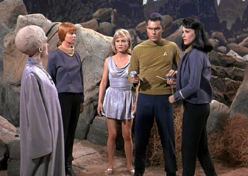
So, The Cage. Some of the crew beam down to the planet Talos IV to look for survivors from a long-ago spaceship crash, and find a small encampment of old men and -- gasp! -- a hot girl. What could possibly go wrong? As soon as Pike and his companions set eyes on Vina ("This is Vina, her parents are dead," one of the old men explains suddenly, in a moment of great unintentional comedy.) they become incompetent, because everyone knows that merely seeing an attractive woman instantly turns all men into craven imbeciles. Within minutes, Pike has been captured by mysterious aliens and his crew are left bewildered and bereft in a landscape of haphazardly-painted cardboard boulders. Number One was left onboard the Enterprise to lead the rest of the crew in the Captain's absence, and I'm pretty sure that if she'd been on the landing team then this whole kidnapping malarkey would've been a non-issue.
The plot of The Cage is pretty hackneyed, even by 1960s sci-fi standards, but it does work better with Pike than it would've done with Kirk. Pike, who admits to his friend the martini-swilling ship's doctor (some things never change) that he's thinking of retiring and going for something less stressful like the Orion slave trade (!!!), is the perfect victim for telepathic aliens who tantalise their prey with projections of their heart's desire. So even though he quickly works out that what he's experiencing is an illusion, his mind continues to conjure up fantasies of rescuing a damsel in distress, watching a sexy Orion slavegirl dance around in a bikini, and being married to a nice lady who makes picnics for him in the forst. Unfortunately, poor Vina is made to act out the woman's role in every one of these scenarios. (It's really astonishing that Pike is still single, isn't it?)
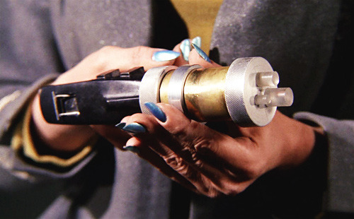
I love Number One's manicure and so should you. DITTO HER LASER GUN.
In some ways The Cage is less sexist than much of the later Original Series episodes, but it's still utterly rooted in 1960s society. Number One's presence on the bridge of the Enterprise tells us something about shipboard sexism almost immediately, beginning with an unfortunately realistic scene where Pike remarks that he's uncomfortable with "a woman" being on the bridge (referring to a young Yeoman, there to deliver some documents) before being reminded that Number One is a woman. He quickly catches himself and says that she "doesn't count". This kind of thing -- plus the fact that Number One is demonstrably the most competant person in the crew, yet is still left in a support role right up until the last moment -- indicates to me that the writers knew quite a bit about sexism and how it would show itself in this type of workplace (from a 1960s perspective, that is), and yet other aspects of the episode are preposterously misogynist. It's almost pointless to criticise a TV show written in 1965 for having terrible representations of women, but I find it fascinating that such a strong and strongly-written character as Number One can coexist with Vina's two-dimensional damsel/sexpot characterisation and Pike's incredibly dated fantasy life.
Vina in her guise as an Orion slavegirl.

When Vina first appeared ("This is Vina, her parents are dead.") I laughed out loud because she seemed so parodically vacuous and poorly acted, but by the end of the episode I was thinking that her situation was about 3242 times more horrifying and tragic than Pike's relatively brief clash with the Talosians. As a survivor of the earlier spaceship crash, Vina had been in the hands of the Talosians for twenty years, being tortured and forced to live in a fantasy world created by her telepathic captors. Pike, on the other hand, was trapped by the Talosians for a couple of days before his crew rescued him, during which time the Talosians forced Vina to try and seduce him in the hopes of creating more humans for the Talosians' entertainment. And at the end? Vina chose to stay behind because it turned out that her beauty was a Talosian illusion all along (and probably she has Stockholm syndrome). Oh, and it was Number One who saved the day. I miss Number One. If only Majel Barrett could've stayed in that role instead of turning into Nurse Chapel for the rest of the series.
(source)
Regarding the less serious stuff (because let's face it, some enterprising superfan has almost certainly written their dissertation on gender roles in 1960s Star Trek, and this post is already fast approaching tl;dr territory): the costumes and sets in this episode are A DELIGHT. For one thing, the Starfleet uniforms are understandably even more cack-handed than they are in later episodes, with officers and crewmembers all dressed in the same blue or gold sweaters, all of which look like they're doing their best to choke the wearer. And when going down to the planet's surface, the crew changes into jackets so ill-fitting that even I, with my limited dressmaking capabilities, could hot-glue-gun something better.
The stunning Number One in a not-so-stunning jacket. (source)
The costume team must have invested in a job-lot of uncomfortable-looking silver synthetic fabric, because not only are all the Talosians decked out in it from head to foot, Vina's minidress is made out of the same material, as is the comforter on one of the beds. Oh, and speaking of beds, the set-design inside the Enterprise is, as always, to die for. The sets were spruced up quite a bit after this pilot episode was made, but the overal aesthetic is the same. That is, an aesthetic that revels in acres of soul-deadening empty space, greyish lighting, and an oppressive atmosphere of being trapped in a sealed container drifting through the cosmos with no hope of rescue from the monotony unless you volunteered for a deadly-perilous mission to an alien planet.
Captain Pike "relaxes" on his uncomfortable, too-short bed.
Honestly, I find it hilarious just how much of a nightmare it'd be to live on the Enterprise if it were a real place. You probably know that hospitals and prisons are painted specific colours in order to help calm the patients and inmates, and most offices have dismal-looking houseplants lurking on the windowsills in an attempt to inject some life into the room? Well, the USS Enterprise has none of that. Just hundreds of grey, pink and pale green oblong consoles and angular 1960s furniture, with the occasional ornament in peoples' personal quarters only serving to highlight the overall monotony. No wonder the redshirts are always so keen to fling themselves, lemming-like, into danger. One of my favourite Tumblrs in existence is Space Trek (subtitle: "the quiet despair of the Starship Enterprise"), which posts nothing but hauntingly empty shots of 1960s-era Star Trek sets, sans people.
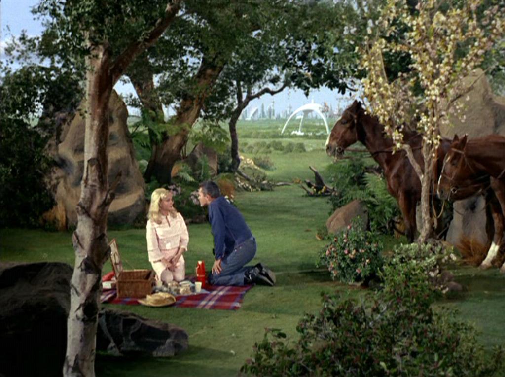
Pike and Vina have a picnic in the least organic-looking forest I've ever seen. (source)
Star Trek always seems to try harder with its "outdoor" sets. I like to imagine that somewhere out there, there are whole teams of people who spent their entire careers crafting air-filled boulders for TV heroes to throw at each other. In The Cage, the alien planet sets are even more painted-on than I dared hope, with the best ones being the utopic picnic scene pictured above (Pike's fantasy life = there is no middle ground between "alien slavegirl in a bikini" and "mid-20th-century suburban nuclear family Stepford Wife") and this deliciously cardboardy planetscape:
(source)
So, yeah, there's a lot of fun stuff in this pilot (most of it in the adorably crumby low-budget visuals), but it's flawed enough that I can definitely see why so many changes were made before the series went to air. I'd have loved for Number One to reprise her role in the rest of the series, but I have my doubts over whether the writers could've created a successful dynamic between Kirk and Number One, particularly since The Cage featured some foreshadowing of Number One having feelings for Pike. From what little we saw I feel like a Pike/Number One relationship would be a lot more compelling (for all that Pike gives every appearance of being a misogynist) than a Kirk/Number One relationship. I can only imagine how easily it might have degenerated into Number One playing the role of sensible, scolding foil to Kirk's fun, adventurous playboy -- a dynamic that very rarely works, especially since it's almost always the woman who ends up being the straightlaced one. Like James Bond in the earlier Bond movies, Kirk's carefree skankiness is in many ways preferable to an ongoing romance subplot. As for Pike, I suspect that an Enterprise helmed by him would have made for a significantly different Star Trek from the show we know and love. He was wrong for the optimistic, forward-thinking tone the show later developed, whereas Kirk turned out to be the precise opposite of a reluctant hero.
(source)
Read More
Posted in sci-fi, set design, star trek | No comments

Saturday, September 1, 2012

Links post: The Creature from the Black Lagoon, literary bathing costumes, 2500-year-old tattoos, and more.

Posted on 6:16 AM by christofer D
Behind the scenes of "Creature from the Black Lagoon", 1954. 

Kate Imbach matches famous book covers to bathing costumes. How do you even come up with an idea like that?? I love the human mind. (Matchbook)
Lanvin's Fall 2012 ad campaign is one of those rare high-end fashion campaigns that is something other than deadly dull. Most designers rely on celebrity endorsements and/or bland, photoshopped supermodels, and although this ad campaign isn't exactly pushing the boundaries of high art it's certainly a welcome change from the symmetrical perfection of Kate Moss et al. Using "real people" as models is a gimmicky ploy, but it makes for some arresting images nonetheless, not to mention injecting some personality into the normally airless environment of major ad campaigns.


Surreal clips from Adam West Batman are nothing new, but this scene where Batman drinks orange juice and jives in a cool 1960s nightclub is a delight.

Medieval lingerie. Bras are something we think of as being relatively modern, but archaeologists have discovered that women in 15th and 16th century Austria were definitely wearing something that looks suspiciously like the bras we see today.

Competition to design a "fat" female superhero. SHOULD BE RELEVENT TO EVERYONE'S INTERESTS.

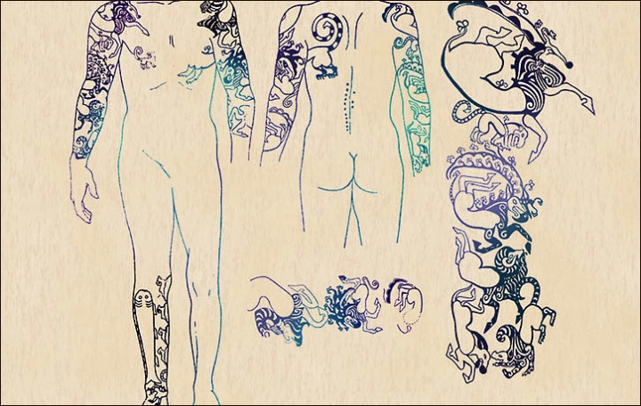
Siberian princess reveals her 2500-year-old tattoos. "Compared to all tattoos found by archeologists around the world, those on the mummies of the Pazyryk people are the most complicated, and the most beautiful."

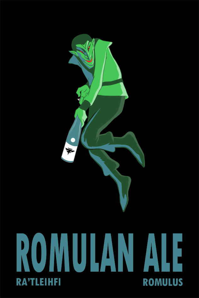
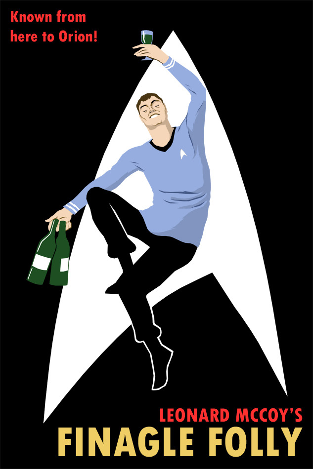
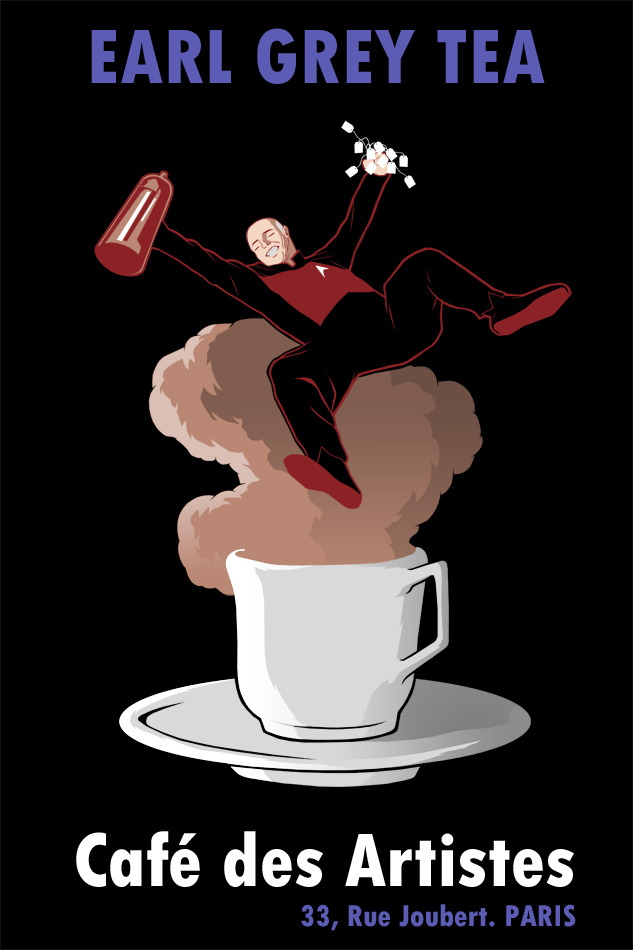
Illustrator Brian of Dangerous Days has come up with a run of cool Star Trek-inspired licquor ads, riffing off classic vintage advertising. You can see the whole collection here.


Read More
Posted in star trek | No comments

Monday, May 7, 2012

The costumes and characters of The Avengers. Part 1: SHIELD.

Posted on 1:29 PM by christofer D
This post contains no plot spoilers.

In many ways The Avengers is comparable to the 2009 Star Trek reboot. Both are major Hollywood juggernauts with a huge pre-existing fanbase; both had to deal with the problem of setting up a cast of well-known characters in a way that would seem new and fresh. My trust in Joss Whedon's writing was the only thing that kept me from being skeptical when it was announced that The Avengers would include a lot of adversarial posturing between the teammates, but the fact is that the type of team dynamic that drives a two-hour movie is very different from the dynamic that drives a long-running TV show or comic series. The story of a collection of superheroes meeting and immediately becoming BFFs would be somewhat lacking in dramatic tension.
Maria Hill and Phil Coulson, Agents of SHIELD.
SHIELD represents the unromantic side of the Marvel universe. Individually, each of the Avengers has their own origin story and hero's journey, Steve Rogers' probably being the most fairytale-like: a poor boy growing up during a time of war, gaining strength thanks to his goodness of heart and spirit, and using that strength to protect others before finally sacrificing himself for the greater good. Then there's Thor, an alien prince whose greatest enemy is his own hubris, who must learn to control his temper and act with empathy before he can regain his powers. But in the context of a world very much like our own, these characters cannot realistically survive to become heroes without some more cynical and practical-minded external force buffering them from the rest of society.

Nick Fury, Director of SHIELD.
Nick Fury didn't make much of an impression on me in the previous Marvel movies, aside from the the fact that his presence was telegraphing the possibility of a future Avengers team-up. Samuel L Jackson is one of those actors who can steal the show merely by playing himself, which is great for a cameo role but doesn't have a great deal of emotional or intellectual impact. But Fury's role in The Avengers is far more fleshed-out, and SHIELD is very clearly Nick Fury's baby. And Jackson's as well, in a way, since he originally had a hand in pressuring Marvel to increase SHIELD's presence in the first Iron Man film.
Nick Fury in Iron Man 2. For him, this is apparently casual-wear.
Fury's costume should be the silliest at SHIELD. Most people who wear ankle-length leather coats 24/7 tend to resemble late-1990s Blade or Matrix wannabes, but Fury gets away with it because he's Samuel L Jackson and he can probably have you vanished if you look at him funny. The coat should be cumbersome, limiting and easy to trip over, but since we see Fury firing rocket-launchers at fighter jets while running around his giant invisible flying aircraft-carrier, I'll handwave all that. Either way, we know that Fury's pretty fond of that coat because he wears it all the time, even when he's meeting Tony Stark for breakfast in Iron Man 2. Fury's costume in Avengers is tougher than the more relaxed outfits we see in his previous appearances, though, with a visible thigh-holster and a bulletproof vest. The vest I find particularly telling because while he spends most of the movie in his own home base, the Helicarrier, he still feels the need to be armed and protected at all times. He didn't survive this long by taking any chances.  

The Nick Fury we see in Avengers is far more interesting than the two-dimensional hardass we met in those prequel cameos. He's been fleshed out into someone whose life and work extends far beyond the Avengers Intiiative, who always has to be thinking five steps ahead of his enemies, his superiors and his underlings, and who is altogether a far more morally ambiguous character than any of the other "good guys".
Clark Gregg as Agent Coulson of SHIELD, alongside Thor's biceps, triceps and deltoids.
Agent Coulson is one of my favourite characters in the Marvel universe. Originally appearing in a minor role in Iron Man, Marvel quickly realised that Clark Gregg's sly, understated humour was gaining him a significant fanbase. I've read interviews where Joss Whedon et al seemed to think that Coulson's popularity is down to the fact that he provides an everyman character for the audience to identify with, but I'm inclined to think it's more to do with his quiet competence providing a counterpoint to the bombastic, showy nature of characters like Tony Stark. In a way he's the Alfred Pennyworth or Ianto Jones of The Avengers -- often in the background, but never unimportant.

Coulson's role at SHIELD is never really specified. He's high up on the food chain, working directly alongside Fury and usually getting sent on missions that require someone to act as a liaison or negotiator between SHIELD and a potential threat. He's kind of the superhero babysitter, and seems to be a person who is very aware of his own image -- a small, unassuming man with a suit and a nametag who will pose no apparent threat to the gargantuan egos of people like Tony Stark and Thor. Perfectly happy to act in the beta-male role while remaining quietly confident in his own abilities. The generic two-piece suit is very much part of that deceptively bland persona, but I enjoy how it's evolved over the course of his Marvel movie appearances. In Iron Man, for example, he looked quite different:
The original Coulson was meant to be more of a nerdy beaurocrat, a G-Man who spends most of the film trying but failing to arrange a meeting with Tony Stark. And his suit does not fit at all! The sleeves are way too long, it isn't tailored around the shoulders or waist, and it generally makes him look like a bit of dweeb when compared to Tony's billionaire playboy wardrobe. Whereas in The Avengers, Coulson's Dolce & Gabbana (seriously) fits like a glove, with one precise inch of shirt-cuff emerging from the sleeves.
Cobie Smulders as Deputy Director Maria Hill
Maria Hill, Nick Fury's deputy, is our first real look at a more typical SHIELD agent. The pre-movie advertising gave the impression that she was going to have a far greater role than she actually did, and I suspect that this oversaturation of Cobie Smulders/Maria Hill publicity was because they were very aware that out of an ensemble cast of around 15 characters, only three are women, and only one of those women is in a starring role. While The Avengers wasn't explicitly sexist, it did follow the Hollywood habit of setting all action/adventure stories in some parallel universe where women only make up about 25% of the population. This isn't a criticism of Hill's characterisation, which was more or less what you'd expect from a businesslike second-in-command/expository dialogue character. The cast is already so big that there's no time to expand every character, but the fact that Cobie Smulders was featured so prominently at the Avengers premieres and press events does rather highlight the fact that the first-tier cast consists of seven men plus Scarlett Johansson.
Another issue that The Avengers shares with the Star Trek reboot is that both franchises originate in the '60s, and the characters are now so beloved that augmenting the lineup in a remake/adaptation would alienate fans. This troubles me because while I find it irritating and belittling to watch so many movies where women are under-represented in token or love-interest roles, I'd still react negatively if the next installment in the Star Trek reboot series suddenly introduced three or four new Enterprise crewmembers to a cast that already feels whole and complete. With The Avengers, however, there is the option of including a whole host of female characters from the extended Marvel universe, even women who were in the Avengers team themselves, like Wasp. Because this film was the product of a long game of semi-prequels -- Iron Man, Captain America, Thor and The Hulk -- it would've been difficult to introduce another new first-tier character this time round, but I hold out hope that the Avengers sequel(s) will include more lady superheroes. Or Darcy Lewis from Thor. Because Darcy is awesome.

Recreation of the Helicarrier interior, at Comiccon 2011.
I have mixed feelings about the SHIELD uniforms as we see them in The Avengers. The fitted jumpsuits/trousers-shirt combos worn by most of the agents onboard the Helicarrier don't look too bad, but I'm a little confused as to why they're wearing them. They look like field uniforms, but we already know that field agents either wear normal clothes like the suit-wearing Coulson, or out-and-out military gear (like the soldiers sent to pick up Bruce Banner and guard Loki when he's on the Helicarrier). Also, the people on the bridge of the Helicarrier are analysts and pilots, doing what essentially amounts to desk work. Although Hill and Fury do both carry sidearms, the fact that female SHIELD agents have the option of wearing a skirt and heels indicates to me that the agents on the bridge of the Helicarrier are not expected to be battle-ready.
More from Comiccon -- these uniforms are accurate, as far as I can tell.
Joss Whedon doesn't seem to believe in the idea of "background characters". A lot of the time, his characters are the background characters. Just look at Cabin In The Woods. In the context of The Avengers, this meant that even the dialogue-free SHIELD agent extras got their chance to shine, reacting to Tony Stark's posturing and, at one point, playing Galaga on one of the Helicarrier's display screens when they were meant to be working. But while I always enjoy efforts to give personality to background extras, I'm still not wild about the whole jumpsuit/catsuit thing. Jumpsuits are near-universal in sci-fi/superhero movies, and the current zeitgeist (X-Men; Star Trek 2009; Prometheus) is for the slightly more flattering option of figure-hugging bodysuits with concealed structure and muscle padding. They look more like diving wetsuits than the spandex costumes we know from Adam West's Batman, and even musclebound types like Chris Evans get to have a little shoulderpad action going on.
The captain and bridge crew of the USS Kelvin in Star Trek (2009).
It's all well and good for the crew of fit 30-somethings on the Helicarrier be kitted out in catsuits every day, but even if people in real life were as uniformly slim and well-muscled as the average SHIELD agent appears to be, I still doubt they'd be entirely comfortable about wearing that to work every day. Particularly if their entire job is to sit in front of a computer screen and zap any pigeons that look like they might be getting near to one of the Helicarrier's rotor blades. The best reason I can think of for the ubiquity of pointless jumpsuit-wearing is that it helps to normalise the costumes worn by the superheroes themselves. Captain America's and Black Widow's skin-tight outfits -- both manufactured by SHIELD -- bear more than a passing resemblance to the SHIELD uniform jumpsuits. 
Black Widow on the bridge of the SHIELD Helicarrier.
Oh, and a postscript: The interior of the Helicarrier cracks me up, a little. It looks so shiny and awesome, but I'm not convinced that it was such a great decision to have smooth floors and no barriers on the raised walkways... on a ship that spends half the time flying and half the time in the water, and is equipped for mobile combat. How many times a day do you think people slip over and brain themselves on one of the consoles? Seriously, I want to baby-proof the corners of every single one of those Stark Industries display screens.

CONTINUED IN:  Part 2: Tony Stark, Pepper Potts, and Bruce Banner.


Links
The Pentagon Quit The Avengers Because of ‘Unreality’
Marvel Avengers wallpapers.
Interview with the super-dreamy Clark Gregg about Agent Coulson (after Iron Man 2; before The Avengers).
SPOILERY interview with Clark Gregg about his role in The Avengers.
Read More
Posted in avengers, costumes, marvel, movie costumes i have loved, movies, sci-fi, star trek, suits, superheroes, uniforms | No comments
Older Posts Home
Subscribe to: Posts (Atom)

Popular Posts

  • Master & Commander: The Far Side of the World. (Part 2)
    Previously: Master & Commander, Part 1. The characters in Master & Commander have a lot to say about the division between Navy and n...
  • Costuming & design in NBC's Hannibal: Hannibal Lecter's wristwatch.
    As part of my ongoing series on costume and design in Hannibal , I'm going to post my first guest blog with contributions from an outsi...
  • The costumes of X-Men: First Class, Part 2: Menswear.
    Part 1: Womenswear. OK, let's be real here. 99% of this section is gonna be about Erik and Charles, firstly because 99% of the movie is...
  • Costuming and Design in Captain America: The Winter Soldier -- Steve & Bucky.
    Part 1: "Trust No One" -- How Captain America became the gritty superhero we never knew we wanted. Part 2: HYDRA, Sitwell, and div...
  • Teen Wolf 2x09: Party Guessed.
    Previously: Teen Wolf 101: An introduction to the eighth wonder of our world . (Now available in audio as well!) Why does Teen Wolf hate ha...
  • Capitol Couture in The Hunger Games.
    It's a little late for a review of the Hunger Games movie itself, so in summary: I thought it was an excellent adaptation, and the few t...
  • The ultimate TEEN WOLF DRINKING GAME.
    OK, the midseason finale is upon us. After tonight, there's no more Teen Wolf until January 2014. To help you deal with the pain, I'...
  • Harry Potter, costume design, and wizarding fashion in 1920s New York. (Part 2)
    Previously: Part 1 . Most wizarding robes in the Harry Potter movies are a combination of bell-sleeved faux medieval robes, and old-fashion...
  • Teen Wolf: Tattoo.
    Previously: Teen Wolf 101: An introduction to the eighth wonder of our world . Welcome to Teen Wolf! The show where the shirts are off, and ...
  • The costumes of Alien. Part 1: Uniforms and characterisation.
    It took me until the ripe old age of 22 to see Alien, mostly because my mother warned me for years that it was the Most Terrifying Film Ever...

Categories

  • "it's historical"
  • 1920s
  • 1940s
  • 1950s
  • 2014
  • accessories
  • agent carter
  • agents of shield
  • alexander mcqueen
  • alexander wang
  • alien
  • alien quadrilogy
  • aliens
  • apocalypse fashion
  • armour
  • avengers
  • bad movies
  • bad reviews
  • batman
  • bbc
  • benedict cumberbatch
  • big bang press
  • books
  • captain america
  • chanel
  • china
  • chris kane
  • comics
  • constantine
  • conventions
  • cosplay
  • costume design
  • costumes
  • couture
  • dance
  • dc
  • dior
  • dior homme
  • doctor who
  • dolce and gabbana
  • duckie brown
  • duro olowu
  • dystopias
  • elementary
  • erdem
  • fall 2012
  • fall 2013
  • fanart
  • fandom
  • fanfiction
  • fashion
  • fashion week
  • fausto puglisi
  • figure skating
  • game of thrones
  • gareth pugh
  • givenchy
  • goth
  • gwyneth paltrow
  • haider ackermann
  • hannibal
  • harry potter
  • hugo awards
  • hunger games
  • interstellar
  • interviews
  • IRL
  • iron man 3
  • it's historical
  • james bond
  • jason wu
  • jean paul gaultier
  • jonathan saunders
  • jw anderson
  • karl lagerfeld
  • ladies in suits
  • links post
  • london
  • london fashion week
  • louis vuitton
  • marc jacobs
  • marketing
  • marvel
  • mary katrantzou
  • masterpost
  • mcu
  • mediocre
  • menswear
  • menswear fashion week
  • milan
  • movie costumes i have loved
  • movie costumes i have loved
  • movie reviews
  • movies
  • mugler
  • needs more gold
  • neil marshall
  • new york
  • nyfw
  • oscars
  • other writing
  • ozwald boateng
  • pacific rim
  • paris fashion week
  • peggy carter
  • penny dreadful
  • persional taste
  • person of interest
  • personal taste
  • peter pilotto
  • podcasts
  • prabal gurung
  • pre-fall 2012
  • pre-fall 2013
  • pre-spring
  • prometheus
  • punk
  • ralph lauren
  • rants
  • resort 2013
  • retrofuturism
  • revenge
  • rick owens
  • s/s
  • scandinavia
  • sci fi
  • sci-fi
  • scotland
  • set design
  • shakespeare
  • sherlock
  • sherlock holmes
  • SHIELD
  • shoes
  • snowpiercer
  • spring 2012
  • spring 2013
  • spring 2014
  • star trek
  • star trek into darkness
  • star wars
  • starfleet
  • stargate
  • stoker
  • street style
  • suits
  • superheroes
  • superman
  • supernatural
  • tailoring
  • teen wolf
  • the hour
  • the row
  • theatre
  • theyskens theory
  • thom browne
  • thor
  • thor 2
  • threeasfour
  • tom ford
  • tom hiddleston
  • tv
  • ulyana sergeenko
  • uniforms
  • upholstery
  • versace
  • victoria beckham
  • video post
  • viktor and rolf
  • vivienne westwood
  • walter van beirendonck
  • watches
  • writing
  • x-men
  • yohji yamamoto
  • zac posen

Blog Archive

  • ▼  2015 (4)
    • ▼  January (4)
      • Hugo Award eligibility & 2014 masterlist
      • Interview: Agent Carter costume designer Gigi Melton
      • Behind the seams of the Oscars' costume design cat...
      • A guide to 1940s costume design in Marvel's Agent ...
  • ►  2014 (38)
    • ►  December (3)
    • ►  November (3)
    • ►  October (3)
    • ►  September (1)
    • ►  August (1)
    • ►  July (3)
    • ►  May (1)
    • ►  April (8)
    • ►  March (4)
    • ►  February (2)
    • ►  January (9)
  • ►  2013 (68)
    • ►  December (2)
    • ►  November (2)
    • ►  October (7)
    • ►  September (9)
    • ►  August (5)
    • ►  July (9)
    • ►  June (6)
    • ►  May (4)
    • ►  April (3)
    • ►  March (5)
    • ►  February (11)
    • ►  January (5)
  • ►  2012 (122)
    • ►  December (6)
    • ►  November (11)
    • ►  October (11)
    • ►  September (13)
    • ►  August (9)
    • ►  July (12)
    • ►  June (13)
    • ►  May (8)
    • ►  April (6)
    • ►  March (7)
    • ►  February (13)
    • ►  January (13)
  • ►  2011 (32)
    • ►  December (8)
    • ►  November (10)
    • ►  October (13)
    • ►  September (1)
Powered by Blogger.

About Me

christofer D
View my complete profile