Why you need to watch Spanish Snow White movie ...

  • Subscribe to our RSS feed.
  • Twitter
  • StumbleUpon
  • Reddit
  • Facebook
  • Digg
Showing posts with label thom browne. Show all posts

Tuesday, February 12, 2013

Fall 2013: Thom Browne Womenswear.

Posted on 10:38 AM by christofer D
Previously on Thom Browne. 

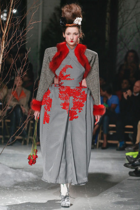
Amazingly, this is Thom Browne's Ready-To-Wear collection. If you've heard of Thom Browne, chances are it's either because of his rather eccentric menswear or because Michelle Obama wore one of his designs to this year's Inauguration -- you know, the dress that made her look kind of like a Vulcan. This collection drew far more from his menswear than from his more sedate womenswear designs, however. Not because it was remotely masculine in appearance, but more because of the exaggerated proportions and Browne's unique ability to make grey look like the loudest colour on the spectrum.
Many of the outfits on display this week reminded me of Tim Burton's Alice in Wonderland, not just because of the red rose imagery but because the styling seemed so in tune with Helena Bonham Carter's hair and makeup as the Queen of Hearts -- and her personal appearance in real life. The overall themes, however, were not particularly gothic. This wasn't so much a Twilight rose with sharp thorns as the image of a rose taken from girlish embroidery or cake decorations.


Thom Browne loves to play with gender in his designs, and viewed through the lens of his recent menswear shows, this collection does show some aspects of that. Where the silhouette of his menswear designs was rounded and soft (even if it was the roundness of overly-padded muscles), many of the coats and dresses in this show were angular in the extreme, going well beyond the squared-off shoulderpads of the 1930s and '80s. Some of these outfits reminded me of nothing less than the duo of oblong-torsoed spies in Belleville Rendez-vous:


 As well as the resolutely right-angled 1930s box suits, there were a few nods to 1950s Dior, in the form of ladylike dresses with nipped-in waists. Even these were exaggerated, however, with Browne including bulky crinolines at the hips.

This collection was a real breath of fresh air when compared to the multiple New York Fashion Week shows that focussed on leather trenchcoats and conservative cocktail dresses. While obviously very costumey, most of the clothes were far more season-appropriate than much of the other supposedly "Fall" designs I've seen on the runway over the past few days. Following on from the beautifully weird suits and gowns at the beginning of the show, the final few outfits focused on outerwear, featuring rose-red fur and layer upon layer of heavy wool tweeds.


images from Style.com
Youtube guide to watching New York Fashion Week online.
Read More
Posted in thom browne | No comments

Wednesday, July 4, 2012

Spring Menswear: Moncler Gamme Bleu, Salvatore Ferragamo, Yohji Yamamoto, and more.

Posted on 2:27 PM by christofer D
Moncler Gamme Bleu
Compared to Moncler Gamme Bleu's recent nominally-sports-themed collections, this one was practically restrained. Not a fencing mask in sight! And some of the clothes actually looked like clothes! Almost a disappointment, to be honest. I'd become oddly invested in the idea that Moncler Gamme Bleu was a label that had actual real-life customers who faithfully bought Thom Browne's seemingly unwearable designs season after season. Moncler Gamme Bleu always seems like a label invented for Saturday Night Live's Stefon sketches, you know?
Misgivings aside re: the tragic lack of truly ridiculous clothing, the show itself did look hella fun. The theme was sailing, meaning that most of the outfits looked like a cross between waterproof sailing gear and parts of yachts. I highly recommend watching footage of the show because it includes a line of Charleston-dancing sailors alongside the catwalk.


Ports 1961
I'm mostly including this because Robert Downey Jr needs to wear it.

Roberto Cavalli

Salvatore Ferragamo
I hope everyone likes translucent v-neck sweaters! Because if you don't, I'm coming round to your house and sitting you down in the Clockwork Orange chair and showing you these pictures until you do.
Really the only flaw in this shriekily bright show was the shoes. Ferragamo is known for Italian leather dress shoes, so it's kind of bemusing to me why they even decided to go for rainbow-coloured trainers in the first place. I doubt their regular buyers will be very enthused, for all that the menswear itself was excellent.


Vivienne Westwood

Yohji Yamamoto
Predictable Yamamoto fare: If you like him then you'll like this, but if you're not a Yamamoto fan then I can see why you'd be critical. I didn't see much development from his previous collections of baggy, shapeless streetware, and although I enjoyed this collection I feel like he needs to branch out a bit more in the future.

Read More
Posted in menswear, spring 2013, thom browne, yohji yamamoto | No comments

Monday, February 6, 2012

Fall 2012 Menswear: Agnes B., Damir Doma, Dior, Lanvin, Miharayasuhiro, and Thom Browne.

Posted on 3:37 PM by christofer D
Agnès B.
I'm impressed that this is even possible, but: Agnès B. managed to create a denim miniskirt -- in a menswear collection, even -- that looks at least semi-dignified. Aside from the ankle-socks over the tights, this outfit is perfect casualwear.


What's that, more tweedy knee-breeches? I'm never going to say no to those. Also, the dark grey ribbed tights are a really good choice for a menswear line, I think. Knee-socks would look schoolboyish, but sheer/nylon tights are irrevocably feminine. The ribbed tights are an excellent compromise.
Damir Doma
Damir Doma gets extra points for playing with draping without resorting to "reinventing the trad suit", which -- imagine me shuddering dramatically at this point -- seldom works out. Take heed, first-year design students.

The jackets and coats seemed to be very Asian-influenced, and there was a conspicious lack of buttons.
Dior
Ostensibly themed around classic sportswear, most of this show resembled olive-green iterations of the officer uniforms worn by all the stressy Empire guys Darth Vader used as chew-toys on the Death Star. Close to the end of the show this white bird motif began to show up, however, and it immediately caught my interest. Thanks to the subtlety of the white/grey illustration it almost looks abstract, especially on the items with more than a few birds, such as the trousers in this outfit.

Lanvin
I'm posting this jacket because it's one of the very, very few examples of this exaggerated shoulder-silhouette that I've actually liked. It's just a shade short of cartoonish, and the smooth curve down to the waist and hips stop the too-large shoulders from looking as strange and disproportionate as most of the womenswear jackets I've seen in this style.
 These boots are what Marty McFly thought we'd all be wearing in 2012, I think.
Miharayasuhiro
Superficially this outfit looks like it shouldn't be in this post, for two pretty obvious reasons: it's womenswear, and it doesn't really... look particularly interesting. However, given a little backstory, it's cooler than you might think.
Miharayasuhiro threw a couple of womenswear outfits into the middle of his menswear show, just for funsies I guess, but they fit impeccably thanks to the interlocking themes of delicate kimono fabric and staunchly masculine military uniforms/outerwear. Here he took a rather generic evening-gown silhouette but livened it up with traditionally-woven kimono silk that melds camouflage patterns and floral embroidery so the orange and brown shapes of the camo almost look like the clouds of a Japanese watercolour painting.
Check out the embroidery on the lining of the cuffs!
Thom Browne
BE STILL. MY HEART. It's rare that one sees a show so gloriously unwearable, and I include Walter Van Beirendonck in that estimation. There are so many different things to marvel at here that I hardly know where to begin.
American football parody seems like a good layer to begin with: obvious, and not particularly difficult to achieve since it mostly requires a huge superfluity of shoulders and a helmet, at which point anyone with any exposure to US pop-culture will probably see what you're getting at. Sports references are far from rare in menswear collections, and I'm sure that the football armour thing has been done many times before. But Thom Browne has taken it to a ridiculous degree here, padding out false muscles and joints until the models looked like Popeye.
Yes. Quite.

Double-breasted skirts: an acquired taste.
This whole colour scheme + knitted trousers = just as unwearable as the inflatable football outfits, even though it technically falls into the category of "normal clothes". Individually one might see someone wearing the scarf, the cardigan, or even the midriff-exposing under-cardigan, but the combination of all three would be a rare event.
There's something quite mesmerising about this show because it's so off-the-wall but at the same time lacking in coherency. Your eyes rebel, but what's the meaning behind what you're looking at? Why combine toothpaste-hued tartan, metal spikes, pink man-skirts and full-face balaklavas all in one outfit? If there was some way to combine the extreme, aimless creativity of this show with the kind of subtle thematic work (ie, not, "this collection was inspired by the ocean!") found in the Miharayasuhiro collection then you'd have my perfect fashion show. Thom Browne's padded-out football jocks were apparently a nod to The Incredibles, but aside from that it's difficult for me to divine.


DUCKIES!
Just in cast the animal print (as in, print of animals, not... "animal print"), spikes, balaklava/fetish mask, belly shirt or fur jacket distract you in this last picture, may I draw your attention... down and to the middle. Yes, that is a merkin poking cheekily out from this gentleman's trousers. And there were others. One of the other models had a white fur one. I'm certain that this trend will catch on like wildfire.
Read More
Posted in fall 2012, fashion week, menswear, thom browne | No comments
Older Posts Home
Subscribe to: Posts (Atom)

Popular Posts

  • Master & Commander: The Far Side of the World. (Part 2)
    Previously: Master & Commander, Part 1. The characters in Master & Commander have a lot to say about the division between Navy and n...
  • Costuming & design in NBC's Hannibal: Hannibal Lecter's wristwatch.
    As part of my ongoing series on costume and design in Hannibal , I'm going to post my first guest blog with contributions from an outsi...
  • The costumes of X-Men: First Class, Part 2: Menswear.
    Part 1: Womenswear. OK, let's be real here. 99% of this section is gonna be about Erik and Charles, firstly because 99% of the movie is...
  • Costuming and Design in Captain America: The Winter Soldier -- Steve & Bucky.
    Part 1: "Trust No One" -- How Captain America became the gritty superhero we never knew we wanted. Part 2: HYDRA, Sitwell, and div...
  • Teen Wolf 2x09: Party Guessed.
    Previously: Teen Wolf 101: An introduction to the eighth wonder of our world . (Now available in audio as well!) Why does Teen Wolf hate ha...
  • Capitol Couture in The Hunger Games.
    It's a little late for a review of the Hunger Games movie itself, so in summary: I thought it was an excellent adaptation, and the few t...
  • The ultimate TEEN WOLF DRINKING GAME.
    OK, the midseason finale is upon us. After tonight, there's no more Teen Wolf until January 2014. To help you deal with the pain, I'...
  • Harry Potter, costume design, and wizarding fashion in 1920s New York. (Part 2)
    Previously: Part 1 . Most wizarding robes in the Harry Potter movies are a combination of bell-sleeved faux medieval robes, and old-fashion...
  • Teen Wolf: Tattoo.
    Previously: Teen Wolf 101: An introduction to the eighth wonder of our world . Welcome to Teen Wolf! The show where the shirts are off, and ...
  • The costumes of Alien. Part 1: Uniforms and characterisation.
    It took me until the ripe old age of 22 to see Alien, mostly because my mother warned me for years that it was the Most Terrifying Film Ever...

Categories

  • "it's historical"
  • 1920s
  • 1940s
  • 1950s
  • 2014
  • accessories
  • agent carter
  • agents of shield
  • alexander mcqueen
  • alexander wang
  • alien
  • alien quadrilogy
  • aliens
  • apocalypse fashion
  • armour
  • avengers
  • bad movies
  • bad reviews
  • batman
  • bbc
  • benedict cumberbatch
  • big bang press
  • books
  • captain america
  • chanel
  • china
  • chris kane
  • comics
  • constantine
  • conventions
  • cosplay
  • costume design
  • costumes
  • couture
  • dance
  • dc
  • dior
  • dior homme
  • doctor who
  • dolce and gabbana
  • duckie brown
  • duro olowu
  • dystopias
  • elementary
  • erdem
  • fall 2012
  • fall 2013
  • fanart
  • fandom
  • fanfiction
  • fashion
  • fashion week
  • fausto puglisi
  • figure skating
  • game of thrones
  • gareth pugh
  • givenchy
  • goth
  • gwyneth paltrow
  • haider ackermann
  • hannibal
  • harry potter
  • hugo awards
  • hunger games
  • interstellar
  • interviews
  • IRL
  • iron man 3
  • it's historical
  • james bond
  • jason wu
  • jean paul gaultier
  • jonathan saunders
  • jw anderson
  • karl lagerfeld
  • ladies in suits
  • links post
  • london
  • london fashion week
  • louis vuitton
  • marc jacobs
  • marketing
  • marvel
  • mary katrantzou
  • masterpost
  • mcu
  • mediocre
  • menswear
  • menswear fashion week
  • milan
  • movie costumes i have loved
  • movie costumes i have loved
  • movie reviews
  • movies
  • mugler
  • needs more gold
  • neil marshall
  • new york
  • nyfw
  • oscars
  • other writing
  • ozwald boateng
  • pacific rim
  • paris fashion week
  • peggy carter
  • penny dreadful
  • persional taste
  • person of interest
  • personal taste
  • peter pilotto
  • podcasts
  • prabal gurung
  • pre-fall 2012
  • pre-fall 2013
  • pre-spring
  • prometheus
  • punk
  • ralph lauren
  • rants
  • resort 2013
  • retrofuturism
  • revenge
  • rick owens
  • s/s
  • scandinavia
  • sci fi
  • sci-fi
  • scotland
  • set design
  • shakespeare
  • sherlock
  • sherlock holmes
  • SHIELD
  • shoes
  • snowpiercer
  • spring 2012
  • spring 2013
  • spring 2014
  • star trek
  • star trek into darkness
  • star wars
  • starfleet
  • stargate
  • stoker
  • street style
  • suits
  • superheroes
  • superman
  • supernatural
  • tailoring
  • teen wolf
  • the hour
  • the row
  • theatre
  • theyskens theory
  • thom browne
  • thor
  • thor 2
  • threeasfour
  • tom ford
  • tom hiddleston
  • tv
  • ulyana sergeenko
  • uniforms
  • upholstery
  • versace
  • victoria beckham
  • video post
  • viktor and rolf
  • vivienne westwood
  • walter van beirendonck
  • watches
  • writing
  • x-men
  • yohji yamamoto
  • zac posen

Blog Archive

  • ▼  2015 (4)
    • ▼  January (4)
      • Hugo Award eligibility & 2014 masterlist
      • Interview: Agent Carter costume designer Gigi Melton
      • Behind the seams of the Oscars' costume design cat...
      • A guide to 1940s costume design in Marvel's Agent ...
  • ►  2014 (38)
    • ►  December (3)
    • ►  November (3)
    • ►  October (3)
    • ►  September (1)
    • ►  August (1)
    • ►  July (3)
    • ►  May (1)
    • ►  April (8)
    • ►  March (4)
    • ►  February (2)
    • ►  January (9)
  • ►  2013 (68)
    • ►  December (2)
    • ►  November (2)
    • ►  October (7)
    • ►  September (9)
    • ►  August (5)
    • ►  July (9)
    • ►  June (6)
    • ►  May (4)
    • ►  April (3)
    • ►  March (5)
    • ►  February (11)
    • ►  January (5)
  • ►  2012 (122)
    • ►  December (6)
    • ►  November (11)
    • ►  October (11)
    • ►  September (13)
    • ►  August (9)
    • ►  July (12)
    • ►  June (13)
    • ►  May (8)
    • ►  April (6)
    • ►  March (7)
    • ►  February (13)
    • ►  January (13)
  • ►  2011 (32)
    • ►  December (8)
    • ►  November (10)
    • ►  October (13)
    • ►  September (1)
Powered by Blogger.

About Me

christofer D
View my complete profile