Why you need to watch Spanish Snow White movie ...

  • Subscribe to our RSS feed.
  • Twitter
  • StumbleUpon
  • Reddit
  • Facebook
  • Digg

Tuesday, June 12, 2012

Resort 2013: J. Mendel, Balenciaga, Givenchy, and The Row (AKA the continuing mystery of the Olsen Twins).

Posted on 4:17 PM by christofer D
Previously: A Beginner's Guide to Resort Season: Marc Jacobs, Calvin Klein, Lanvin, and more.

J. Mendel
These translucent bandage-skirt dresses have been very popular recently, particularly on the red carpet, and mostly I think they look sort of terrible. Usually they tend to be coloured in either beige or black, with opaque areas around the hips that make the wearer look like they've put on granny panties and an underskirt but forgotten the rest of their outfit. HOWEVER. This season's J Mendel has (I think) managed to carry off the ethereal look, if only in the context of this photoshoot.
There's something delicate enough around the bodice and the general draping of this dress that makes it look like a ballet costume as opposed to the weird mess of net curtain that usually occurs with this kind of dress.


My main criticism of this collection is that it's so overtly geared towards the extremely thin. I enjoyed a surprising proportion of this show, particularly the shorter dresses, but I highly doubt that outfits such as these would look anywhere near as good on someone with any body fat.
I'm automatically in favour of anything that looks like power- dressing for a cold-hearted cyberpunk CEO, so I love this grey leather outfit. Charlize Theron's character in Prometheus definitely has this in her wardrobe for days when she needs to look extra badass and/or waterproof.

Balenciaga
Half of this collection was taken up by these strangely rigid summer dresses outfits that looked like they'd maybe been moulded out of solid plastic by Lego...
... and the other half included EXTERIOR BRAS. Like, yeah, OK, I can kind of get behind this look when it's Daenerys Targaryen's spangly Tattooine-city bodices in Game Of Thrones, but in real life? Not so much. Especially when it's this peculiar combination of 1940s grandmother pleat-front trousers, bland shirts, and stiff leather bustiers.

Carlos Miele
1960s Star Trek empress gown: LOVE IT. I hope someone wears one to the Oscars in the good ol' tradition of there always being a nominee who dresses like one of the statuettes for luck.

Givenchy
Successful pattern mixing: tricky, but doable. I wouldn't wear them (too fussy and too '70s), but I can't deny that these outfits are eye-catching and way more interesting than most Resort season efforts.

BUT WHAT THE HELL IS THIS. Oh god, just get out. Every year someone tries to pull off pale-washed double-denim and every year I sink further into my swamp of despair because stop trying to make fetch happen, it's never going to happen. (In this case, "fetch" = "any and all attempts at horrible '90s-influenced denim outfits".)
On the whole I think that fashion "rules" are idiotic -- Who are you to tell me I can't wear brown shoes with black trousers, huh? Fight the man! -- but there is one rule that I hold to be true unto forever: Don't Double Denim. In fact, the only denim my own personal draconian law permits is in the form of jeans, jeans shorts, miniskirts, and possibly dungarees if you're really sure about it. No denim jackets. No quirky denim accessories. And for god's sake no denim dresses unless you're hell bent on looking like like Britney and JT circa that tragic period before Sexy was Brought Back.

The Row
The one thing you need to know about The Row is that it's run by the Olsen Twins. As long as you know this (and, I suppose, have some vague idea of what Mary Kate and Ashley look like) then you know what to expect: Granny Chic.
The baffling thing about this show in particular is that the extremely stylish Beatrix Ost was a guest of honour. So, while The Row basically models itself around the wardrobe of a septuagenarian who wears clothes with the same approximate shape and appeal as a potato sack, the septuagenarian they actually invite to the show is a sartorially adventurous woman who would probably never wear any of these clothes in real life. But then, I find the Olsens' fashion success in general to be rather puzzling, because while they do appear to be quite successful businesswomen I still can't quite work out who's buying their clothes. I know that a lot of young women do enjoy the Granny Chic look, but they usually overlap with the thriftstore crowd and therefore it seems unlikely that they'd be shelling out thousands of dollars for Olsen designs. Enquiring minds want to know!
Read More
Posted in givenchy, resort 2013 | No comments

Friday, June 8, 2012

A Beginner's Guide to Resort Season: Marc Jacobs, Calvin Klein, Lanvin, and more.

Posted on 4:31 PM by christofer D
I know most of you guys are here for the superheroes, but I gotta be what I gotta be, and sometimes that means posting about mediocre high-end fashion. Right now we're in the middle of Resort/Cruise season which, as you may have noticed from the name, is an imaginary season. In the world of Game Of Thrones, seasons take years to change, meaning that the characters get years to practise the best way to portentiously say "Winter. Is. Coming." In Fashion Land, Resort/Cruise season is the time between Spring and Summer when you swan around various luxury locations while wearing £3000 sunglasses and doing things that are way, way classier than watching Game Of Thrones. The purpose of Resort/Cruise season is to sell designer clothes to these rich people so they have something new to wear on their yacht. This year's Chanel show was pretty good, but by and large the attitude of most major fashion houses to Resort/Cruise season seems to be: "Someone's gonna buy this shit, so let's just print out some bikinis and knee-length skirts and go to the bar, YOLO."
Chris Benz. (All photos from Style.com.)
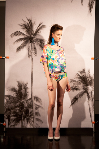
One of the A+ things about Resort season is the hilariously lacklustre photoshoots. Even during Couture season some designers choose to exhibit using photoshoots instead of live shows, but usually that's either for aesthetic reasons or because they can't afford decent placement at Fashion Week. During Resort season, however, pretty much everyone whose name isn't Lagerfeld exhibits solely via lookbooks. And those lookbooks, as you may be able to tell from the above photo, can be kind of... dodgy. For one thing, the monochrome photo of palm trees looks like something you'd see hanging up in a coffee shop, and it's held up by bullclips. Secondly, the lighting is edging dangerously close to "we shot this in my garage". 

Burberry Prorsum
Believe it or not, the idea of a blank backdrop used to be a weird concept (you can read a bit more about that and post-war fashion photographer Irving Penn here). Sometimes it can make the models look washed out and dull, but for brands like Burberry it's fine because the clothes are mostly in neutral tones.

So, yeah, did I give you enough warning yet that there's going to be a bunch of super-bland shit in this post? Because: BEHOLD.

This gown baffles me because a) there is literally no one in the world who has the correct body shape and boob-volume to correctly fit into this and make it look good, and b) Burberry is a really commercial brand so I really... don't know what they were thinking...?? Resort season mysteries.

Just Cavalli
It's the colour of a really gross-tasting soda drink, it's partially leopard-print, and it comes with a matching lime-green Justin Bieber hat. Teenagers of America, it's your duty to wear this outfit to prom!

Zero + Maria Cornejo
Despite the ~highly imaginative~ usage of backing boards, I give this outfit a grudging B+ because it doesn't look like a half-hearted Resort season attempt at summer fun, and it hits all the things about the irritating "1920s trend" that most mainstream designers miss. Instead of being a period-drama pastiche or Baz Luhrmann ripoff, it takes the drop-waist/long-beaded-necklace details and puts them together in an outfit that looks modern and interesting without being outrageous.


Calvin Klein
This suit may look dull to the untrained eye, but by Calvin Klein standards it's a Lady Gaga stage costume. Calvin Klein hates colours and patterns and loves to design hundreds and hundreds of outfits that essentially amount to beige bedsheets. Unfortunately CK streams a lot of their catwalk shows online, meaning that I've probably wasted/spent at least half an hour of my life heckling at my laptop screen as 37 blank-faced nymphs stride along a pale grey runway in near-identical pale grey smocks. So you can probably understand why this outfit made me fall off my horse.

That being said, there was still a whole bunch of CK outfits that looked like black or white curtains and would only ever look good on Gwyneth Paltrow. But this! Is progress!

DKNY
"LOL" -- direct quote from DKNY head designers after they "finished" "work" on this.  

Lanvin
I love this bathing suit because it just looks so ferociously uncomfortable. Nothing says "relaxing beachwear" like an angry-looking model wearing a bathing costume that looks like it may well be 100% rigid (and attempting to cut off all circulation to her vag), armed with 5-inch perspex heels and a leather shoulderbag.

BEDSHEET.
I feel like I've dissed Lanvin kind of unfairly here because these three photos aren't indicative of the whole show (which was rather stylish, if not particularly remarkable to me personally), but this microwavable tinfoil suit is just the shiznit. I hope someone wears this with the black bathing costume on underneath and uses it to go to the beach on Mars.

Organic by John Patrick.
"My junk feels great in this outfit," thought the John Patrick model, too distracted to button his fucking jacket properly.

Diesel Black Gold
I like this for realsies because it's so Blade Runner.


VPL
This model's name is Hannelore Knut. So: perfect model choice, really, for a lookbook that is so uncharacteristically focused around power rather than passivity.  There's always an unfortunate quantity of crappy, sports-themed fashion during an Olympics year, but this is sports-themed fashion done well. It doesn't look like workout gear but it does look strong and practical and simple, and has a few hints of "sporty" colours without going all-out Adidas.
Hannelore Knut can totally work it, am I right? Some models couldn't carry off low-heeled boots and dresses made from wetsuit material, but this whole photoshoot was like a gallery of badassery.

Marc Jacobs
This is an unexpected departure for Marc Jacobs, who is usually far closer to the the chic, vampy end of the Ladylike scale than the floral, Frida Kahlo/Miuccia Prada end. That being said, the sheer exuberant colours of this collection sucked me in, and I found myself really enjoying how summery and weird-looking it managed to be without ending up in Zooey Deschanel hipster quirk territory.


Read More
Posted in bad reviews, fashion week, marc jacobs, mediocre, resort 2013 | No comments

Wednesday, June 6, 2012

Chanel: Cruise 2013 at Versailles.

Posted on 9:45 AM by christofer D
Previously: See the Chanel tag for further reports on Karl Lagerfeld's forays into a variety of intriguing design themes that usually boil down to "I'm stupendously rich."

Karl Lagerfeld and the court of Versailles -- to be honest, I can't believe this hadn't happened before. Lagerfeld, with his ever-present chalk-white ponytail, aura of eccentric aristocracy, and conscious detachment from the everyday wants and needs of the proles, couldn't fit in any better if he tried.
Studio photos from Chanel's lookbook; show photos from Style.com.
This being Chanel, the eighteenth-century French influences only went so far. For all that Lagerfeld adores extravagance when it comes to showmanship, he still adheres to the relatively sedate and conservative Chanel ethos. While this show was rather more cheeky and street-cool than many recent Chanel collections, it was mostly restricted to a calming colour palette of fondant-like pastels in Chanel-favoured fabrics.

The show took place at the gardens in Versailles, the models strutting around one of the fountains to a soundtrack of M.I.A. and harpsichord remixes. The styling choices were impeccable: a modern, Harajuku-like twist on powdered wigs in the form of two-tone pastel ponytail/pageboy haircuts, plus every model was wearing snazzy brothel-creepers. A nod to both the old and the new, alongside some cool Chanel-symbol beauty marks that, unlike the pale blue pageboy wigs, I suspect may make an appearance on actual humans outside of catwalk land.
The most direct Versailles influences were the pannier skirts and pantaloons, decked out in pastel frills and lace. Short and stylised, those outfits were 18th century by way of Lolita and Sofia Coppola's Marie Antoinette rather than being a real nod towards historical fashions.

Karl Lagerfeld is self-aware enough that I'm sure this show's peasant vs super-rich undertones were entirely intentional. There were a couple of male models in the show and they, along with the female models wearing the trouser-suit outfits, looked like pantomime parodies of pageboys.
The suits with knee-breeches looked almost costumey, like the girls-dressed-as-boys outfits worn in comic plays, and the wide-legged trouser suits were like a modern retelling of Marie Antoinette's fetish for dressing up as a faux peasant and working on her own private "farm". They were made from traditional Chanel suit fabrics in frothy cupcake shades of pink and blue, and the baggy trousers were only peasant-like in that they had artfully unhemmed cuffs. The end result was a series of outfits that were one half neatly-tailored Chanel womenswear, one half Japanese street style Lolita parody.

For me, this show was both more youthful and more interesting than expected. Cruise/resort collections tend to be unimaginative and mostly focussed around easy summer staples like bikinis and maxi-dresses, but this show was 72 outfits long and covered a wide variety of styles from straight-up 18th century costuming to modern party dresses and hip-hop influenced brothel-creepers. The biggest surprise was the prevalence of faux-gold and purposeful tackiness -- themes that the mature designers at Chanel usual shy away from.

Footage of the full show is available online here, and hi-res mid-walk photos can be found here. 

Read More
Posted in "it's historical", chanel | No comments

Monday, June 4, 2012

Snow White & The Huntsman: The prince doesn't get the girl; the girl gets the kingdom.

Posted on 2:27 PM by christofer D
Previously: Snow White & The Huntsman: How to tell a fairy story.

Thanks to last week's new releases, my Charlize Theron viewing history is now all the way up to three films total. (The first was Aeon Flux, which, yeah, ask me about that sometime. It's the worst.) I won't be posting a review of Prometheus until it's been out for a little longer, but the one thing I will say is that if you're planning on seeing it, you should read this (non-spoilery) warning first. Following the advice therein will, I think, improve your Prometheus experience.
I was very excited about Snow White & The Huntsman because the marketing was so gosh-darned appealing (surprisingly so, considering the content and audience) and I am of the opinion that Kristen Stewart and Charlize Theron should be the next Bogart and Bacall. Unfortunately, SWATH was nowhere near as good as I expected, dragging on longer than it should have done and including several completely superfluous characters. In some respects it succeeded (ie, visual effects and Awesome Ladies, both of which featured prominently in the trailer) but the end result was an action movie that could've done with more action, and a drama that needed tighter drama.

This movie may not have been very good but KRISTEN STEWART IS STILL MY KHALEESI.
I'm inclined to be biased in favour of SWATH because it's so clearly Bechdel-approved. It's a story about women and the problems they face because of the way women are socialised to think about their own power and beauty. The hero and the villain are both women, and neither of them resemble Kate Beaton's Strong Female Characters or the kind of emotionless kickboxing androids that appear in so many other genre movies. The prince doesn't get the girl; the girl gets the kingdom. 2012 has been a fantastic year for female-led sci-fi/fantasy movies, and my only serious issue with the feminist themes in SWATH is the way Ravenna's relationship with beauty and power was portrayed. While too much explanation will inevitably ruin any story that hinges on "magic", the complete lack of a coherent explanation regarding Ravenna and Snow White's various intangible powers meant that their ultimate standoff packed far less of a punch than it should have done. It's not often that I complain about there being not enough exposition in a blockbuster movie, but this was such an easily-solved problem that a minute or so of flashback montage might well have sorted it out.
screencap from here.
Ravenna's belief that a woman's youthful beauty is a direct source of power means that she ends up sucking the land dry, bathing in milk while peasants starve and faceless medieval Stormtroopers serve up supermodel Lily Cole as a royal snack. Kristen Stewart's Snow White, on the other hand, shows no signs of knowing or caring what she looks like, and is the avatar of some kind of Aslan-like power that causes flowers to blossom as soon as she comes near. But if her inherent goodness (or divine Queenship, passed down from Mum?) is so strong that it charms the fairies from the trees and Princess Mononoke's forest-spirit from the water, how come there was no evidence of this in the cell she was locked inside those years? Was she unable to photosynthesise?
I couldn't help but compare this aspect of the film unfavourably to Stardust, a movie that, while different in tone, stars a similarly image-obsessed witch as the villain. Another place where SWATH fell down in comparison to Stardust was the cast of cameo characters, headed up by Bob Hoskins as a blind dwarf soothsayer. Hoskins had the unenviable role of saying things like, "She is... the one," in portentious tones while making it abundantly clear that he was only there for the paycheque. While the ghostly princes in Stardust provided witty comic relief, the dwarves in SWATH (all of them famous character-actors, and all utterly wasted in the roles they were given) were embarrassing and could just as well have been cut from the film entirely. Not to mention how uncomfortable it was to realise that eight average-sized actors had been hired to play dwarves, something that seems dangerously similar to racebending.

If this post seems overly negative, it's only because I had such high hopes for this film before I saw it. In fact there were many things that I did enjoy once I got past the clunky pacing and the inexplicable inclusion of terrible characters like Ravenna's ambiguously incest-y albino brother (ugh). Charlize Theron's intense/camp supervillain meltdowns were awesome, and I have a lot of admiration for Kristen Stewart's ability to work so well with what she was given. SWATH would have benefited hugely from a scene or two where Snow White either learns some more tangible skills or gives a Game Of Thrones-esque speech to her troops before battle, but Kristen Stewart still came across as an appealing and unusual hero. This film had many flaws, but casting wasn't one of them. I haven't seen Twilight, but I'm beginning to see why Stewart was chosen to be Bella Swan. I've heard that Bella is a character whose success hinges on the actor's ability to silently emote for five movies in a row while still retaining audience interest, and having seen Kristen Stewart's Snow White I'm inclined to believe that she can do it. I only wish that she'd been given more dialogue in this movie, for all that she managed to wring as much emotional truth from her running-and-fighting scenes as possible.
This was a Costume Movie. It's been out for less than a week and I've already had several people ask me if I'm going to review the costumes, but I honestly don't think there's much to say about them other than that they were stunning. The strongest aspect of SWATH was the visuals, from the supernatural forests to the hyper-real troll attack to the scene where a flock of ravens coalesce to form an oil-slick filthy Ravenna wearing a glistening raven-feather dress. For anyone with any interest in clothes, Ravenna's gowns are the standout costumes, and I suspect that the designer (Colleen Atwood) is a shoo-in for another Oscar nomination. Combining a Marie Antoinette-like opulence with spiky, venomous imagery, Ravenna's loosely medieval-inspired gowns are destined for fashion magazine photo spreads. This is the kind of costume design that works very well in a broad, "that looks awesome" sense because Ravenna's clothes are so obviously beautiful and intricately complex, even out of context. I don't mean to imply that this type of costume design is somehow less worthy than subtler, more character-specific costuming -- just that it's a good example of the kind of attention-grabbing work that gets nominated for awards year after year.
Detail shot of Ravenna's beetle-carapace dress.
All these ferociously uncomfortable-looking costumes fit well with Charlize's over-the-top, campy performance, and serve to highlight Ravenna's vanity and lack of care for the fate of the less fortunate. Thousands starve while Ravenna sits in her chambers wearing 30lbs of silk and reapplying her blood-of-virgins lipstick. I like to imagine that after she's drained a young woman of her life-force, her victim is then put to work in a sweatshop full of other young/old women sewing thousands of sequins and feathers onto Ravenna's next sartorial masterpiece. The white wedding dress she wears at the beginning of the film is almost "historical"-looking and comparatively soft in appearance, but once she becomes queen her own style takes over and it's sexy glam-rock Nazgul corsetry from there on in.
Fairytale by way of Gareth Pugh?
While Ravenna's gowns were beautiful examples of craftsmanship and design they were, in a way, the easy choice. The queen in Snow White has to look evil and sexy and rich, whereas Snow White herself is a far more difficult character to quantify. The dirty hand-me-down dress, though, looked great on Kristen Stewart, and handily transformed into a more practical tunic/leggings outfit with a bit of help from Thor's the Huntsman's knife. And her practical, flat-chested armour? Wonderful. I was actually disappointed when she finally reached her victorious coronation moment at the end and had to wear a Queen dress instead.

Kristen Stewart's Snow White and Katniss Everdeen from The Hunger Games are the only mainstream blockbuster heroines I can think of who really have no idea of personal vanity or prettiness, which is kind of marvellous. Now all we need to do is work on making more movies like this that don't implicitly demonise women who like to dress up and look pretty.
I have mixed feelings about the love-triangle situation. I find it refreshing to watch a movie like this and not feel that a romance subplot has been shoehorned in just for the sake of it, and I appreciated that the Huntsman didn't immediately abandon his drinking problem and the memory of his wife as soon as he began to have feelings for Snow White. However, the ending already seemed abrupt enough without some hint of a romantic resolution, especially since it might have balanced out the creepily non-participatory nature of Snow White's earlier kisses. Even though I suspect that those kisses were meant to be a cut-and-dried "true love's kiss" deal, I'd rather interpret them as being about trust. When Snow White first escapes, she wants to get to William because she has nowhere else to turn, and although she accepts the Huntsman's help she still keeps her cards close to the chest. Her trust in him grows organically, and is finally proven when he shows up by her side when her army attacks the castle. The reason why the Huntsman's kiss works while William's fails is because William's feelings for Snow White are mostly based on guilt and childhood obsession, whereas the Huntsman actually knows Snow White as an adult.

(Alternatively, the kisses were just coincidental and Snow White woke up of her own damn accord because the Force is strong with her.)
The Huntsman has the Aragorn-esque look of a man who smells really intensely terrible but is handsome enough to get away with it (because we can't smell him). When we first see him he's swilling ale and being pushed into a trough full of dirty water, and for the rest of the movie he marinades gently in his no-doubt old and sweaty leather jerkin. The men of SWATH are very obviously second-tier to Charlize Theron in terms of costume design, most of them clad in the kind of dirty faux-medieval fare one would expect. William is more of a traditional knight-in-shining-armour than the more lower-class Huntsman, but both of their costumes fall into the nonspecific medieval fantasy category.
photo from here.
A friend pointed out to me that the romance in SWATH reads a lot like the first volume in a Young Adult trilogy. Both of the guys have been introduced, but while they both seem to have sorted out their own feelings for the heroine by the end of the story, she's still barely aware that she's in the middle of a potential love triangle. The implication is that the Huntsman is the favoured suitor, but William is no less heroic or appealing, leaving options open for a possible sequel. And, you know, even though this film was far from the high-quality Game Of Thrones drama I was hoping for, I would watch a sequel. But not to find out whether Snow White is Team William or Team Huntsman, because I'm still firmly in Team Snow White.

Links

Photo gallery of Colleen Atwood's costumes for Snow White & The Huntsman.
HuffPo: 'Snow White and the Huntsman' Is A New Twist On An Old Tale.
Early concept art for Ravenna. 
Read More
Posted in "it's historical", armour, bad reviews, costumes, mediocre | No comments
Newer Posts Older Posts Home
Subscribe to: Posts (Atom)

Popular Posts

  • Master & Commander: The Far Side of the World. (Part 2)
    Previously: Master & Commander, Part 1. The characters in Master & Commander have a lot to say about the division between Navy and n...
  • Costuming & design in NBC's Hannibal: Hannibal Lecter's wristwatch.
    As part of my ongoing series on costume and design in Hannibal , I'm going to post my first guest blog with contributions from an outsi...
  • The costumes of X-Men: First Class, Part 2: Menswear.
    Part 1: Womenswear. OK, let's be real here. 99% of this section is gonna be about Erik and Charles, firstly because 99% of the movie is...
  • Costuming and Design in Captain America: The Winter Soldier -- Steve & Bucky.
    Part 1: "Trust No One" -- How Captain America became the gritty superhero we never knew we wanted. Part 2: HYDRA, Sitwell, and div...
  • Teen Wolf 2x09: Party Guessed.
    Previously: Teen Wolf 101: An introduction to the eighth wonder of our world . (Now available in audio as well!) Why does Teen Wolf hate ha...
  • Capitol Couture in The Hunger Games.
    It's a little late for a review of the Hunger Games movie itself, so in summary: I thought it was an excellent adaptation, and the few t...
  • Teen Wolf: Tattoo.
    Previously: Teen Wolf 101: An introduction to the eighth wonder of our world . Welcome to Teen Wolf! The show where the shirts are off, and ...
  • The ultimate TEEN WOLF DRINKING GAME.
    OK, the midseason finale is upon us. After tonight, there's no more Teen Wolf until January 2014. To help you deal with the pain, I'...
  • Harry Potter, costume design, and wizarding fashion in 1920s New York. (Part 2)
    Previously: Part 1 . Most wizarding robes in the Harry Potter movies are a combination of bell-sleeved faux medieval robes, and old-fashion...
  • Costumes and design in NBC's Hannibal, Part 1.
    I probably should've been writing about the costumes of Hannibal from the very start, but I confess to feeling a little overwhelmed. The...

Categories

  • "it's historical"
  • 1920s
  • 1940s
  • 1950s
  • 2014
  • accessories
  • agent carter
  • agents of shield
  • alexander mcqueen
  • alexander wang
  • alien
  • alien quadrilogy
  • aliens
  • apocalypse fashion
  • armour
  • avengers
  • bad movies
  • bad reviews
  • batman
  • bbc
  • benedict cumberbatch
  • big bang press
  • books
  • captain america
  • chanel
  • china
  • chris kane
  • comics
  • constantine
  • conventions
  • cosplay
  • costume design
  • costumes
  • couture
  • dance
  • dc
  • dior
  • dior homme
  • doctor who
  • dolce and gabbana
  • duckie brown
  • duro olowu
  • dystopias
  • elementary
  • erdem
  • fall 2012
  • fall 2013
  • fanart
  • fandom
  • fanfiction
  • fashion
  • fashion week
  • fausto puglisi
  • figure skating
  • game of thrones
  • gareth pugh
  • givenchy
  • goth
  • gwyneth paltrow
  • haider ackermann
  • hannibal
  • harry potter
  • hugo awards
  • hunger games
  • interstellar
  • interviews
  • IRL
  • iron man 3
  • it's historical
  • james bond
  • jason wu
  • jean paul gaultier
  • jonathan saunders
  • jw anderson
  • karl lagerfeld
  • ladies in suits
  • links post
  • london
  • london fashion week
  • louis vuitton
  • marc jacobs
  • marketing
  • marvel
  • mary katrantzou
  • masterpost
  • mcu
  • mediocre
  • menswear
  • menswear fashion week
  • milan
  • movie costumes i have loved
  • movie costumes i have loved
  • movie reviews
  • movies
  • mugler
  • needs more gold
  • neil marshall
  • new york
  • nyfw
  • oscars
  • other writing
  • ozwald boateng
  • pacific rim
  • paris fashion week
  • peggy carter
  • penny dreadful
  • persional taste
  • person of interest
  • personal taste
  • peter pilotto
  • podcasts
  • prabal gurung
  • pre-fall 2012
  • pre-fall 2013
  • pre-spring
  • prometheus
  • punk
  • ralph lauren
  • rants
  • resort 2013
  • retrofuturism
  • revenge
  • rick owens
  • s/s
  • scandinavia
  • sci fi
  • sci-fi
  • scotland
  • set design
  • shakespeare
  • sherlock
  • sherlock holmes
  • SHIELD
  • shoes
  • snowpiercer
  • spring 2012
  • spring 2013
  • spring 2014
  • star trek
  • star trek into darkness
  • star wars
  • starfleet
  • stargate
  • stoker
  • street style
  • suits
  • superheroes
  • superman
  • supernatural
  • tailoring
  • teen wolf
  • the hour
  • the row
  • theatre
  • theyskens theory
  • thom browne
  • thor
  • thor 2
  • threeasfour
  • tom ford
  • tom hiddleston
  • tv
  • ulyana sergeenko
  • uniforms
  • upholstery
  • versace
  • victoria beckham
  • video post
  • viktor and rolf
  • vivienne westwood
  • walter van beirendonck
  • watches
  • writing
  • x-men
  • yohji yamamoto
  • zac posen

Blog Archive

  • ▼  2015 (4)
    • ▼  January (4)
      • Hugo Award eligibility & 2014 masterlist
      • Interview: Agent Carter costume designer Gigi Melton
      • Behind the seams of the Oscars' costume design cat...
      • A guide to 1940s costume design in Marvel's Agent ...
  • ►  2014 (38)
    • ►  December (3)
    • ►  November (3)
    • ►  October (3)
    • ►  September (1)
    • ►  August (1)
    • ►  July (3)
    • ►  May (1)
    • ►  April (8)
    • ►  March (4)
    • ►  February (2)
    • ►  January (9)
  • ►  2013 (68)
    • ►  December (2)
    • ►  November (2)
    • ►  October (7)
    • ►  September (9)
    • ►  August (5)
    • ►  July (9)
    • ►  June (6)
    • ►  May (4)
    • ►  April (3)
    • ►  March (5)
    • ►  February (11)
    • ►  January (5)
  • ►  2012 (122)
    • ►  December (6)
    • ►  November (11)
    • ►  October (11)
    • ►  September (13)
    • ►  August (9)
    • ►  July (12)
    • ►  June (13)
    • ►  May (8)
    • ►  April (6)
    • ►  March (7)
    • ►  February (13)
    • ►  January (13)
  • ►  2011 (32)
    • ►  December (8)
    • ►  November (10)
    • ►  October (13)
    • ►  September (1)
Powered by Blogger.

About Me

christofer D
View my complete profile