Why you need to watch Spanish Snow White movie ...

  • Subscribe to our RSS feed.
  • Twitter
  • StumbleUpon
  • Reddit
  • Facebook
  • Digg

Sunday, July 1, 2012

The Hollow Crown, Part 1: Richard II.

Posted on 9:48 AM by christofer D
Caveat: I am no Shakespeare scholar. I come at Shakespeare from the perspective of a pop-culture nerd, meaning that when I lived in London I was the person getting weird looks from the ushers at the Globe Theatre because I'd be all like, "No, don't give me a programme! I don't want spoilers!" Spoilers for King Lear, that is. I get why some people like to read plays before they see them, but I wouldn't read the script of The Avengers before seeing that so why should Richard II be any different? Usually this works out fine as long as I pay attention to the performance, although I did have some trouble the other week when I went to see Alan Cumming's one-man Macbeth, which was kinda hard to follow because, you know, he was playing all the roles. Fortunately I'm Scottish, and all Scottish people are forced to memorise the plot of Macbeth while being beaten with birch twigs and standing on a blasted heath at midnight as a rite of passage, which certainly comes in very useful in situations like this.
The other problem facing me when embarking upon the first installment of the BBC's Hollow Crown series was a complete lack of knowledge about the Wars of the Roses. I'm pretty sure that the Wars of the Roses are a History class staple in England, but Scottish education system tends to concentrate more on the Reformation, mostly for practical reasons because people in Scotland still get into barfights on a semi-regular basis about things that happened during the Reformation. I watched Richard II with a group of Scots and even though we had at least one History degree among us, we still weren't 100% certain whether Richard II took place in the 14th or 15th century until we wikipedia'd it afterwards. (N.B. Watching Shakespeare's English History plays in a roomful of Scots is ideal because the entire plot revolves around English people killing each other, which gives us all a schadenfreude thrill.)
As soon as Richard showed up I knew I was going to love him. I'd never seen Ben Whishaw in anything before, but I can now go on record to say that he's my new #1 casting choice for any roles that require a slimy, effeminate dweeb to Gaius Baltar his way around all the other characters while flopping onto furniture and sobbing about how misunderstood he is. A+ KINGING, BEN WHISHAW.

The first scene consists of Bolingbroke (the guy on the right) challenging James Purefoy to a duel in King Richard's court. Take a look at these two guys: you're going to be seeing a lot of those expressions over the course of this play. As far as I can tell, the main purpose of most of the non-Richard characters  is to provide entertaining "WTF, Richard?" reaction shots to whatever godawful King-decision he's has just made.
Aside from the multitude of comedy reaction shots, my favourite thing about Richard II was how Richard was so obviously styling himself as Jesus. I'll talk a bit more about his costumes later, but seriously. SERIOUSLY. That's some old-style White Jesus shit right there with the robes and the beard and the hair and what-have-you.
THIS PLAY INCLUDES A PRE-DUEL TRAINING MONTAGE WHERE JAMES PUREFOY HITS A PIG'S HEAD WITH A MACE AND HENRY BOLINGBROKE CHARGES AT STRAW DUMMIES WITH A LANCE.
Thanks to the presence of James Purefoy, this movie is KIND OF a sequel to A Knight's tale, right?
Although Bolingbroke and James Purefoy are totally geared up to joust each other to death in the name of honour, Richard loses interest at the last moment and -- I'm not kidding -- decides to stop the fight so he can go for a potty-break in his sparkly gold tent full of exotic pets and handsome manservants. Bolingbroke and James Purefoy are not pleased:
Tragically this is the last we're going to see of Purefoy, because Richard banishes them both. Bolingbroke is super upset about this, even though England is plainly a shithole where it rains 97% of the time and your King is a creepy slimeball who spends more time brushing his hair than doing any actual kinging.
AUMERLE LOOKS GOOD IN BLUE.
Richard and his courtiers hang out on a bridge in their tights, playing with flowers and talking about what an A+ idea it'll be to tax the poor in order to pay for a pointless war in Ireland. Richard is not the keenest mind of his generation, but compared to Aumerle (whose face is caressed lovingly by the camera at every opportunity) he's practically Einstein. Aumerle is the loyalest himbo courtier a dissolute and amoral King could wish for, seriously.

Next up, Richard goes to shake down Patrick Stewart, Bolingbroke's father. It's pretty clear that Patrick Stewart knows that Richard is a complete cockwaffle, but Richard doesn't give a shit because he's the King. ("Richard doesn't give a shit because he's the King" = the actualfacts synopsis of this play, I believe.) Anyway, Patrick Stewart proceeds to kick the bucket and Richard mourns for all of 14 milliseconds before seizing all his assets because girlfriend loooooooves him some gold.
This scene solidly establishes Richard as complete bag of dicks. Also, it's pretty clear from step one that the whole "war in Ireland" plan isn't going to go very well because Richard's national security council consists of a portrait artist and two courtiers. One of the courtiers goes to Wales to muster the Welsh troops, who look like this because everyone who isn't English is, of course, a savage:
To my complete lack of surprise, the portrait artist and his courtier buddy are captured by Bolingbroke, who is back in the country to retake Patrick Stewart's lands and fortune from Richard's dastardly clutches. Up until now I was kind of nonplussed as to the disappointing lack of a body count, but then this happened:
DECAPITATIONS ALL ROUND. It's almost like watching Game of Thrones! (N.B. Bolingbroke's entire rationale for decapitating those two seemed to have been "You're guilty of gaying up the King!" which, yeah, no.)
Here we come to the point where Richard's costumes really come to their own. He's obviously obsessed with the idea of styling himself as Jesus, plus the quantity of gold he wears warms the cockles of my heart. We already know that he's into the sparkles and the riches in a big way, but mostly I enjoy the fact that the costumiers have dressed him in such a way that his opulent wardrobe is really not the typical "I'm a King so I look rich" tradition of royals through the ages. Kings are meant to look rich and powerful but while Richard looks rich, he most emphatically does not look powerful. The combination of loose, Jesus-inspired robes and Ben Whishaw's slight figure make Richard look even more narrow-shouldered and soft when compared to gruff warriors like Bolingbroke in their coarse fabrics and utilitarian armour. The fabric choices alone lend something to his effeminate appearance: pale pastels, pure white, and all of it made from floaty, draped cloth that looks more like the clothes his wife wears than the tough warrior garb worn by most of the other men.
Bolingbroke and his troops come to overthrow Richard, at which point even I am making comedy reaction-shot faces at Richard because he decides to address them from the battlements while wearing all-gold armour and surrounded by cherubs and a gold halo. Amazing. Meanwhile, Aumerle is Richard's "cousin" the same way Patrocles is Achilles' "cousin" in Troy:
Regular readers probably know that I love me some armour, and I've got to fling a whole handful of gold stars at the costume people for Richard II because even Richard's armour makes him look round-shouldered and weak. Anyhow, Richard surrenders to Bolingbroke without a fight because it's pretty damn clear that Richard isn't much of a fighter.
SHAKESPEARE: He always has to include some comedy commoners to alleviate the tension. Always. I'm only bothering to mention this scene because it involved Argus Filch talking to Fleur Delacour. Harry Potter actors! If you want to make a film in Britain then you're going to have to include at least one of them or no one will take you seriously.
It's time for Richard to give up his crown to Bolingbroke, and since it seems likely that this is the last time he'll have a captive audience he milks it and milks it. Seriously, Richard spends more time talking about giving up the crown than he did trying to keep the crown in the first place. He has a lot of emotions. Also he wears an extra-special Sparkly Jesus costume made from translucent linens. It's pretty rad:
Richard's You-can-be-the-King-now speech takes so long it involves props, tears, and at least two instances of him prostrating himself on the floor. Richard II: Drama King.
This inspires some of the best "WTF, Richard?" reaction shots of the entire play:
Richard is flung into a dungeon but Aumerle remains loyal because he's the Best Boyfriend Ever. Honestly it's kind of inexplicable why he even cares so much, but the great thing is that it leads to this awesome scene with Aumerle and his parents. It's the immortal "stop trying to read my Facebook!" argument, with Aumerle's dad being all, "What's in that letter, son?" and Aumerle being like, "NOTHING!!!!" because that never sounds suspicious.
Unfortunate truth: the letter is actually part of a plot for Aumerle and some other dudes to assassinate Bolingbroke and get Richard back on the throne, so the entire Aumerle family decamps to Bolingbroke's court so Bolingbroke can a) decide whether or not to execute Aumerle for treason, and b) mediate the 14th-century equivalent of a Jerry Springer family dispute. Bolingbroke, as always, is not amused:
Deciding that the only way to prove his loyalty to the crown is to kill Richard, Aumerle goes to the cave where Richard is now languishing in  -- seriously -- a loincloth. At this point I was like, "We have four minutes until the end of the play. Can they really manage to insert more Jesus imagery before then?"
Answer: Yes.

Things I learnt from Richard II
  1. People in 14th Century England were suicidally loyal to their Kings, regardless of how crazy, incompetent or unappealing those Kings actually were.
  2. Richard II was really sparkly. Like, Edward Cullen sparkly. 
  3. Aumerle looks good in blue.
  4. Henry Bolingbroke Doesn't Like Dick. 
Next: Henry IV Part 1, starring Tom Hiddleston and Jeremy Irons. 
    Read More
    Posted in armour, bbc, costumes, movie costumes i have loved, needs more gold, shakespeare | No comments

    Friday, June 29, 2012

    Mugler: Menswear and Resort 2013.

    Posted on 11:33 AM by christofer D
    This lookbook was strikingly photographed by the head designer himself, Nicola Formichetti, and the clothes were consistently beautiful in a way that still managed to fit in with Resort season's less extravagant mood. Just like how a good album ought to be played at maximum volume, these photos should be as big as possible so you can feast your eyeballs on all that agonisingly clean-cut precision.
    There's just something so clean and perfect about this collection -- I love it. The Mugler look has always involved a lot of artificial fabrics and inorganic silhouettes but since Nicola Formichetti took over, the label has taken on a far less aggressive aesthetic and begun to concentrate more on tailoring.


    Of course, Mugler tailoring isn't the kind of traditional work we see from the designers who are known for their suits and eveningwear. Formichetti focuses on structure, with this Resort collection looking more like airplane wings and aerodynamic speedboats than normal clothing, even though the pieces themselves (simple skirts and dresses) are technically far more conventional than the iconic spiked corsets of Mugler's heyday in the '90s.
    The title of the collection was "Kabuki Kiss", which, OK, is not a good title. It's not like fashion shows ever have particularly inspired and/or comprehensible titles, but this time round it's almost as if they just picked "Kabuki" out at random from a bunch of well-known Japanese words. While the designs did show some Japanese influences, they certainly weren't Kabuki influences -- particularly since the most recogniseable visual of Kabuki is the makeup, and the model's face was hidden in almost every picture. Also, this is one of the least theatrical Mugler shows I've ever seen, what with the smooth silhouettes, the minimalist backdrops and the distinct lack of fetishwear influences.


    I don't understand why all Formichetti/Mugler designs don't get bought up and/or plagiarised by sci-fi movie costume designers. (Sidenote: if the costumes in Ridley Scott's Blade Runner sequel aren't any good, then we can totally start a Kickstarter to sue him, right? That's a thing people can do?)
    Mugler's Spring 2013 menswear line was a lot less dramatic than the Resort collection, although it did share its largely monochrome colour-scheme and pristine tailoring. The theme, supposedly, was the ocean, although even once I knew this I was hard pressed to see many underwater influences in a show that was mostly made up of razor-sharp, futuristic suits and lapel-free jackets.
    There are unnumbered rules on how and when women can show their cleavage/arms/legs to the world, most of them counterintuitive, but for men the rules are relatively simple: do what you like, as long as it doesn't look "like a girl". So, many of the menswear designs that are brought low by the Zoolander Effect do so because they're exposing too much and/or the wrong area of manflesh. However, Mugler takes what I can only describe as the classy approach. For the last couple of seasons a lot of womenswear labels have been experimenting with designs that incorporate slits and windows into unexpected areas like mid-torso and around the ribs (which doesn't translate well to mainstream fashion because normal people have, you know, fat on their mid-torso and rib areas...) with varying results, and this is the menswear equivalent. Formichetti sidesteps any Zoolander issues by making the more revealing outfits as strict as possible in other areas: square shoulders, relatively conservative suit-tailoring, and all-black or all-white colour schemes.

    This black outfit looks like it's made from diving suit material so I guess it could be construed as being ocean-themed?? Although to be honest all it really reminds me of is Spock's black Starfleet uniform in the Star Trek reboot movie, which only serves to tear a hole in my soul because then I remember that I have to wait an entire year until Star Trek 2.

    Previously: Gareth Pugh and Thierry Mugler: Who needs trends when you're an intergalactic bug-queen?
    Read More
    Posted in menswear, mugler, resort 2013 | No comments

    Thursday, June 28, 2012

    Spring 2013 Menswear: Versace loves you.

    Posted on 8:39 AM by christofer D
    I love Donatella Versace. Have you ever seen the Saturday Night Live sketches where she's followed everywhere by a crowds of semi-naked male models? I'm pretty sure that's some documentary-style accuracy right there. The theme of this show was pugilism, with most of the models decked out in a selection of tacky gold outfits that fell somewhere between sexxxy gladiator costumes and a Vegas backing-dancer version of boxing robes and prizefighter belts.
    pics from Style.com
    Before we go any further, I just gotta break it to you: If you don't appreciate the wonders of this show then we can't be friends. It's everything that's wonderful about the horrible sections of Milan menswear design! I mean, at one end of the Milan menswear scale you get the expertly-cut three-piece suits of the type one mostly sees being worn by 60-year-old men on The Sartorialist, but at the other end we have Versace, whose eternal motto seems to be "LESS SHIRT; MORE GOLD".

    For the record, this collection is mostly swimwear. I don't know if that's an acceptable explanation for the sparkly harem pants or prizefighter belts, but it does at least legitimise Donatella's decision to expose maximum quantities of bronzed manflesh in the name of high-end fashion. I don't know what the market is for most of these pieces, but there's something glorious about the Versace ethos of supergluing fake gold onto everything and then laughing all the way to the bank. Some day a male Jennifer Lopez will appear and Versace Menswear will become mainstream. Some day, my brethren.
    This is what would happen if Magic Mike had a baby with Gladiator and then dressed it up in leftovers from Joan Collins' accessory collection.

    Wallet harness? OK. Honestly I love shit like this because I have a weakness for the less clockworky aspects of steampunk designs, plus strapping stuff to your body is way better than having to carry a bag around all the time. I don't know if wallet holsters are likely to catch on anytime soon, but to my eyes this looks totally reasonable, if a little shiny for most busineswear outfits.
    I find it interesting that this menswear collection is so varied and interesting (and, yes, ridiculous, but that goes without saying) while Versace's recent relaunch of their womenswear couture line was so lacklustre. This is the kind of fun, eyecatching work Versace should be putting forward for their womenswear lines, not pale imitations of Lady Gaga stage outfits made from cheap-looking plastic fibres.

    The shoes were the most obvious mixture of influences in the collection: a boxing boot crossed with gladiator sandals. I kinda love it, but not in a way that I think is... wearable. If you wear them with socks you look like a dweeb, but if you wear them without socks then... I don't even know, because men don't typically expose their toes to the world unless it's a billion degrees outside or they're at the beach, and hot-pink, calf-length boxing boots aren't really suitable for either of those situations.
    Read More
    Posted in menswear, spring 2013, versace | No comments

    Tuesday, June 26, 2012

    Resort 2013: Alexander McQueen, Mother of Pearl, Bibhu Mohapatra, and Roberto Cavalli.

    Posted on 3:02 PM by christofer D
    Alexander McQueen
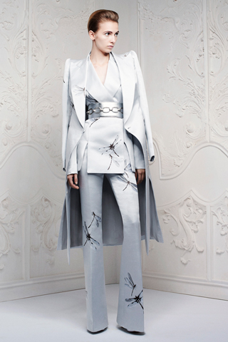
    McQueen wins at everything again because as aways, they straight-up discarded your plebeian notions of "Resort clothing" and produced another Couture collection. Or, you know, what would be considered Couture by another designer. Because McQueen Couture usually involves a lot more antlers, brocade, and feathered crinolines.
    pics from Style.com
    Whatever this fabric is, it looks so much like galvanised steel that it's hard to imagine the model being able to move at all. Although the corset-belted waists were very McQueen, the chilly roboticism of the slim David Bowie suits were surprisingly distant from McQueen is usually known for.

    If you don't like clothes with photorealistic insect motifs on them, then I don't like you.
    These next two suits are what Tilda Swinton wears in the imaginary movie I'm writing about a Las Vegas talent-manager in the late 1970s who moonlights as a Kill Bill style bounty hunter. (All the "talent" she manages will be played by members of the cast of Teen Wolf.)
    My favourite scene in this imaginary movie is probably the one where one of Tilda Swinton's business rivals drips some barbecue sauce on one of her shirt-cuffs, at which point she flips him out of his chair and hangs him out of the window until he apologises.

    How, McQueen? How does it work? You take one of my least-favourite items of clothing ever -- the strapless onesie/jumpsuit -- and make it look classy. HOW?
    I SWEAR THIS DRESS IS ONE OF THE COSTUMES FROM THE ASGARD SCENES IN THOR.


    Mother of Pearl
    My opinions of this collection are very mixed. On the one hand we get cool, comfy-looking street style outfits like this...
    ... but on the other, Mother of Pearl seemed inordinately fond of putting peplums and frills on places where they really should not be. If you're thinking of making a skirt that frills out anywhere lower than the waist? Don't. It looks awful. Especially if it's in a block colour and the rest of the outfit is really plain.

    Bibhu Mohapatra
    Sad truths: I'm obsessed with this kind of vaguely 1960s-inspired sc-fi minidress, but you so totally know that you wouldn't be able to sit down properly if you were wearing one. Or, like, do anything that isn't related to standing artfully next to something made of chrome in your spaceship-themed nightclub.

    Roberto Cavalli
    I am never not in favour of clothing that's printed with delicate blue willow porcelein patterns.


    Read More
    Posted in alexander mcqueen, resort 2013 | No comments

    Friday, June 22, 2012

    Costume design and the crew of the Prometheus.

    Posted on 4:12 PM by christofer D
    Costume design is the point where my positive and negative feelings about Prometheus intersect. The visuals of this movie were amazing, but at the same time I'm of the opinion that almost every reference that directly connected Prometheus to Alien was handled very poorly. I've already written about how the decision to make Prometheus into a glossy sci-fi epic and attempt to overtly tie it to Alien was a mistake, and costume design was definitely one of the details that should have been used to distance Prometheus from Alien, not bring the two together.
    In space, all food is brightly-coloured and comes served in Muji containers.
    This interview with costume designer Janty Yates touches upon the fact that while the spacesuits in Prometheus were designed to look very different from those in Alien, the indoor/casual clothes were intentionally similar to the costumes worn by the crew of the Nostromo. Which, to me, immediately seems like a bad idea. The waking-up/breakfast scene in Prometheus is already similar enough to the one in Alien that it's a comfortably direct reference, but aside from the basic scene-setting they should have avoided any other similarities because the premise and setting of the two movies are so fundamentally different. Although the two films share the same discovery-thriller structure and pacing, the crews are different people with very different aims in mind. The Nostromo was a beat-up old mining ship, crewed by experienced blue-collar workers who treated each other with friendly, professional wariness; the Prometheus is a brand new, hugely expensive exploration vessel, crewed by academics, businesspeople, and some expert pilots and security staff. The idea of these two casts of characters looking similar makes no sense at all.

    Shaw, Ford, Holloway, and Fifield. (pics from www.prometheus-movie.com)
    Alien has some of my favourite character-based costume design ever. If you want a bit more detail my review is here, but the short version is that most of the clothes we seen on the crew of the Nostromo are well-worn uniforms, with a couple of personal items thrown in. For a group of people who work for a strongly branded corporation -- and may only be allowed a limited quantity of personal items onboard -- this makes perfect sense, especially when you see how dirty some parts of the Nostromo are. Basically, they are dressing for work on the space equivalent of a long-distance freighter ship. The Prometheus, however, is a completely different kettle of fish. Firstly, the ship itself was built specifically for this mission, and is state-of-the-art. For several of the people onboard this is probably the first time they've travelled to another planet, and in the case of Shaw and Holloway at least, they are passionate. Unlike the characters in Alien or Aliens, they aren't just showing up for another day at work in an uninspiring job they don't particularly enjoy. The fact that everyone seems to be wearing Weyland Industries uniforms kind of makes sense because that's who funded the mission in the first place, but also they're really not very... uniform? This isn't something I have a major problem with, but I do feel like it's been consciously included in order to emulate the aesthetic of Alien in a way that doesn't really make a lot of sense.
    Ford, Fifield, and Millburn
    Much of my confusion about the costuming decisions stems from my confusion about the characters themselves. One of the biggest failings of this movie was its inability to explain why the characters acted the way they did. Which, you know, is kind of an important aspect of storytelling. Alien was simple: the crew of a mining vessel happen upon what appear to be the ruins of an alien structure and accidentally bring an alien onboard their own ship, causing chaos and disaster. Prometheus, though, is a far trickier story to tell, mostly because Ridley Scott made it difficult for himself. The background of the mission to LV-223 was baffling from the start because even once we'd found out Weyland's "true" reasons for wanting to find the Engineers, we still had no explanation as to why half of the people onboard had agreed to come along in the first place. In the introductory scene where Shaw and Holloway explain their hokey search for Bald Xenu Jesus to the rest of the crew, we learn that several of the crewmembers literally do not know why they are there.
    Ravel, David, and some redshirts.
    As an expository device, that scene was incredibly clumsy. In a more general sense it was even worse because it immediately made me start wondering about a) who the hell signs up for a two-year research mission on another planet without knowing what they'll be working on or why, and b) who picked out the crew in the first place. Because the two people in charge are Vickers and Weyland, and since they're both meant to be entitled, self-absorbed control-freaks, crossing the galaxy in a spaceship full of volatile and/or incompetent strangers seems like a really out-of-character life choice. This Prometheus Pre-Prequel youtube sketch is spot-on with regards to the terrible survival skills of these people. A certain amount of panicked stupidity can be excused in sci-fi and horror movies, but not this much -- especially when you're trying to inject a little gravitas into your sci-fi epic. I mean, either you can tell a story about people struggling with faith and searching for the origins of the human race, or you can make a cheesy horror movie where people get their heads blown up for doing stupid things like taking their helmets off on an alien planet and touching creepy-ass slime worms. You can't have both.
    You're an idiot.
    There are a lot of clumsy plotholes in Prometheus that I can ignore or explain away, but I just can't find a way to legitimise why Vickers and/or Weyland would actively allow everyone to go into such a dangerous situation completely unprepared. Considering the fact that they're all alone in a spaceship millions of miles away from anything safe or familiar, this shows a distinct lack of the self-preservation instincts that supposedly make up the backbone of Vickers' and Weyland's personalities.
    Fifield the geologist is the only crewmember chose characterisation really benefited from his costuming and character design. Although other characters all had little personalised costume details like Holloway's neckerchief (realistically douchey because he's a world-travelling archaelogist), Fifield had the most distinctive style, and for good reason. Aside from Shaw, none of the characters get any explicit backstory. This isn't a criticism per se -- Alien did just fine without providing any backstory for anyone -- but Fifield's actions and appearance made him seem like he might be the kind of person who would be reckless enough to sign up for a lengthy space mission to an unknown destination. It's implied that Fifield has had more field experience than the other academics, specifically in terraforming (Weyland Industries' main focus). His smock is covered in patches, indicating that he's travelled with several other ships, and his personal style is way more individualistic than anyone else's. With his mohawk and tattoos, there's clearly no way that he's going to fit in with the uniform guidelines -- if, indeed, there even are any. The fact that no one seems bothered that he's ditched the uniform entirely just makes everyone else look stranger to me, because if no one's enforcing the uniform rules then why does everyone else appear to be following them?
    If the costumes in Prometheus hadn't been so closely related to Alien, I probably would've been way less critical. The visuals are one of the main strengths of this movie, and it's not like I think Janty Yates did a bad job. I think the crew look great, in fact, particularly the spacesuits (which were apparently an absolute bitch to construct and maintain) and Millburn's white tube hoodie, for which I have an inordinate fondness. Ridley Scott is the real source of my irritation here because although he didn't actually write the movie, he's the person who made all the major decisions. He hasn't reached anywhere near George Lucas levels of franchise-ruination, but some of the quotes I've heard from him regarding this movie's mythological background have been rather ominous. As in, his original vision included wayyy more Space Jesus. After 30 years it's  understandable that he'd want to tell a different kind of story than he did when he was just starting out as a director, but rather than providing a complementary addition to the Alien franchise, Prometheus only seemed to ovecomplicate things. Instead of trying to tie the crew of the Prometheus to the crew of the Nostromo he should have done the exact opposite and made them look as different as possible.

    Coming soon: David8! Until then, you should totally read that Clothes On Film interview with Janty Yates, particularly if you're interested in the intricacies of how they worked out spacesuit logistics during filming.

    Previously
    Prometheus: Proof that epic sci-fi doesn't belong in the Alien franchise.
    Prometheus and the fannish mindset: Plotholes Aren't Everything.
    The costumes of Alien. Part 1: Uniforms and characterisation.
    The costumes of Alien. Part 2: Space suits, retrofuturism, and Prometheus.
    Read More
    Posted in alien quadrilogy, costumes, movies, prometheus, sci-fi, uniforms | No comments
    Newer Posts Older Posts Home
    Subscribe to: Posts (Atom)

    Popular Posts

    • Master & Commander: The Far Side of the World. (Part 2)
      Previously: Master & Commander, Part 1. The characters in Master & Commander have a lot to say about the division between Navy and n...
    • Costuming & design in NBC's Hannibal: Hannibal Lecter's wristwatch.
      As part of my ongoing series on costume and design in Hannibal , I'm going to post my first guest blog with contributions from an outsi...
    • The costumes of X-Men: First Class, Part 2: Menswear.
      Part 1: Womenswear. OK, let's be real here. 99% of this section is gonna be about Erik and Charles, firstly because 99% of the movie is...
    • Costuming and Design in Captain America: The Winter Soldier -- Steve & Bucky.
      Part 1: "Trust No One" -- How Captain America became the gritty superhero we never knew we wanted. Part 2: HYDRA, Sitwell, and div...
    • Teen Wolf 2x09: Party Guessed.
      Previously: Teen Wolf 101: An introduction to the eighth wonder of our world . (Now available in audio as well!) Why does Teen Wolf hate ha...
    • Capitol Couture in The Hunger Games.
      It's a little late for a review of the Hunger Games movie itself, so in summary: I thought it was an excellent adaptation, and the few t...
    • Teen Wolf: Tattoo.
      Previously: Teen Wolf 101: An introduction to the eighth wonder of our world . Welcome to Teen Wolf! The show where the shirts are off, and ...
    • The ultimate TEEN WOLF DRINKING GAME.
      OK, the midseason finale is upon us. After tonight, there's no more Teen Wolf until January 2014. To help you deal with the pain, I'...
    • Harry Potter, costume design, and wizarding fashion in 1920s New York. (Part 2)
      Previously: Part 1 . Most wizarding robes in the Harry Potter movies are a combination of bell-sleeved faux medieval robes, and old-fashion...
    • Costumes and design in NBC's Hannibal, Part 1.
      I probably should've been writing about the costumes of Hannibal from the very start, but I confess to feeling a little overwhelmed. The...

    Categories

    • "it's historical"
    • 1920s
    • 1940s
    • 1950s
    • 2014
    • accessories
    • agent carter
    • agents of shield
    • alexander mcqueen
    • alexander wang
    • alien
    • alien quadrilogy
    • aliens
    • apocalypse fashion
    • armour
    • avengers
    • bad movies
    • bad reviews
    • batman
    • bbc
    • benedict cumberbatch
    • big bang press
    • books
    • captain america
    • chanel
    • china
    • chris kane
    • comics
    • constantine
    • conventions
    • cosplay
    • costume design
    • costumes
    • couture
    • dance
    • dc
    • dior
    • dior homme
    • doctor who
    • dolce and gabbana
    • duckie brown
    • duro olowu
    • dystopias
    • elementary
    • erdem
    • fall 2012
    • fall 2013
    • fanart
    • fandom
    • fanfiction
    • fashion
    • fashion week
    • fausto puglisi
    • figure skating
    • game of thrones
    • gareth pugh
    • givenchy
    • goth
    • gwyneth paltrow
    • haider ackermann
    • hannibal
    • harry potter
    • hugo awards
    • hunger games
    • interstellar
    • interviews
    • IRL
    • iron man 3
    • it's historical
    • james bond
    • jason wu
    • jean paul gaultier
    • jonathan saunders
    • jw anderson
    • karl lagerfeld
    • ladies in suits
    • links post
    • london
    • london fashion week
    • louis vuitton
    • marc jacobs
    • marketing
    • marvel
    • mary katrantzou
    • masterpost
    • mcu
    • mediocre
    • menswear
    • menswear fashion week
    • milan
    • movie costumes i have loved
    • movie costumes i have loved
    • movie reviews
    • movies
    • mugler
    • needs more gold
    • neil marshall
    • new york
    • nyfw
    • oscars
    • other writing
    • ozwald boateng
    • pacific rim
    • paris fashion week
    • peggy carter
    • penny dreadful
    • persional taste
    • person of interest
    • personal taste
    • peter pilotto
    • podcasts
    • prabal gurung
    • pre-fall 2012
    • pre-fall 2013
    • pre-spring
    • prometheus
    • punk
    • ralph lauren
    • rants
    • resort 2013
    • retrofuturism
    • revenge
    • rick owens
    • s/s
    • scandinavia
    • sci fi
    • sci-fi
    • scotland
    • set design
    • shakespeare
    • sherlock
    • sherlock holmes
    • SHIELD
    • shoes
    • snowpiercer
    • spring 2012
    • spring 2013
    • spring 2014
    • star trek
    • star trek into darkness
    • star wars
    • starfleet
    • stargate
    • stoker
    • street style
    • suits
    • superheroes
    • superman
    • supernatural
    • tailoring
    • teen wolf
    • the hour
    • the row
    • theatre
    • theyskens theory
    • thom browne
    • thor
    • thor 2
    • threeasfour
    • tom ford
    • tom hiddleston
    • tv
    • ulyana sergeenko
    • uniforms
    • upholstery
    • versace
    • victoria beckham
    • video post
    • viktor and rolf
    • vivienne westwood
    • walter van beirendonck
    • watches
    • writing
    • x-men
    • yohji yamamoto
    • zac posen

    Blog Archive

    • ▼  2015 (4)
      • ▼  January (4)
        • Hugo Award eligibility & 2014 masterlist
        • Interview: Agent Carter costume designer Gigi Melton
        • Behind the seams of the Oscars' costume design cat...
        • A guide to 1940s costume design in Marvel's Agent ...
    • ►  2014 (38)
      • ►  December (3)
      • ►  November (3)
      • ►  October (3)
      • ►  September (1)
      • ►  August (1)
      • ►  July (3)
      • ►  May (1)
      • ►  April (8)
      • ►  March (4)
      • ►  February (2)
      • ►  January (9)
    • ►  2013 (68)
      • ►  December (2)
      • ►  November (2)
      • ►  October (7)
      • ►  September (9)
      • ►  August (5)
      • ►  July (9)
      • ►  June (6)
      • ►  May (4)
      • ►  April (3)
      • ►  March (5)
      • ►  February (11)
      • ►  January (5)
    • ►  2012 (122)
      • ►  December (6)
      • ►  November (11)
      • ►  October (11)
      • ►  September (13)
      • ►  August (9)
      • ►  July (12)
      • ►  June (13)
      • ►  May (8)
      • ►  April (6)
      • ►  March (7)
      • ►  February (13)
      • ►  January (13)
    • ►  2011 (32)
      • ►  December (8)
      • ►  November (10)
      • ►  October (13)
      • ►  September (1)
    Powered by Blogger.

    About Me

    christofer D
    View my complete profile