Why you need to watch Spanish Snow White movie ...

  • Subscribe to our RSS feed.
  • Twitter
  • StumbleUpon
  • Reddit
  • Facebook
  • Digg

Thursday, December 8, 2011

Pre-Fall 2012: Zac Posen, Michael Kors, Jason Wu and Donna Karan.

Posted on 2:55 PM by christofer D
The frequently boring nature of Pre-Fall lines (plus my desire not to spam you with multiple tiny posts) means that most designers are not going to get their own post this season. Although Karl Lagerfeld decided that his Pre-Fall 2012 show could not be adequately displayed without banquet tables and a miniature gold Chanel-logo railway, most designers tend to show their Pre-Fall collections by standing a model in front of a blank background, telling her to pose like an awkward automaton, and photographing her in the accepted manner of "glum and weirdly unbending".

Michael Kors
I took one look at this and lost several seconds of my life to thoughts of Due South, the greatest Canadian Mountie-based surreal comedy-drama cop show of all time.

Seriously, the awesomeness of this show cannot be underestimated. So as to avoid me spending the rest of this post talking about the 900 reasons why Due South is incomparable in the cop show genre, I merely suggest that you find someone who has seen this show, and ask them what they thought. YOU WILL NOT RECEIVE A NEGATIVE ANSWER.
pics from Style.com
While not too ridiculous, I'd still categorise this as a Zoolander outfit. It's got a pointless cowboy theme (ie, the most overused and least interesting theme ever, trotted out by at least one designer every year and seldom explored very well), plus the combination of leather dress over fabric t-shirt makes it look both awkward and slightly as if the model is wearing a butcher's apron. Sexy Hipster Cowboy Serial-Killer, anyone? No? (No.)
Cowboy assassin accountant?
Let's run through this one. The fabric is all slouchy 90s ladies' trouser-suit but the length and cut of the jacket (waistcoat??) indicate Matrix-style goth nerd. Then once you notice there's a short jacket over the longer one, the overall weirdness of this outfit percolates into your brain. And that's not even taking into account rigid stetson and Sam Browne belt: inexplicable Mountie accessorising.
I LOVE THIS. Warm, beautifully fitted winter coat, suitable for a range of figures and with an interesting enough touch (the wraparound lapels) that it's a conversation-starter without seeming agonisingly on-trend or flashy. This is the point of high-end designer clothing.
About a quarter of the Michael Kors collection had these skirts. Sigh. Very, very difficult to carry off unless you're going the cabaret/steampunk route, which these are decidedly not. This just looks cheap, and is most likely to end up as something a B-list starlet wears on the red carpet in order to get a quick and easy buzz of "oh look, she's on-trend!" without actually looking good. What we have here isn't a skirt -- it's an arse-cape.

Jason Wu
WARM COAT = A+. This outfit is kind of a mixture between Sherlock Holmes (book version) and Blair Waldorf from Gossip Girl. Who knew that was a look that works?

Donna Karan
There were several interesting New Look-esque outfits in this collection, but I felt this one was the simplest and most appealing. It makes me think of that narrow-waisted Henry Clarke photograph style. Interestingly, I think that an alteration to the colour palette (Hot-pink/orange/red? Mint-green/white/orange?) would turn this into one of those Jil Sander colour-blocking outfits everyone was raving about last year, albeit less shapeless. Look:
Jil sander, Spring 2011

Zac Posen
At first this dress looks very dull, until you realise that it's subtly ridged along the waist from right to left, with ribs spanning across the waist and hips and down the right thigh, mirroring the slimming effect of a wrap dress.
Another 1950s New Look silhouette! POWERLESS TO RESIST.
Perhaps it's down to the fact that the model resembles her slightly, but to me many of these outfits seem to be perfect for the character of Victoria Grayson from that show you guys probably already know I'm obsessed with, Revenge. There's a real "chic, skeletal ice-queen" thing going on with this collection.
A lot of the time super-formal eveningwear like this bores me. I realise that may sound odd coming from a fashion nerd, but I find that when it comes to these enormous strapless Oscar red carpet gowns, designers tend to go over the top and/or endlessly rehash "classics" without much visible thought. That being said, this navy-blue gown is bitchin'.

And finally we come to the best of the lot...
PERFECTION.
This, dear readers, is what Galadriel wears to the ball, circa the early/mid-20th-Century. MARVELLOUS. 
Read More
Posted in fashion week, pre-fall 2012 | No comments
Wednesday, December 7, 2011

Chanel Pre-Fall 2012: Karl Lagerfeld has never been to India but let's just gloss over that, shall we?

Posted on 12:34 PM by christofer D
Previously on Chanel: Karl Lagerfeld, Lord of the Sea, addresses the proletariat via harp and conch shell.

Chanel's Pre-Fall 2012 collection surprised me on two counts:
  1. While this line is "India-inspired" (instant alarm bells, especially since Karl Lagerfeld has never been to India) it doesn't seem like the creepy cultural appropriation that typically results from this kind of idea. Of course, come 2012 real-time -- as opposed to fashion-time, which operates approximately six months in everyone else's future -- I fully expect to see a whole host of mildly-racist photoshoots in Vogue, Elle, etc. (If this sounds like cynicism, that's because it is. I'll be sure to get back to you in six months if the world of high-end magazine photography has managed to align itself with the cultural mores of the 21st century by then, but I doubt it.)
  2. Against all fashion-world logic, this show is actually more interesting than Chanel' Spring 2012 line, despite the fact that Pre-Fall isn't a "real" season.
Thankfully, Lagerfeld resisted the temptation to give the models an India-inspired setting, restraining himself to an opulent banquet hall including a Chanel-brand miniature railway carrying decanters round and round the central table as the audience gazed on wistfully from afar, tragically decanter-less. I suspect that the audience couldn't see the lower half of the outfits over the top of their banquet tables, but I doubt any of them complained within earshot of Lagerfeld.

The looks ranged from quite obviously India-inspired to classic Chanel designs such as the kind of fitted, boxy skirt-suits that tend to send me to sleep. There were some rather pretty ones this season, but I'm only posting one of them because you know what a skirt suit looks like already, come on:
All catwalk photos from Style.com

OK, I lied. Here's a second trad-Chanel suit -- one that's far less chic and military-inspired. Urgh. It looks like something Professor Umbridge would wear in a playful mood. By the way, those aren't fishnets -- they're thick tights with gold fishnet pattern, for those who want to wear gold fishnets with their bobbly suit and (why, though) hot-pink sweater, but don't want chilly knees.

Dislike.
One thing I was impressed with was how warm all the models looked. I always feel that bare-legged models look especially chilly when they're wearing Fall/Pre-Fall designs (ie, anything other than couture gowns or wispy dresses), and white backgrounds like this are always reminiscent snow. Chanel's Spring 2012 show was supposedly ocean-themed, but the entire set was white (of course; it's Lagerfeld) so it looked like the models were all wearing summer dresses to an ice rink. Part of the reason for the unusually comfortable-looking models this season was Lagerfeld's love of rough silk and slightly thicker fabrics for his suits, but mostly it was because many of them sported these legging-boots:
Interesting, although possibly not suitable for every outfit. Also, very difficult to fit correctly, by the looks of them, so I don't know if they'll be catching on in the real world any time soon. I did see quite a lot of this kind of boot on the runways last season, though, to go along with the skirt-over-trousers trend, but thankfully none of Chanel's boots were open-toed (ugh).

Another contributing factor to model-warmth: the wraparound scarves.

Edited to add: A commenter informs me that this garment is based on something called a dhoti: "The way it is tied allows men to preserve their modesty with one length of material, while at the same time allowing for breathing space without the silliness of wearing a skirt. The way it is tied can change depending on the regional style, and on social class (more monies more dhoti to wrap on round)."
Gloves, jacket and clutch bag: undeniably Chanel. Shirt, tasselled necklace, skirt-scarf and hair/makeup: in keeping with the Indian theme. This was one of my favourite outfits from the collection, although I notice that when coupled with other garments (and, I should note, a caucasian model) the gathered fabric around the hips started to look a lot more like a product of neo-hippie urban street styles:
I've totally seen this girl participating in a drum-circle in the Edinburgh Meadows.
The hair and makeup definitely accentuate that in this case, but I enjoyed it nonetheless. I'm actually rather a fan of the pile-of-dreadlocks hairstyle, and in conjunction with some of the outfits the combination of dreads and metal accessories gave it an almost Steampunk look.
Karl Lagerfeld is notoriously fat-phobic when it comes to his models, which I find rather surprising considering how many of his Chanel designs are suitable for non-model body types. Chanel designs, particularly suits, look good on older women and don't require the wearer to have a very narrow waist. Also, some of these outfits could be worn by a 90-year-old just as well as they could a woman in her 30s.
This next outfit would be absolutely perfect for the rich and middle-aged, ie Chanel's primary market:
There were 79 looks in all, far more than one expects from a Pre-Fall line. Although considerably more interesting than predicted, there were also a few obvious mistakes. I don't know what this pink dress thinks it's doing lurking amongst the rest of the designs in this show, but it does not belong.
WTF is that? It looks like Primark beachwear crossed with a doily.
And with this new line, Lagerfeld hit a definite wall in terms of his favoured recurring theme of dressing some of the models as himself:
I've seen quite a few outfits like this recently, with a long heavy skirt and button-down shirt, reminiscent of Old West clothing. A little shapeless, but easily workable in real life and warmer than a lot of high-end fashion. However, I really dislike neckties combined with skirts, particularly wide neckties like this. Women in ties: awesome. But only with trousers, and generally a skinny tie. If you're slim (especially if you're a woman), wearing a wide tie means you run the risk of looking oddly miniaturised. Take the model above: the end of her necktie is about 1/3 of the width of her entire waist. Now imagine your father wearing a necktie of the same proportions to his waist. Cartoonish, isn't it? 
Not sure about the headscarf, but this jacket is sleek and wearable. The cut of it looks vaguely South Asian without seeming like a direct riff on Nehru jackets or anything, and the button-spacing is particularly smart. Even though it's got four buttons, they're high and closely-spaced enough that the model doesn't come across as unbending or nebbish when they're all buttoned up. As a rule, though, most jackets should have at least one button left undone.
My favourite outfit of the show. Beautiful and rich without being gaudy, and seamlessly melding the Indian inspiration with the sleek, rectangular sillhouette of the classic Chanel jacket. In my opinon, this outfit is incredibly versatile. Not in the sense that you can wear it to the office and a wedding and a dive bar all in the same day (Because you can't. A wedding, yes. But only to the office if you're P.A. to a countess, and definitely not to anywhere you might encounter dirt.) but because it could actually be worn by pretty much anyone. Given a little tweaking of the pearlescent colouring and beads, this could definitely be a unisex outfit, the coat itself being barely tailored to the female body shape at all. This would have been such a perfect outfit for Andrej Pejic that for a moment, I thought this model was him.
Read More
Posted in chanel, fashion week, karl lagerfeld, pre-fall 2012 | No comments
Tuesday, December 6, 2011

The Good Wife 3x10: "Parenting Made Easy"

Posted on 2:37 PM by christofer D
Previously: A Fan's Introduction to Costume Design.

The Good Wife, as well as being very entertaining and probably the most grown-up show on television, contains some subtly excellent costuming. I haven't posted about it before because the clothes are just one aspect of a show that's brilliant overall, but like many aspects of TGW's quality they crept up on me.

This post requires a little backstory, but no major spoilers for the latest episode (3x10). Earlier in the season Alicia ( lawyer and titular "Good Wife") was told to hire a new junior, a choice narrowed down to two young women. Caitlin had a good resume but came across as a little frivolous, and Alicia clearly found it easier to relate to the more serious-minded Martha. However, Alicia was told to hire Caitlin anyway because she was the neice of one of the senior partners.

Because TGW is a show with three-dimensional adult characters, this didn't result in sulking or infighting. Although Caitlin wasn't Alicia's first choice, they've ended up with a good professional relationship, with Alicia even mentoring Caitlin to a certain extent. This week, though, showed the return of Martha, opposing them in court alongside Alicia's longtime rival, Michael J. Fox (!).

From left to right: Alicia, the client (an English professor played by Jennifer Carpenter of Dexter fame), and Caitlin. Alicia is wearing one of her billion skirt-suits and Jennifer Carpenter looks as much like an English professor as you can make someone who is both smoking hot and best known for playing a foul-mouthed ex-Vice-cop, but Caitlin's who I want to talk about.

I'm never 100% clear on the relationship between women's officewear on American TV and women's officewear in American reality. Do high-flying lawyers wear that many slinky dresses? Maybe. After all, who else can afford them? Anyway, Caitlin's dress looks great, but that's mainly because she's slim and beautiful -- it's quite a plain dress in fact. It goes down to the knee, up to the neck, and has almost a full sleeve. Any complaints about its suitability can be attributed to straight-up body policing, in my opinion. But now let's take a look at what Martha's wearing:
She looks like a member of the clergy. No! She looks like she's wearing one of the super-repressed Thought Police uniforms from the Christian Bale/Taye Diggs/Sean Bean masterpiece that is Equilibrium*.
Because calf-length tailored robes make hand-to-hand combat so easy.
Now we've seen Martha, Caitlin seems like a childrens' TV present by comparison. Her dress is a bright colour! She even seems sort of unprofessional now because, you know... her forearms are exposed? And check out the accessorising as well: Martha's hair and makeup are relatively severe, whereas Caitlin has loose blonde curls and a delicate yet very visible gold necklace on over her dress, all shorthand for prettiness and femininity. Part of the reason for this, I think, is so viewers can instantly clock the two characters as the ones who were competing in an earlier episode, and to indicate their conflicting personalities. Later on their outfits tone down a little, with Martha in a more conventional dark suit and Caitlin in some Legally Blonde-esque maroon tweed:
See? I told you Michael J. Fox was in this show!
Once the audience know Martha and Caitlin on a less superficial level, they no longer need to dress like caractures of themselves. But they still maintain their personal style, with Caitlin as the girlier of the two and Martha sticking to severe black.

I've written before about my love of the underestimated-bimbo character in popular culture (for example, Patricia Arquette in True Romance), and have been watching the unveiling of Caitlin's character with great interest. With typical TGW wit and balance, this episode was neither a subversion nor an affirmation of the stereotypes Martha and Caitlin represent. Caitlin performs well in court, but retains the overly friendly and sorority-girl-ish mannerisms that cause people to make assumptions about her (sometimes accurately). Martha is rather smug and academically competative, but isn't the clear-cut academic career-woman the show might have made her -- she doesn't let the case devolve into a personal conflict, and calls for help when she needs it. Maybe the character traits that set them apart will serve them well later on, though. In TGW, most lawyers have some affectation or idiosyncrasy they habitually use to their adventage in court, and if Martha and Caitlin are to succeed they'll probably have to harness whichever easily-judged quirk they were born with.

One final thing about Caitlin's dress:
The most important thing in this photo is the back of Alan Cumming's perfect haircut.
This picture is from an earlier episode, and I'm pretty sure Caitlin's wearing the same blue dress (plus matching belt). It looks a little darker here, but that could just be down to lighting. If it is the same dress, kudos to the design team for giving Caitlin a specific outfit that she wears to court. Even if she's rich enough to buy a whole bunch of expensive clothes for work (entirely possible), she's still far younger than Alicia and it'd be unrealistic for her to never repeat an outfit. I find it very believable that a newly-employed young lawyer at a prestigious firm would agonise over finding the perfect court outfit that balances style, affluence and professionalism. Either that or Caitlin's a preternaturally accurate uniform-dresser.

*Equilibrium note: I can never decide which scene is better -- the one where Sean Bean reveals that poetry reawakened his previously-blocked emotions, the one where Christian Bale fights Taye Diggs and you kind of expect them to end up making out, or the one where Christian Bale proves he's human by rescuing a puppy and then staring at it quizzically for like fifteen seconds straight?
Read More
Posted in costumes, movie costumes i have loved, suits, tv | No comments

Friday, December 2, 2011

Links post: stylish new video from The Correspondents; 18th century wigs; Pringle Of Scotland; the joys of fashion jargon; Martin Scorsese's Hugo, and more!

Posted on 2:06 PM by christofer D
The Correspondents: Dapper electro-swing merchants The Correspondents are back with a new video, Cheating With You. I saw this band many a time back when I lived in London and not only do they give great live performances, the frontman's costumes are a consistent delight. Usually it's some variation on the slimline neo-Edwardian suit, but I also recall hankering after his splendid green peacock-feather-patterned catsuit (not everyone can pull that off).
Engravings of preposterous 18th-century wigs (via The Oncoming Hope): Waiter, there's a hair in my satire! Because who doesn't love 18th century wigs?

The non-season known as "Pre-Fall" has begun, apparently: With Pringle Of Scotland, who for once have produced some clothes that I rather like. Ordinarily I don't have much interest in Pringle because I'm not a knitwear person (sorry) and the silhouettes aren't to my taste. Yes, sometimes even the endorsement of Tilda Swinton, Ultimate Human (to give her her full title) is not enough to seduce me. However, some of the pre-fall 2012 stuff is rather nice:
pics from NYMag.com
More pics and links below the cut!

The only item from this collection that's actually to my own taste is the grey coat in the first picture, but I enjoy the colour palette and the hood-things on the shoes. I always think bare legs look so cold when they're exposed in autumnal collections like this, though! You can practically see the goosebumps.
I enjoy the juxtaposition of the orange collar/jacket and the burgundy thing underneath, so the furred overcoat is quite annoying. Take it off so I can see the outfit properly! Tch, honestly...

How wives should undress in front of their husbands (according to Life magazine n 1937, that is): A thinly-veiled reason to feature burlesque dancers in a reputable publication in the 1930s. One has to wonder, whichever way you're undressing in front of your husband, the husband is still ending up with a naked wife so does it really matter all that much? (No nudity, but probably NSFW because of 1930s ladies in their underwear?)

Darcy Clothing: I'm too poor to go hunting for awesome period costume outfits at the moment, but this company looks brilliant. They describe themselves as supplying "accurate replicas of mens period clothing" and appear to produce everything from braces to nightcaps. (I mainly sort of looked at the pictures and sighed to myself.)

"Cheap clothes for old fat women": This glossary of fashion jargon terminology is so accurate, even now. 

Hugo: Although I didn't find this film as mind-bendingly incredible as many seem to have done, it was pretty excellent. I do think that part of its critical success can be attributed to the fact that it's about the magic of cinema, a topic that obviously hits straight to the heart of any reviewers/movie buffs. Visually it was absolutely beautiful, though.
Pic from here. I seriously did not realise this character was played by Sacha Baron Cohen until the credits.
From this blog you might assume that I totally obsess about all the costumes in movies, but in fact I don't pay huge amounts of attention to them most of the time. That being said, I really enjoyed all the heavy, old-fashion tweedy fabrics they used in Hugo -- it really added to the warm, nostalgic colour palette. I left the cinema this evening with a craving for that blue-grey heavy suiting that went out of style sometime around WWII.
From here. Gotta love the sensible, shapeless woollen childrenswear of the early 20th century!
Hugo would be a pretty good movie for the "spot the Harry Potter actor" drinking game, a pastime that usually only works for British films. I spotted Madame Maxime, Uncle Dursley and Narcissa Malfoy, but there may have been more in there that I didn't pick up on!
Read More
Posted in links post, video post | No comments

Wednesday, November 30, 2011

The Killing, and the iconic status of Sarah Lund's jumpers.

Posted on 10:31 AM by christofer D
Previously: A fan's introduction to costume design.

Unpopular opinion time: I don't think that Sarah Lund's jumpers are all that significant.

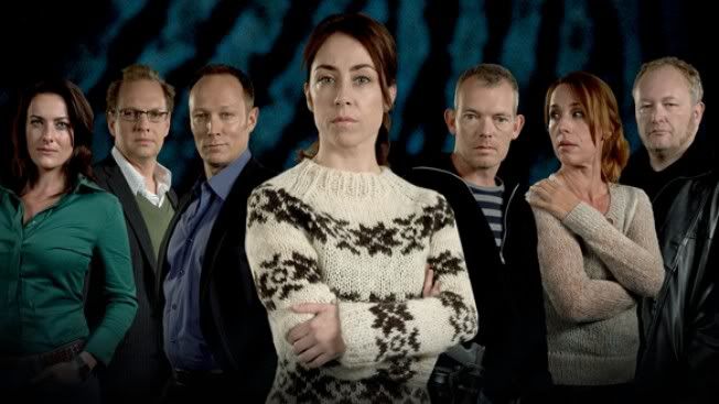
For those of you who don't know what I'm talking about, Sarah Lund is the taciturn protagonist of Danish TV series The Killing, AKA Forbrydelsen. The Killing is a political drama/detective show, the first season taking place over 20 days of a murder investigation in Copenhagen. It was very popular in Denmark, and quickly reached must-watch status in the UK when it aired on the BBC last year. Season 2 just started and I'm watching like a hawk, brain already conditioned into Pavlovian stress attacks whenever I hear the credits music (the Forbrydel-drums). However. While I'm psyched that such a well-made, intelligent, feminist show is so popular, the obsession with Forbrydelsen includes some intense yet slightly bemusing involvement in Lund's jumper choices.
Sarah Lund and the bunch of idiots she has to pretend to tolerate in order to keep her job.
This promo pic gives you a good idea both of Lund's character (confident, serious and aloof), and of the entire cast's attitude towards fashion -- ie, that they don't find it very important.
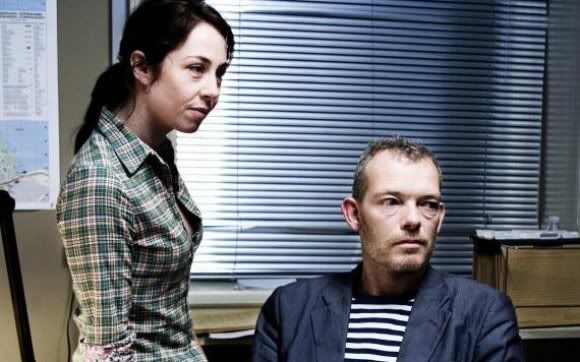
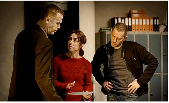
Everyone in Forbrydelsen is either a workaholic with no spare time whatsoever (the politicians and the detectives), or the grieving family of a murder victim. Not people who spend much time pondering their outfits every morning, in other words. There's a high level of realism throughout all aspects of the show, and in the real world most people just do not care that much about clothes unless they're going to a party or a job interview. They wear things that are comfortable and easily washable and unlikely to get creased if they've got a desk job, and the characters of Forbrydelsen reflect that in their uniformly unremarkable dress-sense. On top of this, the main characters are politicians and cops -- people whose jobs require them to look as normal and un-flashy as possible, albeit for different reasons.

Another world-shattering combo from Sarah Lund, who has more important things to worry about, such as murder.
'For fans of The Killing [...] there's only question bigger than whodunnit: "Why does Sarah Lund always wear that thick patterned jumper? And also, of course, where can I get one from?" ' -- from The Killing: Sarah Lund's jumper explained, in The Guardian.

The actress who plays Lund, Sofie Gråbøl, has commented on the jumpers in several interviews. I don't doubt that thought was put into Lund's costumes, but I get the impression that neither Gråbøl nor the showrunners ever predicted the level of interest that fans would exhibit in her jumper collection. And even if she was aware of how exciting people would find her knitwear choices, I suspect she'd prefer to be discussing her acting and character development. I mean, Lund is a pretty unique character -- a female detective who is, if anything, even more abrupt, antisocial and self-destructive than her male counterparts.
The most important development in season two: Lund's new red jumper.
One of the main reasons why Lund's jumper became so iconic during season 1 is because it appeared so often. At the beginning of the season Lund is supposed to be moving house, meaning most of her clothes are packed away and/or already shipped. Also, she only goes home to eat cold leftovers directly from the pan and take brief 3am naps before someone calls with the next clue, so it's not like she's sorting through her wardrobe for tomorrow's snazzily-knitted Faroese crimefighting outfit. You get the impression she only pauses to shower because greasy hair would be detrimental to the suspect-interview process.
This photo spoiled me for episode 2x04, which I hadn't seen yet. Now I know her original brown jumper will be back!
The jumpers are definitely a characterisation decision, I don't argue with that. Lund is unsettlingly driven and has priorities other than feminine/attractive dressing. She has a boyfriend who clearly has no problem with her wearing the same jumper every day (eat your heart out, Sex And The City neo-feminists). But this isn't some statement of "I'm in a man's world so I'm dressing like this" -- Sarah Lund really does not give a shit. Lund's attitude towards other people's opinions is either to listen to them before ignoring them completely (if they're her professional superior), or to just  ignore them completely from the get-go. She ends most conversations by walking away while the other person is still in mid-sentence, looking slightly shocked that anyone could be that rude. The main message her jumpers convey is that she wants to be warm, and the rest of her clothes are in boxes.
If one googles Sarah Lund, the first two hits are about her jumper. To me, this fixation indicates two things: 1) airing this show in November was a good marketing decision because British people apparently become obsessed with knitwear during the winter months, and 2) audiences have unknowingly been yearning for a female character who dresses like a real person.

Links
Win a The Killing jumper in a Lundalike contest -- Radio Times. (WTF)
Sofie Gråbøl interview regarding season 2 -- Huffington Post.
Sarah Lund's Faroese jumper is the surprise star of The Killing -- The Guardian.
Knit your own Sarah Lund jumper -- Radio Times.

Edited to add, 02/12/2011: Just to highlight the hilariously overblown cult status of the Lundjumper phenomenon, I just discovered that this video exists:
Read More
Posted in costumes, tv | No comments

Thursday, November 24, 2011

REVVVEEENNNGE: Nolan Ross costume analysis RETURNS.

Posted on 3:51 PM by christofer D
I've already written quite extensively about my love of the character Nolan Ross in Revenge. Not only is he the best character in what is already an extremely entertaining show, but his dress sense is eye-bendingly awesome. He has this whole peacockish prepster-satire thing going on, and once you start looking out for it you notice that he appears to be wearing themed outfits in certain scenes. Last week he donned a sleazy-looking brown silk patterned dressing-gown to lounge around in after a sordid, loveless tryst, and I'm almost certain this was on purpose.

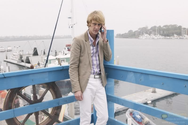
At the start of this week's episode (1x09) Nolan is wearing a fairly everyday ensemble: top half normal-looking, bottom half douchey prepster. (Tragically, you can't see the white dress shoes he's wearing to go with the white jeans and white belt. But rest-assured they are very white and shiny.) 
This is his "I'm not going to be hanging around anyone important today so who cares" outfit, the one he wears to do minor household tasks such as purring threats into the ears of people in bars at 11am, and spying on murderous identity-thieving strippers. (I know, right? This show is amazing.) However, later on he's invited to a party full of financial types, there to invest in the probably-corrupt company of his part-time-rentboy fuckbuddy. Aside from the show's protagonist and the aforementioned part-time-rentboy financial advisor, he's the youngest person at the party by about 20 years. So he wears this:

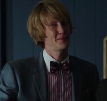
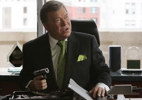
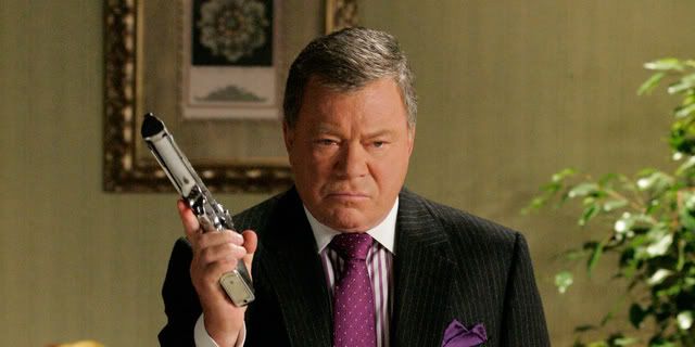
INSPIRED. He's dressed like a 70-year-old banker! But in a bow-tie, because he's at a party! White contrast collar on a striped coloured shirt? PERFECTION. Hyper-masculine Republican power-dressing with an ironic twist, because his main aim is to blackmail his scheming not-boyfriend. Plus matching maroon paisley tie and maroon pocket-square. This is what my brother refers to as a "William Shatner shirt" because it's what William Shatner's aging conservative lawyer character wears in Boston Legal:
IT'S LIKE EXACTLY THE SAME OUTFIT.
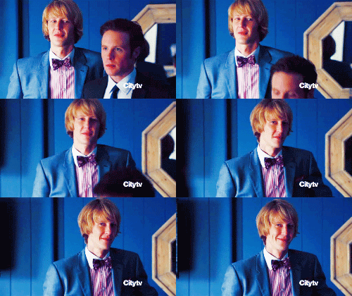
NOLAN ROSS IS IN COSTUME AS AN OLD-FASHIONED MILLIONAIRE INVESTOR. Once again, Nolan Ross pairs his Hamptons parody outfit perfectly with the situation. Let's look at it in motion, shall we?
.gif from http://hollowglances.tumblr.com/
DIVINE. That tie really brings out the colour of your dastardly smirk, Nolan.
Read More
Posted in costumes, personal taste, revenge, tv | No comments

Wednesday, November 23, 2011

Leyendecker and the Arrow Collar Man.

Posted on 3:18 PM by christofer D
Because I feel this blog has been tragically short on vintage suits so far, here's a post all about Leyendecker and the Arrow Collar Man.
The Arrow Collar Man is a creation of J.C. Leyendecker, a German-American illustrator of magazine covers and advertisements in the 1900s-30s. Leyendecker worked on a variety of illustrations and ad campaigns, but his speciality was these hyper-masculine, square-jawed all-American guys who spent their days smoking, posing in a manly fashion, and playing sports. The Arrow Collar Man is kind of The Man Your Man Could Smell like of the early 20th Century.

1920s Twilight.
Arrow Collar Man didn't really have a personality the way The Man Your Man Could Smell Like does, though. He was more just endlessly handsome and glamourous, which is probably all you need in your shirt adverts in 1920s America. The campaign was incredibly successful, although that's probably less to do with the advert itself and more to do with the fact that the concept of shirts with collars already attached was astonishingly tempting when compared to the prospect starching all your collars separately.
Sherlock Holmes and Captain America (I wish).
Despite running for over 20 years, the Arrow Collar Man never seemed to age, which is particularly impressive since Leyendecker used the same model the entire time. I find them a lot more appealing than today's equivalent suit/fashion ads, to be honest, because using an illustration is an acknowledgement that people can't/don't have to be this perfect-looking. With a modern photo ad, the viewer sees a suit and is supposed to think, "That's what the suit looks like," with the photoshop/airbrush artist hopefully an invisible presence somewhere far away from either the model or the camera lens. But with a painting you have the model at one end, the viewer at the other, and in the middle the artist saying, "Hey guys, I'm here to make everyone look better and we both know that!" Photographs imply authenticity, but the point of advertising isn't authenticity, it's to show the product from its good side.
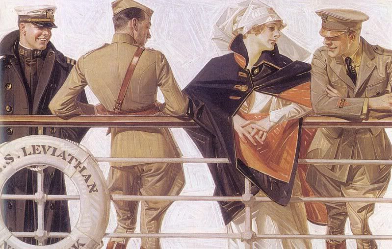
I think it's safe to assume that at least two of those soldiers are not remotely interested in the nurse.
There's a definite element of homoeroticism in a lot of Leyendecker's illustrations, although I have to wonder how much of it was ever picked up on by the general population circa 1905/1920/etc. Most of the time it's rather coy, like the picture above, although occasionally you get adverts that to the modern eye seem entertainingly obvious:
It's like he was going for "world's most phallic advert" award or something.
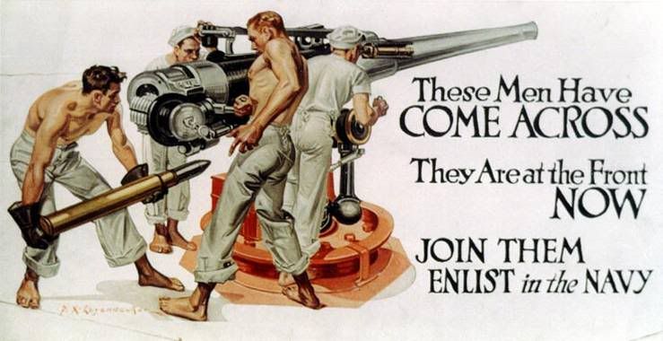
I mean, what is THAT? "Join the Navy, where glistening, shirtless men thrust huge missiles into waiting holes"? And there's more:
I'm going to go ahead and assume that Leyendecker never had much experience with the military, because these guys are basically Chippendales. It makes me feel a little bad for the small number of guys who looked at these posters, thought, "Hell, yeah!" and were then sorely disappointed by the realities of military life in the 1930s.
o rly?
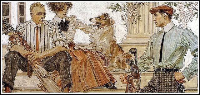
But it's not just a "Leyendecker was gay so he drew a bunch of hot men" thing, I don't think, because he was being hired consistently for this work, meaning that not just gay dudes were buying the products he helped advertise. Arguably the Arrow Shirts could have been marketed directly at women buying for their husbands, but Leyendecker's magazine covers and other adverts weren't. To me it indicates that Leyendecker's men (and the men of early 20th ads in general, although to be honest I don't know much about this) aren't just objects of desire, they're meant to be enviable, and to be emulated. Much like women in modern ads.
 It's no secret that practically everything these days is sold using a hot, frequently half-naked woman, because in theory either you're going to associate sex-appeal with the product (straight men) or you're supposed to want to buy the product in order to gain sex-appeal (women). Leyendecker's men aren't the men of modern ads -- they're admirable, but they're also intentionally desirable. They're paragons of gentlemanly style and sportsmanship. They're a far cry from the Lynx/Axe body spray dudes -- probably an unfair comparison, but you get what I mean. All ice-cream ads in 2011 are women orgasming over the sheer gloriousness of ingesting £2.50's-worth of processed frozen chocolate, whereas a Leyendecker ad for ice-cream in 1911 would probably be two hearty chaps at the tennis court holding ice-creams and looking like they're in the middle of a discussion about tie-pins, the German Problem, or stock options.
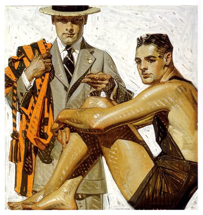
JUST CHILLAXIN' HERE IN MY GOLFING UNDERWEAR...
Check out this sock ad. First of all: sock ad. Obviously it's charmingly archaic by our standards, especially the snappy slogan ("The most extensively sold make of Men's Half Hose in existence"). This is not the way to advertise socks in 2011. Socks are functional; sock ads in 2011 are functional. Men only get to be sexy if they're driving a new car or using a new shaving product, and then it's the product that's sexy, not the man. But I think we can all agree that the socks are not what makes this image awesome.
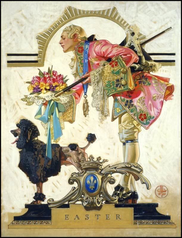
Nothing says "Easter" like an 18th century French courtiere and a poodle.
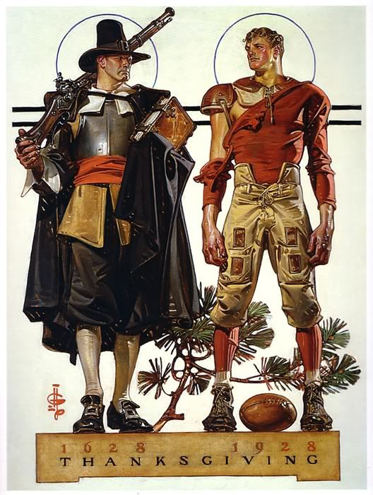
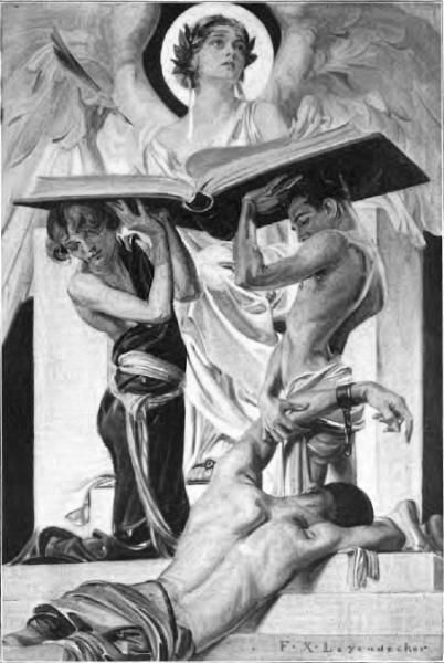
What really cracks me up is when Leyendecker's bosses give him creative control. If you google-image his art you get just as many magazine covers as adverts, and most of those magazine covers are totally impossible to parse. He seems to enjoy historical themes, but not usually for any... relevent reason...
Of course this picture represents Thanksgiving. OF COURSE.
Actually, looking at the Thanksgiving picture above, I can help thinking that 1920s American football uniforms are sort of steampunk. I would so totally wear that! Then again, I'd probably also wear the courtier outfit as well, so long as you removed some of the lace.
I looked at this magazine cover for a good thirty seconds trying to work out what news story it could possibly be supposed to represent. Maybe there was an article about sports and/or rowing in the magazine somewhere? All I know is, most weekly papers no longer feature oiled-up men in short-shorts on the cover.
You know you'd watch this movie in a shot.
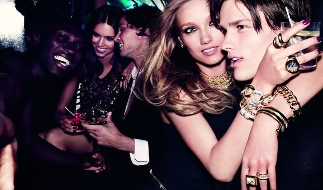
Despite the fact that most of Leyendecker's paintings are very obviously posed scenes, I find it much easier to imagine a narrative for them than I can for modern adverts/fashion spreads. Possibly this can be put down to me being a pleb who finds it easier to interpret "art" in a painting rather than a photograph, but I think it's more likely thanks to the expressiveness of the models. Take this current Michael Kors ad:
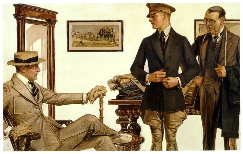
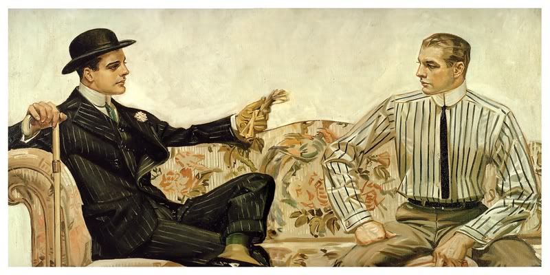
Scene: personality-free mannequins having fun in a bar while being stunningly attractive yet oddly expressionless. Compared to the next scene: the similarly everyday scenario of people buying clothes (albeit buying clothes from a professional tailor in 1910), but in this case the characters seem to be imbued with 100% more human warmth despite being painted rather than acted out by professional models. I don't know if this picture tells a thousand words, but it certainly has more of a story to it than the Michael Kors ad.
N.B. I think the man on the far right is Giles from Buffy.
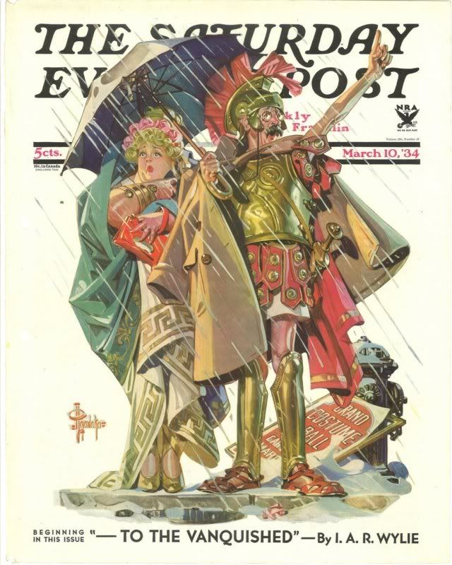
Quite apart from the whole female gaze/male gaze thing, I rather love Leyendecker's love of unnecessary costuming. Check out this newspaper cover:
I bookmarked this as "Mr and Mrs Weasley roleplaying as Naughty Maid and Sexy Centurion". I think Leyendecker just wanted an excuse to draw some Roman armour because it was March and it was chilly and he was being paid for this anyway so hey, why not? (Why not?)

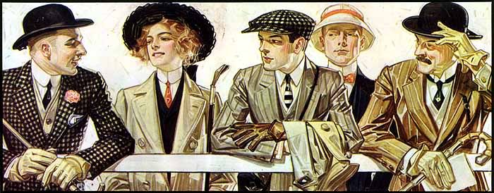
To finish, here's one of my favourite Leyendecker illustrations, another (quite early: 1907) Arrow Collar ad. I particularly love this one because of the variety of styles displayed in the lineup -- two different (and very stylish!) businessman looks bookending the group, a woman with a riding crop, a young dandy out for a walk in his flat-cap, and the 1900s equivalent of a prepster. The woman I particularly like, of course. It's highly unlikely that the ad would be marketing to the women-who-wear-suits crowd (not exactly a big market in 1907, although I assume she is in fact wearing some type of riding outfit) but she's still there and looking badass.
The Arrow Collar Man, Virginia Woolf, Dorian Gray, Sebastian Flyte, and Dr John Watson.
Read More
Posted in "it's historical", ladies in suits, personal taste, suits | No comments
Newer Posts Older Posts Home
Subscribe to: Posts (Atom)

Popular Posts

  • Master & Commander: The Far Side of the World. (Part 2)
    Previously: Master & Commander, Part 1. The characters in Master & Commander have a lot to say about the division between Navy and n...
  • Costuming & design in NBC's Hannibal: Hannibal Lecter's wristwatch.
    As part of my ongoing series on costume and design in Hannibal , I'm going to post my first guest blog with contributions from an outsi...
  • The costumes of X-Men: First Class, Part 2: Menswear.
    Part 1: Womenswear. OK, let's be real here. 99% of this section is gonna be about Erik and Charles, firstly because 99% of the movie is...
  • Costuming and Design in Captain America: The Winter Soldier -- Steve & Bucky.
    Part 1: "Trust No One" -- How Captain America became the gritty superhero we never knew we wanted. Part 2: HYDRA, Sitwell, and div...
  • Teen Wolf 2x09: Party Guessed.
    Previously: Teen Wolf 101: An introduction to the eighth wonder of our world . (Now available in audio as well!) Why does Teen Wolf hate ha...
  • Capitol Couture in The Hunger Games.
    It's a little late for a review of the Hunger Games movie itself, so in summary: I thought it was an excellent adaptation, and the few t...
  • Teen Wolf: Tattoo.
    Previously: Teen Wolf 101: An introduction to the eighth wonder of our world . Welcome to Teen Wolf! The show where the shirts are off, and ...
  • The ultimate TEEN WOLF DRINKING GAME.
    OK, the midseason finale is upon us. After tonight, there's no more Teen Wolf until January 2014. To help you deal with the pain, I'...
  • Harry Potter, costume design, and wizarding fashion in 1920s New York. (Part 2)
    Previously: Part 1 . Most wizarding robes in the Harry Potter movies are a combination of bell-sleeved faux medieval robes, and old-fashion...
  • Costumes and design in NBC's Hannibal, Part 1.
    I probably should've been writing about the costumes of Hannibal from the very start, but I confess to feeling a little overwhelmed. The...

Categories

  • "it's historical"
  • 1920s
  • 1940s
  • 1950s
  • 2014
  • accessories
  • agent carter
  • agents of shield
  • alexander mcqueen
  • alexander wang
  • alien
  • alien quadrilogy
  • aliens
  • apocalypse fashion
  • armour
  • avengers
  • bad movies
  • bad reviews
  • batman
  • bbc
  • benedict cumberbatch
  • big bang press
  • books
  • captain america
  • chanel
  • china
  • chris kane
  • comics
  • constantine
  • conventions
  • cosplay
  • costume design
  • costumes
  • couture
  • dance
  • dc
  • dior
  • dior homme
  • doctor who
  • dolce and gabbana
  • duckie brown
  • duro olowu
  • dystopias
  • elementary
  • erdem
  • fall 2012
  • fall 2013
  • fanart
  • fandom
  • fanfiction
  • fashion
  • fashion week
  • fausto puglisi
  • figure skating
  • game of thrones
  • gareth pugh
  • givenchy
  • goth
  • gwyneth paltrow
  • haider ackermann
  • hannibal
  • harry potter
  • hugo awards
  • hunger games
  • interstellar
  • interviews
  • IRL
  • iron man 3
  • it's historical
  • james bond
  • jason wu
  • jean paul gaultier
  • jonathan saunders
  • jw anderson
  • karl lagerfeld
  • ladies in suits
  • links post
  • london
  • london fashion week
  • louis vuitton
  • marc jacobs
  • marketing
  • marvel
  • mary katrantzou
  • masterpost
  • mcu
  • mediocre
  • menswear
  • menswear fashion week
  • milan
  • movie costumes i have loved
  • movie costumes i have loved
  • movie reviews
  • movies
  • mugler
  • needs more gold
  • neil marshall
  • new york
  • nyfw
  • oscars
  • other writing
  • ozwald boateng
  • pacific rim
  • paris fashion week
  • peggy carter
  • penny dreadful
  • persional taste
  • person of interest
  • personal taste
  • peter pilotto
  • podcasts
  • prabal gurung
  • pre-fall 2012
  • pre-fall 2013
  • pre-spring
  • prometheus
  • punk
  • ralph lauren
  • rants
  • resort 2013
  • retrofuturism
  • revenge
  • rick owens
  • s/s
  • scandinavia
  • sci fi
  • sci-fi
  • scotland
  • set design
  • shakespeare
  • sherlock
  • sherlock holmes
  • SHIELD
  • shoes
  • snowpiercer
  • spring 2012
  • spring 2013
  • spring 2014
  • star trek
  • star trek into darkness
  • star wars
  • starfleet
  • stargate
  • stoker
  • street style
  • suits
  • superheroes
  • superman
  • supernatural
  • tailoring
  • teen wolf
  • the hour
  • the row
  • theatre
  • theyskens theory
  • thom browne
  • thor
  • thor 2
  • threeasfour
  • tom ford
  • tom hiddleston
  • tv
  • ulyana sergeenko
  • uniforms
  • upholstery
  • versace
  • victoria beckham
  • video post
  • viktor and rolf
  • vivienne westwood
  • walter van beirendonck
  • watches
  • writing
  • x-men
  • yohji yamamoto
  • zac posen

Blog Archive

  • ▼  2015 (4)
    • ▼  January (4)
      • Hugo Award eligibility & 2014 masterlist
      • Interview: Agent Carter costume designer Gigi Melton
      • Behind the seams of the Oscars' costume design cat...
      • A guide to 1940s costume design in Marvel's Agent ...
  • ►  2014 (38)
    • ►  December (3)
    • ►  November (3)
    • ►  October (3)
    • ►  September (1)
    • ►  August (1)
    • ►  July (3)
    • ►  May (1)
    • ►  April (8)
    • ►  March (4)
    • ►  February (2)
    • ►  January (9)
  • ►  2013 (68)
    • ►  December (2)
    • ►  November (2)
    • ►  October (7)
    • ►  September (9)
    • ►  August (5)
    • ►  July (9)
    • ►  June (6)
    • ►  May (4)
    • ►  April (3)
    • ►  March (5)
    • ►  February (11)
    • ►  January (5)
  • ►  2012 (122)
    • ►  December (6)
    • ►  November (11)
    • ►  October (11)
    • ►  September (13)
    • ►  August (9)
    • ►  July (12)
    • ►  June (13)
    • ►  May (8)
    • ►  April (6)
    • ►  March (7)
    • ►  February (13)
    • ►  January (13)
  • ►  2011 (32)
    • ►  December (8)
    • ►  November (10)
    • ►  October (13)
    • ►  September (1)
Powered by Blogger.

About Me

christofer D
View my complete profile